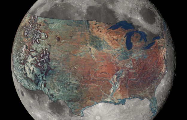
How big is the Moon, really? Reddit user boredboarder8 provided some perspective with this image of the Moon with an overlaid United States. It’s roughly estimated (and others would be better at commenting on the accuracy better than me), but after some back-of-napkin math it seems about right. The area of the United States, not including Alaska, is a little over 20 percent of the Moon’s surface area. [via io9]
-
-
-
-
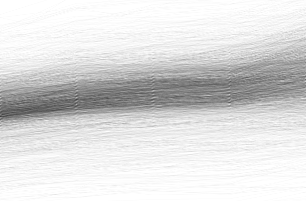
Using Transparency in R to Improve Clarity
When you plot a lot of data at once, points and lines can obscure others and hide patterns. Transparency can help reveal what is really there.
-
Lance Hosey, for The New York Times, on design, beauty, and functionality.
We think of great design as art, not science, a mysterious gift from the gods, not something that results just from diligent and informed study. But if every designer understood more about the mathematics of attraction, the mechanics of affection, all design — from houses to cellphones to offices and cars — could both look good and be good for you.
-
-
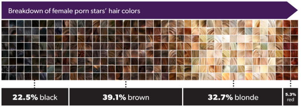
Jon Millward explored porn star demographics using a data scrape from the Internet Adult Film Database: hair color, race, and birthplace, among other things. (There aren’t any dirty pictures, but there’s some terminology that might be NSFW.)
The average measurements?
I thought that maybe if the women are overestimating how light they are, they might also be a bit too generous when reporting their measurements. It turns out they probably aren’t though, because the most common bra size for a female porn star is a surprisingly handleable 34B. Not double-D, not even a D. Double-D actually came in 4th, behind B, C and D. The most common set of measurements for the women was 34–24-34.
So, if the average female porn star is a 5’5″ woman who weighs 117lbs and has B-cup breasts, what colour is her hair? Blonde, presumably, if my friends’ guesses were anything to go by.
Apparently not. Dark-haired porn stars outnumber blonde ones almost 2-to-1.
Millward doesn’t look at changes over time a whole lot, but if the BMI of Playboy playmates is any indicator, I bet those measurements have changed over the years.
-
From NOAA, an animation showing a wave of cold during the Martin Luther King Jr. holiday weekend last month:
A drop in the jet stream sent temperatures across the United States plummeting over the Martin Luther King Jr Holiday weekend. The pronounced change in temperatures can be seen in this weather data from NOAA/NCEP’s Real-Time Mesoscale Analysis. Areas colored blue are below freezing. The diurnal cycle of heating and cooling can be seen over time, but the pattern is clear: much of the U.S. is pretty cold.
While you’re at it, you might as well check out other videos on the NOAA Visualizations YouTube channel. Some good stuff.
-
-
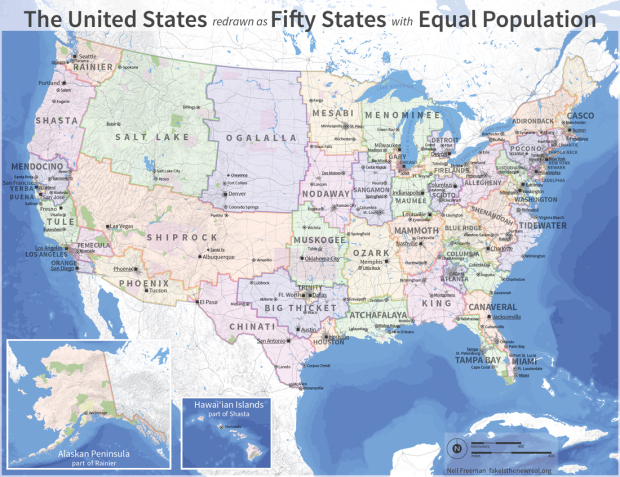
Neil Freeman reimagined state boundary lines based on population. He started with an algorithm and the fifty largest cities, considered proximity, urban area, and commuting patterns, and then hand-tweaked boundary lines and shapes. The state names are mostly centered around geographic features (although I would have opted for ones based on dating profiles).
“Keep in mind that this is an art project, not a serious proposal, so take it easy with the emails about the sacred soil of Texas.” [via kottke | Thanks, Mickey]
-
A handful of experts weighed in on visualization as a spectrum rather than an unyielding tool.
The panelists emphasized repeatedly that data visualization exists on a spectrum. On one side are the pieces that are purely aesthetic and emotional, and on the other, the focus is purely on conveying the insights found in the data. Tom Carden, a data visualization engineer at Square, asks himself if the goal is to grab attention for a new idea, or to build a tool that will be used on an ongoing basis: “Tools need to be actionable, auditable, and they have to stand up to scrutiny long-term.” Tools should be able to accommodate new data, he said, and should grow with companies in such a way that people aren’t surprised by a difference between this week and last week.
From the other side of the spectrum are different types of insight that can be emotional, reflective, or just darn funny. This is equally important to analytic insight that you get from tools, and they feed in to each other providing a more realistic view of what data really represents.
Some illustrated notes from the panel:
-
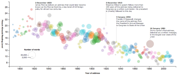
With the State of the Union address tonight, The Guardian plotted the Flesh-Kincaid grade levels for past addresses. Each circle represents a state of the union and is sized by the number of words used. Color is used to provide separation between presidents. For example, Obama’s state of the union last year was around the eighth-grade level, and in contrast, James Madison’s 1815 address had a reading level of 25.3.
My guess is this has to do with changes in how we write and talk more than anything else. Lee Drutman and Dan Drinkard for the Sunlight Foundation ran a more rigorous analysis on Congressional records back in May, and the declining trend is similar.
-
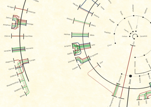
Viviana Ferro, Ilaria Pagin, and Elisa Zamarian had a look at all of Zeus’s relationships according to many authors over the years. Each person on the inside of a circle represents a lover, and the colored branches connect to children. Start with Zeus, the largest black dot near the middle, and then work your way out.
-
-
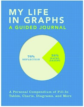 My friends just got this for me, and it’s pretty much the perfect gift, especially since my dissertation is about journaling and personal data collection. My Life in Graphs: A Guided Journal is a book of blank charts and graphs, and you fill in the blanks. For example, there’s a map to mark your travel destinations and an x-y plot to evaluate “bucket-list viability.”
I worked on mine a couple of days ago and showed it to my wife. She said I was like a kid showing off his homework. I think that’s a good thing.
-
-
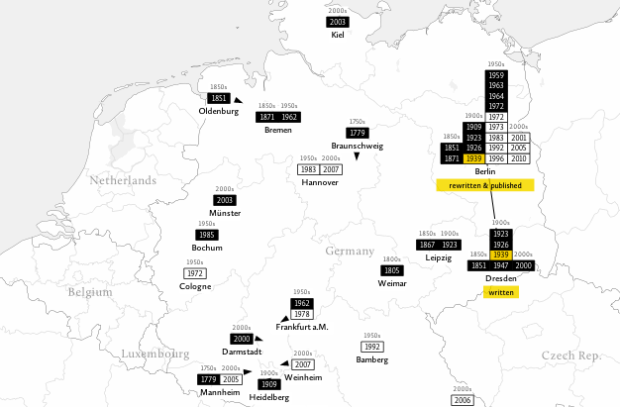
Tom Cheesman of Swansea University, along with Kevin Flanagan and Studio NAND, dives into translations of Shakespeare’s Othello with TransVis.
TransVis collects, digitises, analyses and compares translations and variations of literary works. In an initial prototype named VVV (»Version Variation Visualisation«), we have proposed analysis methods, interfaces and visualization tools to explore 37 translations of Shakespeare’s Othello into German with more works translated into other languages to come.
The map is more of a browser to see where specific publications were written, rewritten and published, but I wonder if you’ll see anything interesting if you looked at just where something is rewritten or translated. It’d be like seeing ideas spreading. Or you know, Twilight copies.
-
-
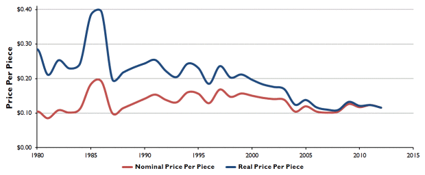
Reality Prose has an excellent analysis on the changing price of LEGO bricks over the years and a misconception that cost has gone up. According to the chart above, based on data from BrickSet and adjusted for inflation, the average cost per brick has come down.
Read More

 Visualize This: The FlowingData Guide to Design, Visualization, and Statistics (2nd Edition)


