• Membership
  • Books
  • Projects
  • Learning
  • About
  • Member Login
  • How to Animate Transitions Between Multiple Charts

    Animated transitioning between chart types can add depth to your data display. Find out how to achieve this effect using JavaScript and D3.js.

  • Global temperature rises over past century

    January 16, 2013

    Topic

    Maps  /  environment, New Scientist, temperature

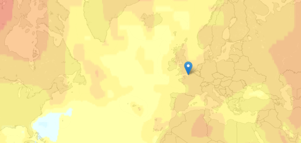
    New Scientist mapped global temperature change based on a NASA GISTEMP analysis.

    The graphs and maps all show changes relative to average temperatures for the three decades from 1951 to 1980, the earliest period for which there was sufficiently good coverage for comparison. This gives a consistent view of climate change across the globe. To put these numbers in context, the NASA team estimates that the global average temperature for the 1951-1980 baseline period was about 14 °C.

    The more red an area the greater the increase was estimated to be, relative to estimates for 1951 to 1980 (especially noticeable in the Northern Hemisphere).

    The most interesting part is when you compare all the way back to to the 19th century when it was much cooler. You can also click on locations for a time series of five-year averages. [Thanks, Peter]

  • Using data to find a husband

    January 15, 2013

    Topic

    Statistics  /  dating, Wall Street Journal

    When it was time to settle down with the right man, Amy Webb joined two dating sites, created a profile, and went on some horrible dates. Her solution was to create fake male profiles and then scrape and analyze data to find out how she could improve her chances.

    Posing as these men, I spent a month using JDate. I interacted with 96 women, cataloging how they behaved and presented themselves online and scraping data from their profiles (such as the language they used or the number of hours they waited before emailing back one of my profiles). Wanting to learn everything I could about my competition, I kept a detailed database, and I recorded which female profiles were popular. While JDate doesn’t publicly release its algorithms, at the time of my experiment I observed that the more popular profiles come up higher in search results, allowing one to get a quick-and-dirty ranking of who’s hot (or not). I quickly realized that the popular women seemed to know something I didn’t; they were clearly attracting the sort of smart, attractive professionals who had been ignoring my profile. Being hypercompetitive, I wasn’t about to let some bubblegum-popping blonde steal the neurotic Jewish doctor of my mother’s dreams.

    Basically, she pulled an OKCupid for herself. It worked.

  • Character mentions in Les Miserables

    January 14, 2013

    Topic

    Statistical Visualization  /  Jeff Clark

    Jeff Clark took a detailed look at Victor Hugo’s Les Miserables via character mentions, word connections, and word usage. The above is character mentions with color showing sentiment. Red means negative, and blue positive.

    Characters are listed from top to bottom in their order of appearance. The horizontal space is segmented into the 5 volumes of the novel. Each volume is subdivided further with a faint line indicating the various books and, finally, small rectangles indicate the chapters within the books. In the 5 volumes there are a total of 48 books and 365 chapters. The height of the small rectangles indicate how frequently that character is mentioned in that particular chapter.

    There’s a good amount of blue towards the end, when everyone decides everyone else isn’t so bad.

    See the full version and other views here.

  • Flowchart: Gandalf problem solving →

    January 11, 2013

    Topic

    Infographics  /  flowchart, Gandalf, humor

    The Lotr Project breaks down the thought process in the magical mind.

  • Series of concentric circles emanating from glowing red dot

    January 10, 2013

    Topic

    Miscellaneous  /  humor, Onion

    Run for your lives. The red concentric circles on the green squiggly are headed your way. From The Onion:

    [via @civilstat]

  • Random walk on pi →

    January 9, 2013

    Topic

    Data Art  /  pi

    By Francisco Javier Aragón Artacho, “This is a walk made out of the first 100 billion digits of pi in base 4 with the following rules for the steps: 0 right, 1 up, 2 left, 3 down.” [via]

  • Five years of traffic fatalities

    January 8, 2013

    Topic

    Statistical Visualization  /  Excel, heatmap, traffic

    I made a graphic a while back that showed traffic fatalities over a year. John Nelson extended on that, pulling five years of data and subsetting by some factors: alcohol, weather, and if a pedestrian was involved. And he aggregated by time of day and day of week instead of calendar dates.
    Read More

  • Women as academic authors over the years →

    January 7, 2013

    Topic

    Infographics  /  bubbles, education, interactive

    The Chronicle of Higher Education has a look at the percentage of academic papers published by women, over the past five centuries.

    The articles and authors described in this data were drawn from the corpus of JSTOR, a digital archive of scholarly papers, by researchers at the Eigenfactor Project at the University of Washington. About two million articles, representing 1765 fields and sub-fields, were examined, spanning a period from 1665 to 2011. The data are presented here for three time periods, the latest one ending in 2010, and a view that combines all periods.

    Percentage of female authors is on the horizontal, and each bubble is a subfield sized by total number of authors. The graphic starts with publishing for all years, but be sure to click on the tabs for each time span to see changes.

    The data is based on the archive of about two million articles from JSTOR, and a hierarchical map equation method is used to determine subfields.

    The gender classification they used for names seems like it could be nifty for some applications. Gender is inferred by comparing names against the ones kept by the U.S. Social Security Administration, which includes gender. If a name was used for female at least 95 percent of the time, it was classified as a female name, and the same was done with male. Anything ambiguous was not included in the study.

  • Page 252 of 395
  • <
  • 1
  • ...
  • 249
  • 250
  • 251
  • 252
  • 253
  • 254
  • ...
  • 395
  • >

Analyze, visualize, and communicate data usefully, beyond the defaults.

Become a member →

Recently for Members

June 26, 2025
Visualization Tools and Learning Resources, June 2025 Roundup

June 19, 2025
Making Data Relatable

June 12, 2025
Comparing multiples

June 5, 2025
Caring Data

May 29, 2025
Visualization Tools and Resources, May 2025 Roundup

Second Edition

Visualize This: The FlowingData Guide to Design, Visualization, and Statistics (2nd Edition)

New tools, refined process.

Order: Amazon / Bookshop

Browse by Chart Type See All →

Table Gantt Chart Sankey Diagram Bar Chart Dot Plot Connected Scatter Plot Chord Diagram Bar Chart Race Bubble Chart Step Chart

Browse By Topic

  • Visualization

    Seeing data

  • Maps

    Seeing geographic data

  • Infographics

    Explaining data

  • Networks

    Connecting data

  • Statistics

    Analyzing data

  • Software

    Working with data

  • Sources

    Getting data

  • Design

    Making data readable

Made by FlowingData

  • The Process

  • Data Underload

  • Chart Everything

  • Guides

  • Books

  • Shop

  • About
  • Contact
  • Newsletter
  • LinkedIn
  • Instagram
  • Bluesky
  • RSS
Copyright © 2007-Present FlowingData. All rights reserved.