Math professor Jeff Bergen explains the odds of picking a perfect bracket.
Read More
-
-
-
On Kickstarter: A project that uses a visualization of pi to connect Brooklyn high school students to their community.
They’ve already made a histogram of emotions in their school’s hallway and a stacked area chart mural at a nearby senior center. Next up is a wall currently covered in graffiti.
In Math class, students will construct the golden spiral based on the Fibonacci Sequence and begin to explore the relationship between the golden ratio and Pi. The number Pi will be represented in a color-coded graph within the golden spiral. In this, the numbers will be seen as color blocks that vary in size proportionately within the shrinking space of the spiral, allowing us to visualize the shape of Pi and it’s negative space.
Backed.
-
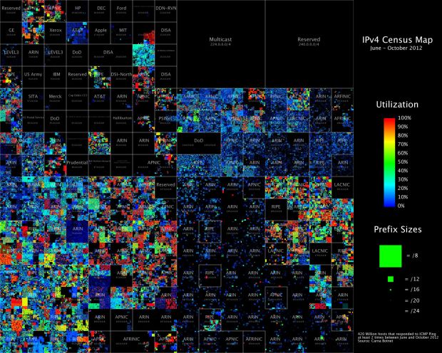
Upon discovering hundreds of thousands open embedded devices on the Internet, an anonymous researcher conducted a Census of the Internet, mapping 460 million IP addresses around the world.
While playing around with the Nmap Scripting Engine (NSE) we discovered an amazing number of open embedded devices on the Internet. Many of them are based on Linux and allow login to standard BusyBox with empty or default credentials. We used these devices to build a distributed port scanner to scan all IPv4 addresses. These scans include service probes for the most common ports, ICMP ping, reverse DNS and SYN scans. We analyzed some of the data to get an estimation of the IP address usage.
It’s a pretty thorough analysis, but the conclusion interested me most:
The why is also simple: I did not want to ask myself for the rest of my life how much fun it could have been or if the infrastructure I imagined in my head would have worked as expected. I saw the chance to really work on an Internet scale, command hundred thousands of devices with a click of my mouse, portscan and map the whole Internet in a way nobody had done before, basically have fun with computers and the Internet in a way very few people ever will. I decided it would be worth my time.
It makes me feel…uneasy. [Thanks, Roger]
-
-
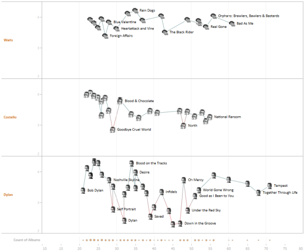
Do singer-songwriters age well like a fine wine, or does quality decline with age? Kyle Biehle analyzed fan ratings by age.
I understand all of the reasons for not comparing artists in this way. Despite twenty-one Academy Award nominations, Woody Allen never attends the Oscars. His reason is that art isn’t competition — judging art is so subjective who’s to say who or what is best? After all one man’s Poison is another man’s Cream. Similarly, Elvis Costello (featured in the viz) is famously credited with saying: “Writing about music is like dancing about architecture – It’s a really stupid thing to want to do.” I agree that using ratings – whether from fans or critics — to judge artistic merit is at best flawed and at worst a fool’s exercise.
But I wanted to do it anyway.
Most peak in their 20s and either stabilize later on or continue to decline. Occasionally, as in the case with Bob Dylan, there’s some see-sawing. Take a look at the Tableau interactive for a closer look. [via Waxy]
-
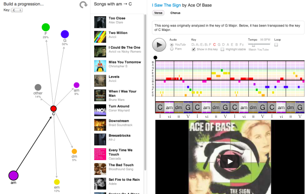
If you listen to the radio long enough, you’ve probably noticed that many songs sound similar or remind of you of a song you’ve heard before. Hooktheory shows you just how similar some songs are via chord progressions in over 1,300 songs. The small group analyzed the data last year and presented some static charts, but this interactive version takes it a step further.
Simply start by selecting a chord in the network diagram. Songs that use that chord appear on the right. Then select another chord in the network diagram to find songs that use the chord progression from the original to the new. Keep selecting chords to filter further.
So in the end, there are two main things you can do: (1) Find songs that use the same chord progression and (2) see the most likely chord given the current selection.
My musical knowledge from middle school jazz band is long gone, but it’s fun to explore, and you’ll likely find relationships to songs that you didn’t expect. [Thanks, Dave]
-
Emily Underwood on new cartographers and the growing field:
Geographers have traditionally studied how the natural environment contributes to human society and vice versa, whereas cartographers have focused more explicitly on the art and science of mapmaking. Over the past couple of decades, a new field has emerged: geographical information systems (GIS), blending the study and expression of geographic information. Cartography and geography have overlapped and spawned innumerable subspecialties and applications. Modern geographers and cartographers are involved in diverse projects: tracking fleets of vehicles or products, helping customers locate a Dunkin’ Donuts, modeling environmental scenarios such as oil spills, and studying the spread of disease.
You could substitute visualization and statistics for cartography throughout, and it’d almost all still be valid. The reoccurring theme is that although academic programs can be fine resources, most of your success has to do with what you can learn on your own, as data-related fields are changing fast.
-
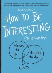 Jessica Hagy, the one who made Venn diagrams on index cards popular, has a new book out today: How to be Interesting.
You want to leave a mark, not a blemish. Be a hero, not a spectator. You want to be interesting. (Who doesn’t?) But sometimes it takes a nudge, a wake-up call, an intervention!—and a little help. This is where Jessica Hagy comes in. A writer and illustrator of great economy, charm, and insight, she’s created How to Be Interesting, a uniquely inspirational how-to that combines fresh and pithy lessons with deceptively simple diagrams and charts.
The book started from this, which could probably also stand in as a guide on how to enjoy life.
-
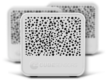 It wasn’t long ago that sensors and personal tracking seemed like pure nerdery. In the early stages of graduate school — before smartphones were popular or even widely available — I played around with sensors that had finicky battery life and Internet connectivity, the software was buggy, and the hardware looked clunky.
New tracking devices pop up regularly these days. They’re built and designed for a wider audience, and sometimes to my surprise, the devices are embraced by the target audience. It started with personal trackers that are fitness and health-related, but people are branching out now to monitoring their surroundings.
Two showed up on my radar this past week: CubeSensors and Thermodo.
Read More -
Each year, Oscar speeches seem to follow a similar format, with familiar names and groups sputtered in 30 seconds. For her master’s project, Thank the Academy, digital media student Rebecca Rolfe explored these patterns.
Read More -
-
-
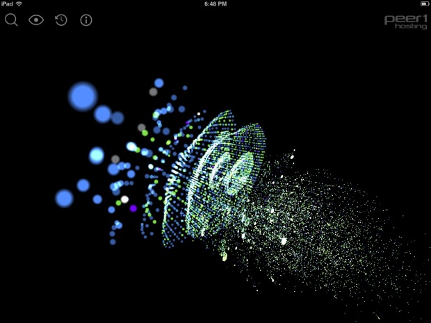
In a collaboration between PEER 1 Hosting, Steamclock Software, and Jeff Johnston, the Map of the Internet app provides a picture of what the physical Internet looks like.
Read More -
With Google Reader closing its doors in July (which stinks because I use it multiple times per day), now is a good time to make a switch.
For those who want to stick with RSS, you can grab the feed here. Note the change in feed URL. I used to use a service called Feedburner to deliver the RSS, but that’s owned by Google, too, so it’s probably best to move away from there.
Then of course you can follow @flowingdata on Twitter.
Or Facebook.
Or Google+.
Or via daily or weekly email.
-
-
Today might be pi day, but yesterday was Feltron Report day. The theme this year is visual density — or maybe programmatic graphics. Either way, it looks mighty fine.
-
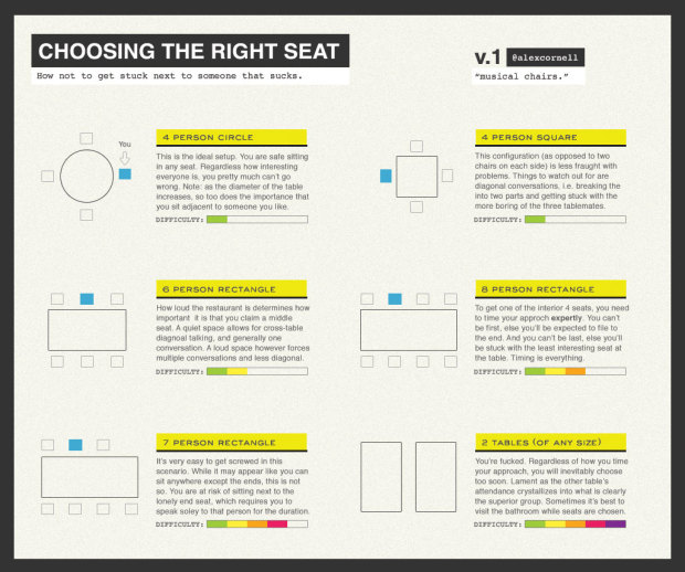
It can be tricky picking the right seat at a dinner party. So much depends on how many people there are and what shape the table is. Luckily, Alex Cornell provides a guide on where to sit and when to arrive to get the best seat of the night. The 4-person circle is your best bet.
This is the ideal setup. You are safe sitting in any seat. Regardless how interesting everyone is, you pretty much can’t go wrong. Note: as the diameter of the table increases, so too does the importance that you sit adjacent to someone you like.
Sorry for always sitting at the lonely end seat in the 7-person rectangle. [via kottke]
-
-
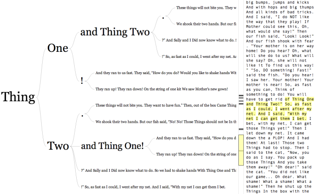
In 2007, Martin Wattenberg and Fernanda Viégas created the word tree, a search tool for unstructured text. You enter the text, pick a word or phrase, and you can see how other words and phrases branch from the root. Data visualization developer Jason Davies rephrased the visualization in JavaScript, and you can enter a URL or a Twitter username (or enter your own text like with the original). There’s also a nice sidebar that makes it easier to browse through the text.
So for example, the above is a word tree for The Cat in the Hat, and you can see what branches from Thing One and Thing Two. The phrase “and Thing Two” often follows “Thing One” as do exclamation points. The reverse feature comes in handy for text like Steve Jobs’ commencement speech.
Recently for Members
Browse by Chart Type See All →


Browse By Topic
Get the Book
 Visualize This: The FlowingData Guide to Design, Visualization, and Statistics
 Visualize This: The FlowingData Guide to Design, Visualization, and Statistics
Available now.