• Membership
  • Books
  • Projects
  • Learning
  • About
  • Member Login
  • Glowing landscape shows river history

    May 3, 2013

    Topic

    Data Art  /  environment, river

    The poster by Daniel E. Coe shows the life-like historical flows of the Willamette River in Oregon.

    This lidar-derived digital elevation model of the Willamette River displays a 50-foot elevation range, from low elevations (displayed in white) fading to higher elevations (displayed in dark blue). This visually replaces the relatively flat landscape of the valley floor with vivid historical channels, showing the dynamic movements the river has made in recent millennia. This segment of the Willamette River flows past Albany near the bottom of the image northward to the communities of Monmouth and Independence at the top. Near the center, the Luckiamute River flows into the Willamette from the left, and the Santiam River flows in from the right.

    Only $15 in print. [Thanks, Larry]

  • Fixing bus routes using mobile data

    May 2, 2013

    Topic

    Maps  /  IBM, mobile

    Transportation map by IBM
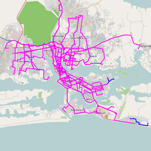
In parts of the world where there are few smartphones and GPS-enabled devices, transportation architecture has to be designed based on less granular resources, such as surveys, which can result in rough estimates. IBM researchers are looking into how data from simple cell phones can be used instead to see how people move.

    The IBM work centered on Abidjan, where 539 large buses are supplemented by 5,000 mini-buses and 11,000 shared taxis. The IBM researchers studied call records from about 500,000 phones with data relevant to the commuting question…

    While the data is rough—and of course not everyone on a bus has a phone or is using it—routes can be gleaned by noting the sequence of connections. And IBM and other groups have found that these mobile phone “traces” are accurate enough to serve as a guide to larger population movements for applications such as epidemiology and transportation.

    [via @krees]

  • Lego minifigure taxonomy

    May 2, 2013

    Topic

    Network Visualization  /  LEGO, minifigure

    There are over 4,000 Lego minifigure characters ranging from plumbers and judges to licensed ones such as Harry Potter and SpongeBob SquarePants. Christoph Bartneck from the University of Canterbury created a taxonomy to logically categorize all of the characters.

    If only the categories in the interactive expanded to show pictures or links to the actual minifigures. That would be killer. Hey, illustrators, looking for a side project? There you go.

  • History of San Francisco street names mapped

    May 1, 2013

    Topic

    Maps  /  history, San Francisco, streets

    Where do street names come from? Sometimes there’s actual history behind a name, and other times a street just needed a label, so someone pretty much pulled one out of a hat. For the former, there can be some interesting stories at work. Web developer and Knight-Mozilla fellow Noah Veltman mapped the history of street names in San Francisco under this premise. Just click on a blue street in the interactive and information pops up.

  • Beer Mapper: An experimental app to find the right beer for you

    April 30, 2013

    Topic

    Software  /  beer, iPad

    Kevin Jamieson, an electrical and computer engineering graduate student at the University of Wisconsin-Madison, put his work in active ranking into practice. The experimental app is called Beer Mapper.

    The application presents a pair of beers, one pair at a time, from a list of beers that you have indicated you know or have access to and then asks you to select which one you prefer. After you have provided a number of answers, the application shows you a heat map of your preferences over the “beer space.”

    Around 10,000 beers with at least 50 reviews on RateBeer were used as the foundation of the recommendation system. The reviews were reduced to just the individual words and counts, which gives sort of a profile for each beer (or a “weighted bag of words”). You rate beers, and the system tries to find profiles that are mathematically most similar.

    Two caveats. The first is that it looks like the app just gives you a heat map of the styles of beer you might like. A recommended list of actual beers would be way better. Second, the app is a research project that likely won’t be in the app store any time soon, so the first point is moot. Sad face. Maybe Untappd should read Jamieson’s paper. [via Fast Company]

  • Math and bad drawings

    April 29, 2013

    Topic

    Miscellaneous  /  blog, math

    Math and bad drawingsBen Orlin likes math and teaching. He’s bad at drawing. He has a blog on math and teaching with bad drawings.

    This blog is about the things I like. It’s also about the things I can’t do. I hope that the juxtaposition here — polished, thoughtful writing alongside art that my fiancee (charitably) likens to “the average 6th grader” — captures the contradictory state of the teacher, of the mathematician – and, what the hell, of the human. We are all simultaneously experts and beginners, flaunting our talents while trying to cover our shortcomings the way an animal hides a wound. You could call this a “math blog,” or a “teaching blog,” but I would call it a blog about owning up to weakness and drawing strength from successes, however transient or trivial they may seem.

  • Small Multiples in R

    Make a lot of charts at once, line them up in a grid, and you can make quick comparisons across several categories.

  • The Numbers Game on National Geographic

    April 29, 2013

    Topic

    Statistics  /  Jake Porway

    Jake Porway, the founder of DataKind, has a new show on the National Geographic channel called The Numbers Game. I unfortunately don’t have the channel, so the clips on the site will have to suffice for now.

    Keep in mind this show is for a wide audience though. Jake notes:

    Now for those of you who have been writing to me excited that Big Data is finally getting its own TV show, I should point out that this show is a lot more like a science show than a show about data. You won’t find discussions about Hadoop, machine learning, or even the basics of correlation vs. causation here. Instead, the show tries to make the latest statistics accessible to a wide audience of people who may just be dipping their toes in to this new world of data. It’s more Guy Fieri than Carl Sagan, but it’s a blast.

    The first of three episodes aired last week, and the second is on tonight. You should watch it.

  • Insecurities of age through the eyes of Google Suggest

    April 26, 2013

    Topic

    Miscellaneous  /  age, Google, video

    In this straightforward video, Marius Budin offers a look at our insecurities as get older through the eyes of Google Suggest. If anything, it’s clear that there’s one thing we fear throughout: loneliness. Although, the suggestions in the early years worry me.

  • A thorough Facebook analysis by Stephen Wolfram

    April 25, 2013

    Topic

    Statistical Visualization  /  facebook, Wolfram

    Stephen Wolfram analyzed the Facebook world, based on anonymized data from the Wolfram|Alpha Data Donor program. He visits topics from how people friend, how the Facebook world compares to the real one, and how people change with age.

    People talk less about video games as they get older, and more about politics and the weather. Men typically talk more about sports and technology than women—and, somewhat surprisingly to me, they also talk more about movies, television and music. Women talk more about pets+animals, family+friends, relationships—and, at least after they reach child-bearing years, health. The peak time for anyone to talk about school+university is (not surprisingly) around age 20. People get less interested in talking about “special occasions” (mostly birthdays) through their teens, but gradually gain interest later. And people get progressively more interested in talking about career+money in their 20s. And so on. And so on.

    Worth the full read.

  • Binify for hexagon binning in Python

    April 25, 2013

    Topic

    Software  /  hexbin, Python

    As an alternative to dot density maps, Binify by Kevin Schaul allows you to map with hexagon binning in Python.

    Dot density maps are a straightforward way to visualize location data, but when you have too many locations, points can overlap and obscur clusters and trends. That’s where binning comes in. Generally speaking, the goal is to look at an area on a map and then count how many points are within that area. Do that across the entire area.

    Grab the package on GitHub and go to town.

  • Stop motion video: Food you can buy for $5 in different countries

    April 24, 2013

    Topic

    Infographics  /  finance, food, video

    This stop motion video from BuzzFeed shows how much food you can buy for $5 USD in different countries. For example, five bucks will get you 7 pounds of rice in the United States and 12 pounds in China. The video is straightforward, but the animation of food appearing and disappearing — or rather, added and taken away — lends well to the context that you wouldn’t get from a quick chart.
    Read More

  • Flowchart for movie time travel →

    April 23, 2013

    Topic

    Infographics  /  flowchart, humor, movies

    Mr. Dalliard provides this handy flowchart to organize time travel movies. And yes, I immediately looked for Back to the Future and backtracked.

  • Orbiting planets found by NASA Kepler mission

    April 22, 2013

    Topic

    Infographics  /  Jonathan Corum, New York Times, space

    The Kepler mission by NASA has discovered more than 100 planets that orbit stars. Jonathan Corum for The New York Times visualized the ones with known size and orbit using small multiples. Scroll all the way down for our solar system as a point of reference.

    Kepler's tally of planets

  • Shot charts show evolution of Lebron James

    April 19, 2013

    Topic

    Maps  /  basketball, LeBron James, shot chart

    With the start of the NBA playoffs tomorrow, it’s worth coming back to Kirk Goldsberry’s analysis on the evolution of Lebron James’ shot preference. James used to hang around the 3-point line a lot, but he spends a lot more time in the low post these days.
    Read More

  • Page 242 of 393
  • <
  • 1
  • ...
  • 239
  • 240
  • 241
  • 242
  • 243
  • 244
  • ...
  • 393
  • >

Analyze, visualize, and communicate data usefully, beyond the defaults.

Become a member →

Recently for Members

May 29, 2025
Visualization Tools and Resources, May 2025 Roundup

May 22, 2025
Conflicting points of view over the same data

May 15, 2025
Step Chart, Enhanced

May 8, 2025
When the data is not what it seems

May 1, 2025
Finding the Right Charts

Second Edition

Visualize This: The FlowingData Guide to Design, Visualization, and Statistics (2nd Edition)

New tools, refined process.

Order: Amazon / Bookshop

Browse by Chart Type See All →

Dot Plot Dot Map Donut Chart Difference Chart Radar Chart Frequency Trails Gantt Chart Variable Width Bar Chart Small Multiples Bar Chart

Browse By Topic

  • Visualization

    Seeing data

  • Maps

    Seeing geographic data

  • Infographics

    Explaining data

  • Networks

    Connecting data

  • Statistics

    Analyzing data

  • Software

    Working with data

  • Sources

    Getting data

  • Design

    Making data readable

Made by FlowingData

  • The Process

  • Data Underload

  • Chart Everything

  • Guides

  • Books

  • Shop

  • About
  • Contact
  • Newsletter
  • LinkedIn
  • Instagram
  • Bluesky
  • RSS
Copyright © 2007-Present FlowingData. All rights reserved.