• I’m not into video games, and my experience has been near zero since high school, but I’m excited about SimCity 2013 coming out tomorrow. I think my excitement comes from one part nostalgia and one part GlassBox — the game engine that drives the simulations of the city you build and its citizens:

    All the glowing reviews probably have something to do with interest, too. But that memory of installing SimCity 2000 from two floppy disks in my 486 totally brings back happy thoughts.

    Apparently, the game makers were inspired by Google Maps and information graphics to display the data generated during gameplay. I hope Maxis releases some of that data. It could be fun to compare SimCity demographics to the real world. Then again, who’s going to have time to look at the data, when we’ll be too busy building arcologies?

  • Andrew Leonard for Salon fears what might come of the creative process if movies are based on algorithms and data and that we might turn into puppets.

    For years Netflix has been analyzing what we watched last night to suggest movies or TV shows that we might like to watch tomorrow. Now it is using the same formula to prefabricate its own programming to fit what it thinks we will like. Isn’t the inevitable result of this that the creative impulse gets channeled into a pre-built canal?

    Because tastes never change? We don’t have any choice but to watch what is handed to us? Will creators stop making things that go against the norm? Leonard concludes with us stuck in a trance, in front of our televisions.

    The companies that figure out how to generate intelligence from that data will know more about us than we know ourselves, and will be able to craft techniques that push us toward where they want us to go, rather than where we would go by ourselves if left to our own devices. I’m guessing this will be good for Netflix’s bottom line, but at what point do we go from being happy subscribers, to mindless puppets?

    Again, the assumption is that we have no say in the matter. But when a company or service suggests that we buy or watch something, we don’t have to follow.

    Netflix in particular thrives by providing a service that shows us what they think we might want to watch from a selection of thousands of options. Part of that algorithm depends on our own movie ratings and preferences. If Netflix offers poor suggestions, you can leave the service. Yeah. You can stop paying 8 bucks a month.

    Let’s turn it around. What if Netflix analyzed viewing data not to offer their best viewing suggestions or to make shows and movies that people like but to expand people’s viewing windows? Let’s say that the data shows that you watch a lot of “witty, critically acclaimed comedies”, so Netflix suggests you watch more “romantic dramas” to make you more well-rounded. Are you a mindless puppet if you take the suggestion, even if you end up hating the movie? Are you a mindless puppet if you ignore the suggestion and continue watching what you know you like?

    From the production perspective, it makes sense to try to make something a lot of people like. From the consumer perspective, we still get to decide what we want to spend our money on.

    It’s good to be concerned about how companies use personal data. Data privacy, ownership, and ethics are important issues, but it shouldn’t mean a fear of all things data.

  • From the Winnipeg Sun. Something isn’t right here. [via]

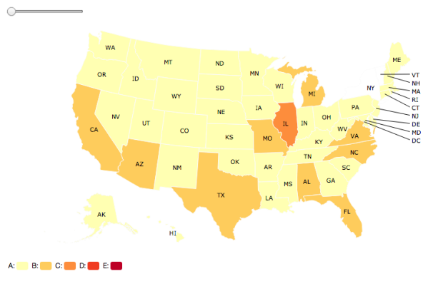
  • StatelyAdd another way to make state-level choropleth maps. Stately, a project by Intridea, allows you to approach state mapping in the browser like you would a font.

    Stately is a symbol font that makes it easy to create a map of the United States using only HTML and CSS. Each state can be styled independently with CSS for making simple visualizations. And since it’s a font, it scales bigger and smaller while staying sharp as a tack.

    The process is fairly straightforward: Link to the Stately stylesheet, add some HTML markup (an unordered list of states) to your page, and then use CSS to color each state. Boom, you’ve got yourself a map.

  • In a follow-up to their map on most used languages in London, James Cheshire and Ed Manley, along with John Barratt, mapped the most commonly used languages in New York, based on the ones used on Twitter.

    English (in grey above) is by far the most popular with Spanish (in blue above) taking the top spot amongst the other language groups. Portuguese and Japanese take third and fourth respectively. Midtown Manhattan and JFK International Airport have, perhaps unsurprisingly, the most linguistically diverse tweets whilst specific languages shine through in places such as Brighton Beach (Russian), the Bronx (Spanish) and towards Newark (Portuguese). You can also spot international clusters on Liberty Island and Ellis Island and if you look carefully the tracks of ferry boats between them.

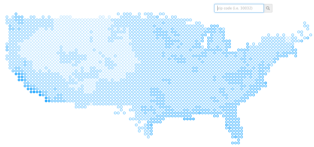
  • It’s not especially straightforward to know or find out what’s going on with your state’s government. Sites aren’t maintained, are unusable, or just don’t provide much information. Open States, a project by the Sunlight Foundation, aims to change that.

    After more than four years of work from volunteers and a full-time team here at Sunlight we’re immensely proud to launch the full Open States site with searchable legislative data for all 50 states, D.C. and Puerto Rico. Open States is the only comprehensive database of activities from all state capitols that makes it easy to find your state lawmaker, review their votes, search for legislation, track bills and much more.

    Just click on a state or enter an address, and you can quickly get information that’s relevant to where you are. There’s also iPhone and iPad apps if you prefer those, and all the data on the site is accessible via an API or a bulk data dump.
    Read More

  • Cardinal compositeWith Pope Benedict XVI’s resignation, 116 cardinals from various regions have to come a consensus on who will be next. Amanda Cox and Graham Roberts for The New York Times wondered what a composite of all the cardinals might look like, which looks exactly how you might expect the average to look.

  • Chris Dancy likes to track facets of his life. A lot. Above is a bunch of automatically logged data to Google Calendar.

    At the moment, he tracks everything he can, even if he doesn’t see an immediate benefit, so long as it’s relatively easy to collect — and he can save the data into Evernote, Google Calendar, and Excel. You never know when something seemingly pointless will come in handy in the future.

    “If I’m on a call and my voice gets over 50 decibels, my phone notifies me,” he says. “My heart rate after a conference call usually can give me better insight into the call and my feelings about the call.”

    I’m all for personal data, but at some point it’s just too much, and I’m pretty sure Dancy is close to that point, if he hasn’t passed it already. Do you really need an alert that pops up when your voice sounds a certain way? Data can tell you a lot of things, but it doesn’t have to tell you everything. [Thanks, Mat]

  • On Craigslist there’s a section in the personals for “missed connections” which lets people post missed chances at love with the (slim) hopes that the person he or she saw sees the random post on Craiglist. They usually start off like, “I saw you in that place, and you were…” Dorothy Gambrell mapped the most frequent location for each state.

    In California, there’s apparently a lot of eyeballing at 24 Hour Fitness, and in New York it’s the subway, which shouldn’t be surprising. I like how bars are most mentioned in North Dakota and Wisconsin, which matches up with the bars versus grocery stores map from a couple of years ago.