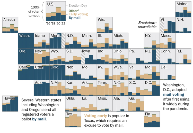
In a riff on Climate Stripes, which shows global temperature change as a color-coded barcode chart, Air Quality Stripes uses a similar encoding to show pollution concentration from 1850 through 2021.
-
In the latest of the genre I-followed-AI-advice-blindly-here-is-what-I-got, Ceylan Yeğinsu for the New York Times, tried AI trip planners for a Norway itinerary:
Overall, Mindtrip — with its polished, dynamic interface that allowed me to cross-check details with maps, links and reviews — was my favorite. While it gave some good recommendations, Mindtrip needed more prompting than Vacay, which offered a wider variety of suggestions in more detail. Unfortunately, Vacay doesn’t save chat history, which I discovered halfway into my planning after closing the website’s tab on my browser.
The biggest drawback was the absence of phone apps for Mindtrip and Vacay, which led me to rely on ChatGPT’s basic A.I. assistant when I needed on-the-spot guidance. Mindtrip, I’ve since learned, is planning to debut an app in September.
This seems like the natural next step from searching Tripadvisor for top reviewed things to do in a given place. So the experience seems as expected.
But I can’t wait until AI just takes the entire trip for you and then we won’t ever have to go anywhere. When is that going to happen? Amazing times ahead.
-
Annette Manes, a retired widow and single mother who saved by spending little, was scammed out of $1.4 million of her life savings. Bloomberg shows the large deposits and withdrawals through Manes’ JPMorgan checking account with a step chart. There’s also a Sankey diagram to show the splits and bank-specific timelines that make you wonder why the banks’ systems didn’t start alerts sooner.
The style of annotation and scrolling through time reminds me of the 2015 chart showing one person’s weight loss diary.
-
The Data GIF Maker is a fun tool from Google that lets you add movement to a handful of straightforward charts. Enter up to five values and select from four chart types. Get a downloadable GIF that you can stick in a presentation.
Here’s a small example for a stacked bar with two values:
The charts are simple and the animations are just bringing the data into view. I prefer to show charts outright, but if this is your thing, the tool makes it really easy.
-
Ben Grosser made a personal mini-site that indicates whether or not he’s on TikTok:
Stuck in the Scroll is a compulsive scrolling monitor that reveals, in real-time, whether I’m currently scrolling TikTok. Think of this work as a last-ditch effort, a sort of public confessional as therapeutic tool aimed at defusing the intense compulsion I feel every day to endlessly scroll the world’s most popular video app.
Combine this with counting the days you have left in life and you’ve got yourself a proper YOLO app.
-
Members Only
-
The climate is changing, and researchers believe that after some point, there will be no going back. The balance will be too out of order to fix. For the New York Times, Raymond Zhong and Mira Rojanasakul map the possible places affected, along with timelines for where we are and when the change might happen.
I appreciate the illustrative aesthetics. A sort of fragile uncertainty in our future.
-
Living in city centers with little space to spend time outside and a lot of space for cars is not ideal. However, the elimination of roads for cars to drive on is also usually not ideal. Superblocks, as Amanda Shendruk for the Washington Post illustrates, is an urban planning compromise that gives way to pedestrians in the center and cars around the perimeter.
-
Speaking of data projects in unexpected places, David Mora repurposed one of my alluvial diagrams on meat consumption over time in the video below. He uses a wooden ladle to commentate as if it were a meat race. Yep.
I’m into it. Maybe all time-based charts with multiple categories should get the sports commentary treatment. Put them on ESPN8 The Ocho.
See the original chart and more food categories here.
-
A few years ago, I made an interactive chart that guesses your name as you type. It considered your sex and decade of birth. For some reason it regained some momentum this month and it ended up on New Jersey 101.5.
It was the Deminski & Moore show on August 13, around the 32-minute mark. People called in with their first initial and the hosts guessed the name for about half an hour. It was fun to hear people so amused by names data.
-
Neal Agarwal made a game of sorts where you either click for the sun or the moon. The points and the positions change based on how quickly you and others click in real-time.
It’s so dumb. It’s so good. I’m guessing Agarwal drew inspiration from the recent but now laid to rest one million checkboxes.
-
It’s gotten relatively easy to replace mouth movements in video and to generate speech to sound like a specific person. So of course scammers are using the tools that are readily available to steal people’s life savings. For the New York Times, Stuart A. Thompson shows how deepfake Elon Musk videos are used in fake ads to promote junk.
I can’t see how any of this ends well for us.
-
One Million Screenshots, by Urlbox, is a collection of 1,048,576 homepage screenshots in a browsable grid layout. Search for a website or browse to random ones.
Sites are chosen based on rank in the Common Craw web graph, and new screenshots are taken on the first of each month.
More popular sites are closer the middle of the grid, and they seem to be loosely organized by dominant color. There’s some weirdness in the bottom left quadrant where gray squares seem to suggest broken screenshots.
If you run a site, it’s a good way to make you feel extra tiny.
-
Members Only
-
For The Pudding, Russell Samora and Michelle Pera-McGhee gave generative AI a serious try to see how much effort is required and the quality of the results. There was output. It wasn’t the best. However:
It’s sort of like comparing a woodworking artisan’s table to one from IKEA. The artisans invest immense time and effort into their high-quality pieces, while IKEA produces things quickly and cheaply, and most people probably can’t tell the difference (or don’t care). Which is kind of sad for us artisans. With AI, we can expect a rise in superficially appealing but low-quality content. But that doesn’t mean there’s no place for craftsmanship. We still find meaning in the bespoke, at doing all the little things right, and in creating things that feel like they have a real person at the other end of it. And we can only hope that others do too.
As they say, this the worst that generative AI will be. It’ll only get better and the chart-making will only get easier. But, analysis, narrative, and the finer details that fit perfectly with a dataset are a lot harder to replicate, because the process is more fluid.
Moving forward, the part of the process that makes data less cold and mechanical is where to focus our energy on.
-
Are more Americans heavier than you or are they lighter? The following chart compares your weight against other adults. It also considers height, since 200 pounds at five feet tall is not the same as someone who is 200 pounds and six feet tall.
-
To demonstrate the level of uncertainty in using climate forecasting models, Bloomberg compared two models that estimate the same type of flood risk in the same geographic area.
In the abstract, maybe the differences don’t seem like such a big deal. It’s a thought exercise. But when governments create policies and insurance companies set rates based on the estimates, the choices behind the forecasts weigh more heavily.
-
Noah Lyles won the men’s 100-meter, but he started as the slowest runner in the final. The New York Times superimposed shaded circles on the track, in combination with composite photos of the runners, to show how it happened.
The color of the circles indicate speed rank, as opposed to run speed. Everyone ran extremely fast, so showing actual speed probably wouldn’t do much good.
People have suggested that the Olympics should have regular people run, swim, and perform alongside the athletes to highlight the extremes. Seems like a good idea. Anything to set a visual baseline since fast against fast or strong against strong can make the extremes seem less extreme.
-
In 1992, when the Dream Team dominated basketball in the Olympics, the best players in the NBA were all from the United States. The league has grown more international since then. For Sportradar, Todd Whitehead shows the shift in where the best players come from and who they played for in the Olympics.
I’m pretty sure Steph Curry moved up a couple notches after his performance in the gold medal game.
-
As the 2024 Summer Olympics wrap up, medal trackers will fade from homepages for a couple years. You’ve probably seen a list or five by now where each row represents a country and four columns show the counts for gold, silver, bronze, and the country’s total. It’s a straightforward view that shows what most people are looking for.
However, I like the wrinkles that add a little something to the counts. The premise is that countries can rank differently based on criteria other than total medals, which highlights smaller countries or maybe just gives you a way to toot your own country’s horn.
Bloomberg’s table, shown above, lets you sort by each medal, but also per million population and $100 billion GDP. For example, Grenada, Dominica, and Saint Lucia bubble to the top when you consider their small populations.
Reuters sorts by total gold medals alongside stacked bars to show the relative distributions:
The Washington Post provides a few angles on the same page. There’s a table you can toggle to sort by total or gold medals only, which looks as you’d expect. I like the comparison against the Tokyo Olympics to see if there was an improvement this year. They call it over- and under-performance, but I think I’d just say better or worse than last time.
My favorite view is still this Josh Katz classic for NYT’s Upshot, which they’ve updated each Olympics since 2018. Apply the importance of each medal yourself and create your own rankings. I suspect the heatmaps might go over the head of a healthy proportion of readers, but I’m glad they bring it back.
Update: The Upshot also made a list with a dropdown to order countries 23 different ways, in case you can’t decide how to judge who won the Olympics.