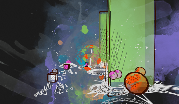
• Membership
  • Newsletter
  • Projects
  • Learning
  • About
  • Member Login
  • Military footprint

    December 19, 2013

    Topic

    Maps  /  military

    Similar to his collection of prison map snapshots, Josh Begley collected images of military bases around the world.

    In addition to the map — which is built using MapBox, an open source and user-friendly publishing platform — I’ve included snapshots of the earth’s surface at various latitudes and longitudes. What does a military base look like from above? Which installations are secret and which can be viewed on the open internet? Running a small Processing sketch to query the Google Maps and Bing Maps APIs, I grabbed a satellite image for each point and am displaying the collection as a simple lightbox gallery.

  • Data scientist surpasses statistician on Google Trends

    December 18, 2013

    Topic

    Statistics  /  data science, trends

    The relative interest in data scientist surpassed statistician this month. It was also higher in April and September of this year, so it’s not new, but it does seem like it’s ready to be a consistent thing, at least least for a little while. That said, it doesn’t seem like statistician is losing interest to data scientist, as the former has been fairly consistent for the past few years, so take that how you want.

  • Earth wind map

    December 17, 2013

    Topic

    Maps  /  environment, wind

    Remember the wind map of the United States by Martin Wattenberg and Fernanda Viegas? Cameron Beccario made one for Earth, based on data from the Global Forecast System.

  • Network of subreddits

    December 17, 2013

    Topic

    Network Visualization  /  Reddit

    There are over 5,000 subreddits with plenty of overlap and similarities. Randy Olson graphed them based on link activity and users and put them in an interactive. The overall view isn’t that useful (other than easily spotting the My Little Pony-themed outlier cluster in the top right), but if you use reddit and are familiar with the territory, it can be fun to browse.

  • Data and visualization year in review, 2013

    December 16, 2013

    Topic

    Visualization  /  annual review, best-of

    Visualization continues to mature and focus more on the data first than on novel designs and size. People improved on existing forms and got better at analysis. Readerships seemed to be more ready and eager to explore more data at a time. Fewer spam graphics landed in my inbox.

    So all in all, 2013 was a pretty good year for data and visualization. Let’s have a look back.
    Read More

  • Airport billboard encourages wonderment

    December 13, 2013

    Topic

    Visualization  /  advertising, flights

    Airports conjure thoughts of security, bag checks, and cramped spaces, and flights are hardly something to look forward to. British Airways wants to bring the magic back with these real-time billboards. As a British Airway flight passes overhead, a child appears and points up to the plane in awe, along with text that says where the plane is from.
    Read More

  • State gun laws since Newtown →

    December 12, 2013

    Topic

    Infographics  /  gun law, New York Times

    The New York Times explored state gun bills since Newtown.

    In the 12 months since the mass shooting at Sandy Hook Elementary School in Newtown, Conn., almost every state has enacted at least one new gun law. Nearly two-thirds of the new laws ease restrictions and expand the rights of gun owners. Most of those bills were approved in states controlled by Republicans. Those who support stricter regulations won some victories — mostly in states where the legislature and governorship are controlled by Democrats — to increase restrictions on gun use and ownership.

    Each chart shows the timeline of a bill and rounds of legislation. A law is signed when the line reaches the top, where green represents looser gun restrictions and orange represents tighter.

  • Uncertain cartographies

    December 11, 2013

    Topic

    Maps  /  uncertainty

    Most people know the layout of their neighborhoods and some are good with the roads in their town. Zoom out farther though — to your city, state, and country — and the landscape grows fuzzy in your imagination. Cartographer Chris McDowall redrew his uncertainty of his native New Zealand with interesting, fuzzy results.

    The maps on this page are an attempt to translate my head landscapes into cartographic artefacts. I am trying to recreate of what I see when I close my eyes. They are rough approximations—the stuff in my head is far stranger and more difficult to pin down—but they feel honest. I share them because I find them beautiful and evocative.

  • Easy text classification

    December 10, 2013

    Topic

    Statistics  /  language, machine learning

    Text can be a great source of data, but it can be a challenge to glean information from an analysis standpoint. etcML can help you with that. Browse Twitter trends, classify your own text with existing machine learning classifiers, or upload your own training data.

    But most importantly, you can use etcML to learn interesting new things about whatever text data you’re already working with in your job or research. Say you’re a social scientist with written and multiple-choice survey responses — you can quickly see how well participants’ written text allows you to guess their multiple-choice response. Or say you’re a literary scholar who wants to know what distinguishes an author’s early and late periods — you can train a classifier and visualize the most predictive words for each category.

    Saved for later.

  • Rocky movie breakdown

    December 9, 2013

    Topic

    Infographics  /  Fathom, Rocky

    Fathom Information Design watched all six Rocky movies, classified segments into dialogue, training, montages, pre-fight, fight, and credits, and then visualized it. Rocky Morphology is the result.

    It’s interesting to see the battle between dialogue, montage and fighting throughout each film. Dialogue beats out training and fighting in the first two Rocky films, but fighting and montage occupy the most time in Rocky III and Rocky IV. Rocky V favors dialogue over fighting — undisputedly slowing its pace next to the previous films. In the final round, Rocky sticks with dialogue over fighting but — “it ain’t over ’till it’s over” — Rocky delivers one last montage and fight scene to close out the series and complete the Rocky Morphology.

    Needs more montage. Maybe we’ll get it in Grudge Match, because as we all know, that has instant classic written all over it.

  • Growth in civic tech

    December 6, 2013

    Topic

    Network Visualization  /  civic, Fathom, Knight

    Fathom Information Design, in collaboration with the Knight Foundation and Quid, visualized the growth of civic tech based on an analysis of terms used to describe civic tech organizations and investments in them. The interactive accompanies a report, which describes the full findings.

    A new report released today by Knight titled “The Emergence of Civic Tech: Investments in a Growing Field” aims to advance the movement by providing a starting place for understanding activity and investment in the sector. The report identifies more than $430 million of private and philanthropic investment directed to 102 civic tech organizations from January 2011 to May 2013. In total, the analysis identifies 209 civic tech organizations that cluster around pockets of activity such as tools that improve government data utility, community organizing platforms and online neighborhood forums.

    Really like the transitions as you move through organizational breakdowns.

  • Artist temperaments

    December 6, 2013

    Topic

    Infographics  /  humor

    Just for kicks, Jimmy Chen plotted artists on a subjective arrogance-vs-genius scale. Above is the one for singers.

  • Online habitats

    December 5, 2013

    Topic

    Network Visualization  /  clustering, communities

    Ekisto, by visual artist Alex Dragulescu, is an experiment in visualizing online communities that provides an interesting city effect. So far there are views for StackOverflow, Github, and Friendfeed.

    A graph layout algorithm arranges users in 2D space based on their similarity. Cosine similarity is computed based on the users’ network (Friendfeed), collaborate, watch, fork and follow relationships (Github), or based on the tags of posts contributed by users (StackOverflow). The height of each user represents the normalized value of the user’s Pagerank (Github, Friendfeed) or their reputation points (StackOverflow).

    Also available in print.

  • What Antarctica looks like underneath the ice

    December 4, 2013

    Topic

    Maps  /  environment, NASA

    Based largely on satellite data and the results of an airborne data collection mission compiled by the British Antarctic Survey, Bedmap2 by NASA Goddard is a construction of what Antarctica looks like underneath the giant sheet of ice. This iteration of the map used 25 million more observations than the original Bedmap1, which was released in 2001, and provides a more granular view.

    [via Wired]

  • Climate change described visually

    December 4, 2013

    Topic

    Maps  /  environment, video

    A video from the International Geosphere-Biosphere Programme explains global warming and projected changes in the near future. I wanted them to provide more contrast to the data they showed over the globe, but the story itself is an interesting one.

  • MiseryMap of current flight delays and cancelations

    December 3, 2013

    Topic

    Maps  /  FlightAware

    FlightAware is a live flight tracker that lets you look up a flight to see where a plane is (and also provides a for-fee API). Their new MiseryMap focuses on delays and cancellations, a sore spot for all fliers and especially relevant given the holiday season and wintery weather. Donuts on the map represent on-time flights in green and delayed and canceled ones in red.

    They also show weather underneath, which is important context and a leading cause of misery. However, I wish there was a legend to tell me what those rainbow spectrum clouds mean.

  • FlowingData Gift Guide 2013

    December 2, 2013

    Topic

    Miscellaneous  /  gifts

    The holiday season came out of nowhere this year. Everyone put their lights up over the weekend while I’m stuck trying to figure out what day it is. If you’re like me and need some quick gift ideas for your fellow data nerd, here are some fine ones that you can’t go wrong with.
    Read More

  • Quantified breakup

    December 2, 2013

    Topic

    Self-surveillance  /  breakup

    A recently divorced woman is using her personal data — phone logs, emails, chats, bank statements, and GPS traces — as her own way to cope with the new situation.

    Divorce is hard. Putting this process into numbers, images and data visualizations is helpful. It yanks me out of these all-consuming moments of sadness and helps me understand how, perhaps as time passes, things are going to be ok in the long run (looking for positive trends within the data!) I hope these web things can help you, too.

    Data and charts as a route to clarity. Sounds right.

    See also: What Love Looks Like.

  • FlowingData Job Board, November 2013

    December 2, 2013

    Topic

    Job Board

    Looking for a job in data science, visualization, or statistics? There are openings on the board.

    Data Scientist at Mi9 in Sydney, Australia.

    Data Visualization Specialist at infogr8 in London, UK.

    Product Engineer at Practice Fusion in San Francisco, CA.

    Data Scientist at Thumbtack in San Francisco, CA.

    Content Marketing Designer in New York, NY.

  • Top reddits of all time

    November 28, 2013

    Topic

    Statistical Visualization  /  Reddit

    For the downtime post-turkey. James Trimble stuck the top 200 reddits of all time into a treemap. Let the time suck begin.

  • Page 228 of 392
  • <
  • 1
  • ...
  • 225
  • 226
  • 227
  • 228
  • 229
  • 230
  • ...
  • 392
  • >

Analyze, visualize, and communicate data usefully, beyond the defaults.

Become a member →

Recently for Members

May 8, 2025
When the data is not what it seems

May 1, 2025
Finding the Right Charts

April 24, 2025
Visualization Tools, Datasets, and Resources – April 2025 Roundup

April 17, 2025
Breaking Out of Chart Software Defaults

April 15, 2025
Line Chart with Decorative Neon Accents

Browse by Chart Type See All →

Word Cloud Ternary Plot Spiral Chart Table Line Map Unit Chart Scatter Plot Cartogram Radar Chart Density Plot

Browse By Topic

  • Visualization

    Seeing data

  • Maps

    Seeing geographic data

  • Infographics

    Explaining data

  • Networks

    Connecting data

  • Statistics

    Analyzing data

  • Software

    Working with data

  • Sources

    Getting data

  • Design

    Making data readable

Get the Book

Visualize This: The FlowingData Guide to Design, Visualization, and Statistics

Available now.

Order: Amazon / Bookshop

Made by FlowingData

  • The Process

  • Data Underload

  • Chart Everything

  • Guides

  • Books

  • Shop

  • About
  • Contact
  • Newsletter
  • LinkedIn
  • Instagram
  • Bluesky
  • RSS
Copyright © 2007-Present FlowingData. All rights reserved.