Burger Place Geography

After looking at pizza places, coffee, and grocery stores, I had to look at burger chains across the country. The data was just sitting there. (Thanks, AggData.)
As before, the map above shows the nearest burger chain out of the selected seven. I chugged along every twenty miles, checked within a 10-mile radius, and then colored each dot accordingly.
With pizza places you saw a lot of regionality despite the national coverage of Pizza Hut. You saw a lot of Domino’s on the east, Little Caesar’s in California, and Godfather’s in the midwest. Similarly, with coffee, Dunkin’ Donuts reigned in the east and Caribou is popular in the midwest.
However, more than a handful of burger chains cover the country somewhat evenly, which gets you this map that resembles sprinkles on a cupcake, save a couple areas of interest. In the Oklahoma and Arkansas areas Sonic Drive-in dominates, and Jack in the Box established itself well in California. We saw a similar geographic pattern in Stephen Von Worley’s burger map a few years ago.
But still, McDonald’s is sprinkled throughout, which shouldn’t surprise since it has more than twice the locations than its nearest competitor Burger King. Keep in mind this includes all the Golden Arches in Wal-Marts, airports, and college food courts.
Because of this expansive burger coverage by McDonald’s and the other major chains, it’s more useful to look at the locations separately, shown below. I also included all the other chains with at least a hundred locations.
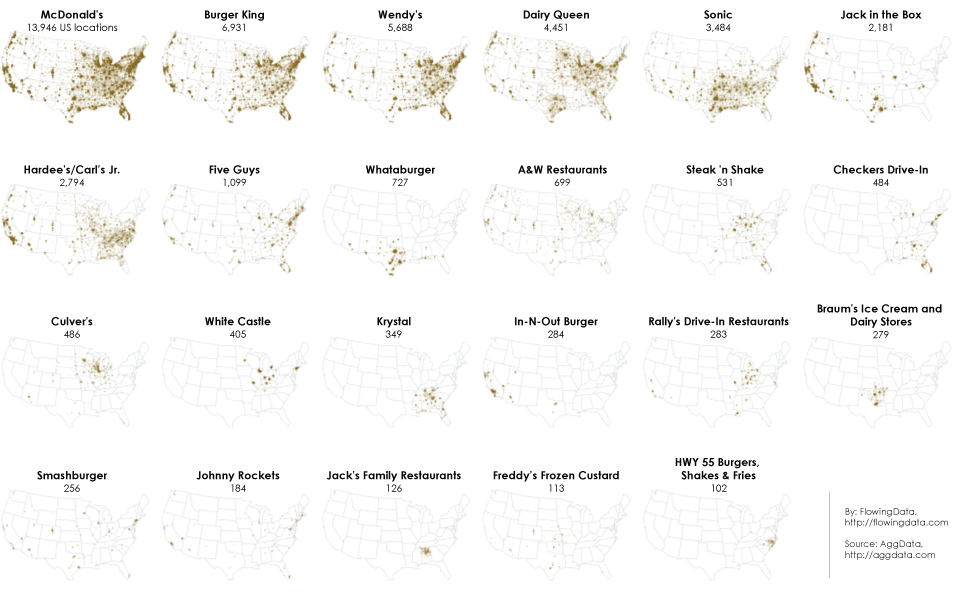
As you expect, it looks like population density in the beginning. Chains are gonna open where the people are. Once you get past Wendy’s though, you start to see region-specific chains.
I’d say Dairy Queen is well-established nationally, but it’s interesting to see a gap with Oklahoma, Arkansas, Mississippi, and Louisiana. Do the folks there not like Dairy Queen? Maybe Sonic has a stronghold on the states in an epic battle for burger supremacy. Or it’s just a totally mundane reason like Dairy Queen started in Illinois, expanded east, and then saw growth opportunity in Texas.
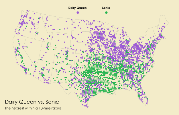
In any case, the separation is more obvious when you look at just Dairy Queen versus a competitor like Sonic, using the same distance formula as the first map.
The rest of the chains kind of have their regional pockets: Whataburger in Texas, Checkers in Florida, and of course, In-N-Out in California.
Then there’s all the local joints, which I didn’t even touch on yet. I’ll have to leave that for another day though. In case someone is interested, Yelp seems like a good place to start. I poked around the review data for a bit, and it was interesting that the local places almost always reigned review-wise, and profiles for chains basically serve as somewhere for people to complain.
Chart Type Used

Become a member. Support an independent site. Get extra visualization goodness.
See What You Get