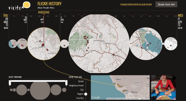
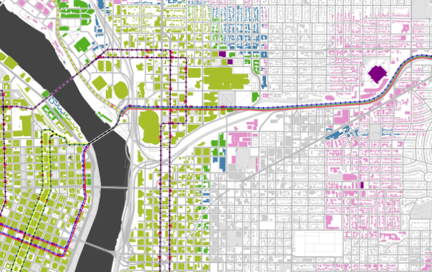
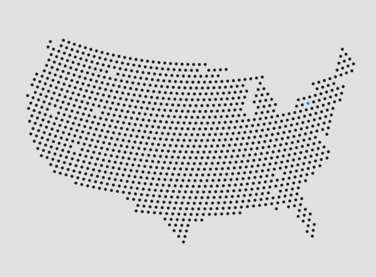
• Membership
  • Newsletter
  • Projects
  • Learning
  • About
  • Member Login
  • Bracket picks of the masses versus sports pundits

    April 11, 2014

    Topic

    Statistics  /  bracket, sports

    Stephen Pettigrew and Reuben Fischer-Baum, for Regressing, compared 11 million brackets on ESPN.com against those of pundits.

    To evaluate how much better (or worse) the experts were at predicting this year’s tournament, I considered three criteria: the number of games correctly predicted, the number of points earned for correct picks, and the number of Final Four teams correctly identified. Generally the experts’ brackets were slightly better than the non-expert ones, although the evidence isn’t especially overwhelming. The analysis suggests that next year you’ll have just as good a chance of winning your office pool if you make your own picks as if you follow the experts.

    Due to availability, the expert sample size is a small 53, but it does appear the expert brackets are somewhere in the area of the masses. Still too noisy to know for sure though.

    If anything, this speaks more to the randomness of the tournament than it does about people knowing what teams to pick. It’s the same reason why my mom, who knows nothing about basketball or any sports for that matter, often comes out ahead in the work pool. The expert picks are just a point of reference.

  • High-detail maps with Disser

    April 10, 2014

    Topic

    Maps  /  Conveyal, disaggregation

    Open data consultancy Conveyal released Disser, a command-line tool to disaggregate geographic data to show more details. For example, we’ve seen data represented with uniformly distributed dots to represent populations, which is fine for a zoomed out view. However, when you get in close, it can be useful to see distributions more accurately represented.

    If the goal of disaggregation is to make a reasonable guess at the data in its pre-aggregated form, we’ve done an okay job. There’s an obvious flaw with this map, though. People aren’t evenly distributed over a block — they’re concentrated into residential buildings.

    So Disser combines datasets of different granularity, so that you can see spreads and concentrations that are closer to real life.

  • Independent coffee shops and community

    April 9, 2014

    Topic

    Maps  /  coffee, MIT Media Lab

    As part of the You Are Here project from the MIT Media Lab, an exploration of independent coffee shops in San Francisco:

    Independent coffee shops are positive markers of a living community. They function as social spaces, urban offices, and places to see the world go by. Communities are often formed by having spaces in which people can have casual interactions, and local and walkable coffee shops create those conditions, not only in the coffee shop themselves, but on the sidewalks around them. We use maps to know where these coffee shop communities exist and where, by placing new coffee shops, we can help form them.

    Each dot is a coffee shop, and the shaded spots around the dot represent the areas nearest each shop. It’s an interesting, more granular contrast to coffee chain geography and provides a better sense of a city’s layout.

    See also the same idea applied to Cambridge. I imagine there are more cities to come, as the data is gleaned from the Google Places and Google Distance Matrix APIs.

  • Extract CSV data from PDF files with Tabula

    April 8, 2014

    Topic

    Software  /  csv, PDF

    Tabula, by Manuel Aristarán, came out months ago, but I’ve been poking at government data recently and came back to this useful piece of free software to get the data tables out of countless free-floating PDF files.

    If you’ve ever tried to do anything with data provided to you in PDFs, you know how painful this is — you can’t easily copy-and-paste rows of data out of PDF files. Tabula allows you to extract that data in CSV format, through a simple interface.

    It’s not the fastest software in the world, but it really is simple to use and it sure beats manual entry. You just load a PDF file into Tabula, which runs on your computer, highlight the table to extract, and the program does the rest. Save as a CSV and do what you want with it.

    Download Tabula here. Find out a little more about it on Source.

  • Regional macrobrews

    April 7, 2014

    Topic

    Maps  /  beer, Floatingsheep

    FloatingSheep pointed their Twitter geography towards beer (and wine).

    From Sam Adams in New England to Yuengling in Pennsylvania to Grain Belt and Schlitz in the upper Midwest, these beers are quite clearly associated with particular places. Other beers, like Hudepohl and Goose Island are interesting in that they stretch out from their places of origin — Cincinnati and Chicago, respectively — to encompass a much broader region where there tend to be fewer regionally-specific competitors, at least historically. On the other hand, beers like Lone Star, Corona and Dos Equis tend to have significant overlap in their regional preferences, with all three having some level of dominance along the US-Mexico border region, but with major competition between these brands in both Arizona and Texas.

    This of course excludes the increased appreciation for craft beer, as there isn’t enough data for significant microbrewery results.

  • Fox News bar chart gets it wrong

    April 4, 2014

    Topic

    Mistaken Data  /  axis, Fox News

    Because Fox News. See also this, this, and this. [Thanks, Meron]

  • Big data, same statistical challenges

    April 4, 2014

    Topic

    Statistics  /  big data, Financial Times

    Tim Harford for Financial Times on big data and how the same problems for small data still apply:

    The multiple-comparisons problem arises when a researcher looks at many possible patterns. Consider a randomised trial in which vitamins are given to some primary schoolchildren and placebos are given to others. Do the vitamins work? That all depends on what we mean by “work”. The researchers could look at the children’s height, weight, prevalence of tooth decay, classroom behaviour, test scores, even (after waiting) prison record or earnings at the age of 25. Then there are combinations to check: do the vitamins have an effect on the poorer kids, the richer kids, the boys, the girls? Test enough different correlations and fluke results will drown out the real discoveries.

    You’re usually in for a fluffy article about drowning and social media when ‘big data’ is in the title. This one is worth the full read.

  • Open access to 20,000 maps from NYPL

    April 3, 2014

    Topic

    Maps  /  NYPL, open access

    The New York Public Library announced open access to 20,000 maps, making them free to download and use.

    The Lionel Pincus & Princess Firyal Map Division is very proud to announce the release of more than 20,000 cartographic works as high resolution downloads. We believe these maps have no known US copyright restrictions.* To the extent that some jurisdictions grant NYPL an additional copyright in the digital reproductions of these maps, NYPL is distributing these images under a Creative Commons CC0 1.0 Universal Public Domain Dedication. The maps can be viewed through the New York Public Library’s Digital Collections page, and downloaded (!), through the Map Warper

    Begin your journey.

  • Planetary layer cake

    April 2, 2014

    Topic

    Maps  /  cake, planets

    From Cakecrumbs, a product that helps you learn while you eat: planetary layer cakes. The graduate student slash baker hobbyist’s sister asked if she could make one, and at first she thought it couldn’t be done. But then she thought more about it.

    I spent the rest of the afternoon thinking about it. I don’t admit defeat. Ever. But especially not with cake. Nothing is impossible is pretty much my baking motto, so to say this cake was impossible left me feeling weird. There had to be a way. A way that didn’t involve carving or crumbing the cake. I kept mulling it over until I had a breakthrough.

    See how it was done.

  • Bike share data in New York, animated

    April 1, 2014

    Topic

    Data Sources  /  animation, biking, New York

    Citi Bike, also known as NYC Bike Share, is releasing monthly data dumps for station check-outs and check-ins, which gives you a sense of where and when people move about the city. Jeff Ferzoco, Sarah Kaufman, and Juan Francisco Saldarriaga mapped 24 hours of activity in the video below.

    [Thanks, Jeff]

  • Dead links on the Million Dollar Homepage →

    April 1, 2014

    Topic

    Statistics  /  Million Dollar Homepage, Quartz

    Remember the Million Dollar Homepage from 2005? It sold ad space to anyone who was interested for one dollar per pixel, and there were one million pixels available. All spots were filled, and it gave a burst of bunch of other million dollar homepages that turned out to be zero dollar homepages.

    David Yanofsky for Quartz returned to the homepage to look at link rot. 22 percent of links on the homepage are dead.

  • Exponential water tank

    March 31, 2014

    Topic

    Infographics  /  exponential growth, teaching

    Hibai Unzueta, based on a paper by Albert Bartlett, demonstrates exponential growth with a simple animation. It depicts a man standing in a tank with finite capacity and water rising slowly, but at an exponential rate.

    Our brains are wired to predict future behaviour based on past behaviour (see here). But what happens when something growths exponentially? For a long time, the numbers are so little in relation to the scale that we hardly see the changes. But even at moderate growth rates exponential functions reach a point where the numbers grow too fast. Once we confirm that our predictions about the future have failed, very little time to react may be left.

    All looks safe at first, because the water rises so slowly, but it seems to rise all of a sudden. Oh, the suspense. What will happen to cartoon pixel man?

  • Centuries of European border changes

    March 28, 2014

    Topic

    Maps  /  borders, video

    The Centennia Historical Atlas is a program that shows you border changes in Europe and the Middle East, from the 11th century to the present. It’s meant as an educational tool. The video below is the animated map from the program set to climactic music from the movie Inception.

    Now contrast that to the original promotional video for Centennia. I’m amused. [via @sogrady]

  • Smoking rates and income →

    March 27, 2014

    Topic

    Maps  /  choropleth, health, New York Times, smoking

    Based on a study on smoking prevalence from 1996 to 2012, a map by The New York Times shows the results. Smoking rates among men and women have declined overall over the years, but there are still relatively high rates in many areas of the country, which appears to correlate with income. Lower income tends towards higher smoking rates.

    That would explain why the map above looks similar to a county-level map for median household income, which probably interacts with life spans by county somehow.

  • Reconstructing Google Streetview as a point cloud

    March 26, 2014

    Topic

    Maps  /  Google Streetview, openFrameworks

    Patricio Gonzalez Vivo, an MFA Design & Technology student, scraped depth from Google Streetview and then reconstructed it in openFrameworks. The result is Point Cloud City. See it in action in the video below.

    Dreamlike.

    Now I’m curious what else can be gleaned from this data, because this essentially means you could get really detailed data about the makeup of places, down to the window of a building. Although I don’t imagine Google will let this stay so accessible for long. [Thanks, @pixelbeat]

  • Human heartbeat

    March 26, 2014

    Topic

    Data Art  /  health, heart, Jen Lowe, personal

    Jen Lowe tracks her heart rate with a Basis watch, and she’s showing the last 24 hours of that data in One Human Heartbeat.

    Basis doesn’t provide an open API, so I access the data using a variation of this code. The heartrate you see is from 24 hours ago. This is because the data can only be accessed via usb connection. Twice a day I connect the watch and upload my latest heartrates to the database. I’ve been doing this for 33 days now.

    It’s March 25, 2014, and statistics say I have about 16452 days left.

    On the surface, it’s just a pulsating light on a screen, but somehow it feels like more than that. The countdown aspect makes me uneasy, as if I were watching a ticker on someone’s life, or my own even. I want to keep watching though, because it continues to pulsate. It’s hopeful.

  • How to Make Smoothed Density Maps in R

    Too many points to plot often means obscured patterns in the clutter. Density maps offer a smooth alternative.

  • Level of road grid

    March 25, 2014

    Topic

    Maps  /  grid, roads

    Seth Kadish looked at the road network of several major counties and estimated the directions the streets run. The result is a set of charts that shows which cities use a grid system and those that don’t.

    If you’re like me, and you use the Sun to navigate, you probably appreciate cities with gridded street plans that are oriented in the cardinal directions. If you know that your destination is due west, even if you hit a dead end or two, you’ll be able to get there. However, not all urban planners settled on such a simple layout for road networks. For some developers, topography or water may have gotten in the way. Others may not have appreciated the efficiency of the grid. This visualization assesses those road networks by comparing the relative degree to which they are gridded.

    Whoa, Charlotte.

    Since the original, Kadish has added more counties and a handful of international cities.

  • Graph TV shows ratings by episode

    March 24, 2014

    Topic

    Statistical Visualization  /  imdb, interactive, ratings, television

    Kevin Wu made a straightforward interactive that lets you see IMDB television ratings over time, per episode and by season.
    Read More

  • Failed Bitcoin market activity

    March 21, 2014

    Topic

    Statistical Visualization  /  Bitcoin, Stamen

    Stamen visualized Bitcoin activity, noting a variety of traders who knew what they were doing, didn’t know what they were doing, and were apparently automated.

    In February 2014 MtGox, one of the oldest Bitcoin exchanges, filed for bankruptcy protection. On March 9th a group posted a data leak, which included the trading history of all MtGox users from April 2011 to November 2013. The graphs below explore the trade behaviors of the 500 highest volume MtGox users from the leaked data set. These are the Bitcoin barons, wealthy speculators, dueling algorithms, greater fools, and many more who took bitcoin to the moon.

  • Page 224 of 393
  • <
  • 1
  • ...
  • 221
  • 222
  • 223
  • 224
  • 225
  • 226
  • ...
  • 393
  • >

Analyze, visualize, and communicate data usefully, beyond the defaults.

Become a member →

Recently for Members

May 22, 2025
Conflicting points of view over the same data

May 15, 2025
Step Chart, Enhanced

May 8, 2025
When the data is not what it seems

May 1, 2025
Finding the Right Charts

April 24, 2025
Visualization Tools, Datasets, and Resources – April 2025 Roundup

Second Edition

Visualize This: The FlowingData Guide to Design, Visualization, and Statistics (2nd Edition)

Order: Amazon / Bookshop

Browse by Chart Type See All →

Chord Diagram Word Cloud Bubble Chart Pie Chart Treemap Difference Chart Parallel Coordinates Scatter Plot Frequency Trails Mosaic Plot

Browse By Topic

  • Visualization

    Seeing data

  • Maps

    Seeing geographic data

  • Infographics

    Explaining data

  • Networks

    Connecting data

  • Statistics

    Analyzing data

  • Software

    Working with data

  • Sources

    Getting data

  • Design

    Making data readable

Made by FlowingData

  • The Process

  • Data Underload

  • Chart Everything

  • Guides

  • Books

  • Shop

  • About
  • Contact
  • Newsletter
  • LinkedIn
  • Instagram
  • Bluesky
  • RSS
Copyright © 2007-Present FlowingData. All rights reserved.