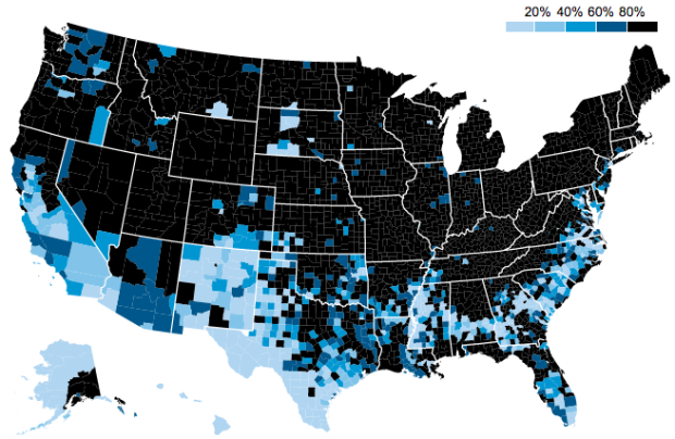
• How to Display Text in R

    Text can provide much needed context to traditional visual cues and can be used as a visual cue itself in some cases.

  • Reuben Fischer-Baum looks at the most popular girl names by state, over the past six decades.

    Baby naming generally follows a consistent cycle: A name springs up in some region of the U.S.—”Ashley” in the South, “Emily” in the Northeast—sweeps over the country, and falls out of favor nearly as quickly. The big exception to these baby booms and busts is “Jennifer”, which absolutely dominates America for a decade-and-a-half. If you’re named Jennifer and you were born between 1970 and 1984, don’t worry! I’m sure you have a totally cool, unique middle name.

    Like the trendy names and unisex names explorations, this series of maps is based on data from the Social Security Administration, which is surprisingly formatted and ready to use. If you’re looking to play around with time series data and simple state geography, the SSA site is worth a bookmark. [Thanks, John]

  • Peter J. Rentfrow, et al. studied personality clusters across states using data from five surveys, totaling responses from about 1.6 million people. They recently published their results in the Journal of Personality and Social Psychology [pdf].

    There is overwhelming evidence for regional variation across the United States on a range of key political, economic, social, and health indicators. However, a substantial body of research suggests that activities in each of these domains are typically influenced by psychological variables, raising the possibility that psychological forces might be the mediating or causal factors responsible for regional variation in key indicators.

    They found three main clusters, mapped above: friendly and conventional, relaxed and creative, and temperamental and uninhibited.

    The maps suggest that states belong only to specific clusters, but I suspect it’s a more continuous scale. For instance, a state might be partially part of cluster 1 and 2, not really 3, as opposed to just cluster 1. Still though, it’s an interesting start. Now if only the data they used were more easily accessible.

  • A challenge these days with visualization is that a piece might look great on a computer monitor and then break on a tablet or phone. However, if you design your software with that in mind so that it adapts to the device it’s on — so that it’s responsive — your audience loves you more for it. Chris Amico explains how to get started in D3.js: responsive maps, charts, and legends.

  • It’s been continuous tracking and monitoring for the past couple of days and nights, but none of that matters now. We get to bring him home today.

  • Those who use the ggplot2 package in R and do everything else in Python will appreciate this Python port of the package from yhat.

    Excel makes some great looking plots, but I wouldn’t be the first to say that creating charts in Excel involves a lot of manual work. Data is messy, and exploring it requires considerable effort to clean it up, transform it, and rearrange it from one format to another. R and Python make these tasks easier, allowing you to visually inspect data in several ways quickly and without tons of effort.

    The preeminent graphics packages for R and Python are ggplot2 and matplotlib respectively. Both are feature-rich, well maintained, and highly capable. Now, I’ve always been a ggplot2 guy for graphics, but I’m a Python guy for everything else. As a result, I’m constantly toggling between the two languages which can become rather tedious.

    Once you get the Python library installed (and its dependencies), you’ll be able to use the same layered graphics approach as the R package, with a similar syntax.

  • Check out this awesome new thing called MAP. It’s made of 100% sustainable material, easy to share, unbreakable, fits in your pocket, and most importantly, shares none of your information.

    Pre-ordered.

  • Most of the major pizza chains are within a 5-mile radius of where…

  • James Hamblin for The Atlantic rendered the average American man based on BMI and compared him to the average man in other countries. Hamblin named the average man Todd.

    Though in his face this reads lonesome, Todd does have three international guyfriends. They met at a convention for people with perfectly average bodies, where each won the award for most average body in their respective country: U.S., Japan, Netherlands, and France. The others’ BMIs, based on data from each country’s national health centers, are 23.7, 25.2, and 25.6.

    I named them all Todd, actually, even though it could be confusing, because not everyone’s name is a testament to their cultural heritage.

  • Digital artist Lauri Vanhala animated a day of maritime traffic in the Baltic Sea.

    Here’s a marine traffic and accident visualization that I created for the Baltic Marine Environment Protection Commission. The video was shown last week in a conference where the ministers of environment in the region of Baltic Sea and a bunch of other professionals were discussing how to protect the vulnerable and polluted sea in the future.

    The background music feels cinematic but not surprising given the audience. I particularly like the highlighting and annotation sync around the one-minute mark.

    See also: Britain from Above and Netherlands from Above. Oldies but goodies.

  • In their continued efforts to help potential home buyers find out all they can about the neighborhoods they want to live in, Trulia added median listing prices to their set of local maps. In the zoomed out view, you get prices per county, at medium zoom it’s per ZIP code, and zoomed in all the way it’s per block. You can also see sale price and sale price per square foot.

    With this, supplemented by crime data, commute, schools, and natural hazards, Trulia’s maps are a required stop for home buyers.

  • Dan Delany took a simple look at furloughed employees due to the government shutdown. There are tickers for duration, estimated unpaid salary, and estimated food vouchers unpaid, but the main view is the interactive tree map that shows furloughed proportions by department.

    Data was nicely collated into one spreadsheet from a bunch of government-released PDF files (of course), and the code for the page is available on Github. [Thanks, Dan]

  • Sometimes it can be a challenge to produce data graphics in vector format, which is useful for high-resolution prints. Raw, an alpha-version tool by Density Design, helps make the process smoother.

    Primarily conceived as a tool for designers and vis geeks, Raw aims at providing a missing link between spreadsheet applications (e.g. Microsoft Excel, Apple Numbers, OpenRefine) and vector graphics editors (e.g. Adobe Illustrator, Inkscape, Sketch). In this sense, it is not intended to be a full “visualization tool” like Tableau or other similar products: as the name suggests it is a sketch tool, useful for quick and preliminary data explorations as well as for generating editable visualizations.

    Although still in its early stages, Raw is actually quite useable. Start with a dataset copy and pasted from your spreadsheet, select a visualization format, and then click-and-drag how you want to represent values. Modify options as you see fit and download in the format you need.

  • Last year, URL shortening service bitly and Forbes made a map that showed popular news sources by state. However, the map was based on a static month of data, so what it showed then doesn’t necessarily apply to now. Bitly took it a step further this year and shows media consumption in real-time.

    They also categorized media sources into newspapers, tv and radio, magazines, and online only for a more detailed view. And to top it off, you can click on states to see a list of top sources, and you can see links driving traffic to the listed sites.

    One key thing to keep in mind as you read the maps: They show disproportionality rather than raw counts. So when you see that Texas is a TMZ fiend, that doesn’t mean they click more on the celebrity news site more than on Huffington Post. Rather, it means the relative volume of TMZ-clicking from Texas versus other states is higher versus the relative volume of Huffington Post-clicking.

  • I’m at an age where my feed is filled with data points. Every day my friends post about their data points, how precious their data points are, and all the peculiarities of their data points. Even though there are hundreds of thousands of data points that pop up every day, each one is a gift that can be compared to nothing and no one else. At the most superficial level, yes, they are easy to compare, but once you look to the details — a wink, a smirk, a bobble — you see individuals, and that’s where we seem to find the most joy.

    I’ll let you know in a few weeks.

    My wife just went on maternity leave, in preparation for our very own data point.

    It’s our first, so I’m not sure how this works, but something tells me I’ll be busier and maybe more tired than usual. I hope to keep FlowingData running, as if nothing changed, but in case you don’t hear from me for a few days, you’ll know why.

  • The video below shows ten seconds of trading on Blackberry on October 2, when they reported a bigger loss than they thought. It might also be a super advanced level of Space Invaders.

  • Mark Graham and Stefano De Sabbata for Information Geographies mapped the most visited site based on Alexa data. Countries are sized by Internet population. There aren’t many surprises with Facebook and Google in the Americas and and Europe, but it gets more interesting when you look elsewhere.

    The situation is more complex in Asia, as local competitors have been able to resist the two large American empires. Baidu is well known as the most used search engine in China, which is currently home to the world’s largest Internet population at over half a billion users. At the same time, we see a puzzling fact that Baidu is also listed as the most visited website in South Korea (ahead of the popular South Korean search engine, Naver). We speculate that the raw data that we are using here are skewed. However, we may also be seeing the Baidu empire in the process of expanding beyond its traditional home territory.

    The remaining territories that have escaped being subsumed into the two big empires include Yahoo! Japan in Japan (in join venture with SoftBank) and Yahoo! in Taiwan (after the acquisition of Wretch). The Al-Watan Voice newspaper is the most visited website in the Palestinian Territories, the e-mail service Mail.ru is the most visited in Kazakhstan, the social network VK the most visited in Belarus, and the search engine Yandex the most visited in Russia.

  • When you go to the United States Census site, Data.gov, or similar government-run sites, you see this. “Due to the lapse in government funding, census.gov sites, services, and all online survey collection requests will be unavailable until further notice.” Now it’s personal.

  • Big data, in all its glory, promises insights into the soul of humankind. There’s a hefty restriction though. Data only tells you about the population and actions of individuals it represents, which inevitably excludes part of the population. Jonas Lerman considers two hypothetical people. The first one:

    The first is a thirty-year-old white-collar resident of Manhattan. She participates in modern life in all the ways typical of her demographic: smartphone, Google, Gmail, Netflix, Spotify, Amazon. She uses Facebook, with its default privacy settings, to keep in touch with friends. She dates through the website OkCupid. She travels frequently, tweeting and posting geotagged photos to Flickr and Instagram. Her wallet holds a debit card, credit cards, and a MetroCard for the subway and bus system. On her keychain are plastic barcoded cards for the “customer rewards” programs of her grocery and drugstore. In her car, a GPS sits on the dash, and an E‑ZPass transponder (for bridge, tunnel, and highway tolls) hangs from the windshield.

    That’s a lot of data. The second person:

    He lives two hours southwest of Manhattan, in Camden, New Jersey, America’s poorest city. He is underemployed, working part-time at a restaurant, paid under the table in cash. He has no cell phone, no computer, no cable. He rarely travels and has no passport, car, or GPS. He uses the Internet, but only at the local library on public terminals. When he rides the bus, he pays the fare in cash.

    The second person has fewer data flows.

    These days, big data exclusion almost sounds like a good thing — if you’re intent on avoiding all marketing-related data collection — but when policy-making, fund allocation, etc. come into play, it’s possible the excluded aren’t counted. That’s not to say people should hurriedly sign up for Facebook and opt-in to every tracking study. It’s the opposite. Those in charged of the data and those who decide based on what they see in the data are responsible for knowing the background of their source.

  • Measuring and Mapping Space: Geographic Knowledge in Greco-Roman Antiquity opens at Institute for the Study of the Ancient World of NYU, this Friday. The exhibit serves as an appreciation of maps and more importantly, the history behind them and what they represent of their time.

    Our modern knowledge of ancient cartography relies almost exclusively on written sources. Despite this paucity of ancient artifacts, it is clear that Greeks and Romans applied topographical studies to the mapping of land and sea routes, to the implementation of an accurate system of recording public and private lands, and to promote specific political agendas. In all these instances, the resulting representations of places presented the viewer with a distorted and schematized version of geographic and topographic elements, transforming those regions both on a conceptual and on a physical level.

    [via The New York Times]