There are a lot of fake, spammy accounts on Twitter that come in a variety of forms. Some tweet links to junk, some serve as retweet and faving bots, and others exist purely to boost follower counts. Gilad Lotan, a data scientist at betaworks, was curious about that last type, so he bought 4,000 followers for five bucks and looked closer at his new found friends.
-
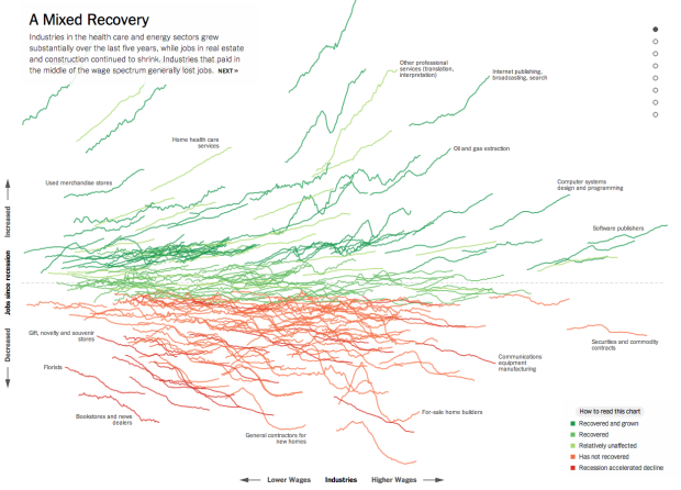
Jeremy Ashkenas and Alicia Parlapiano for The Upshot just plopped this interactive sucker on to the web. Each line shows change in job count for an industry. Horizontally, they’re organized by average salary, and vertically, they’re organized by relative change since the end of the recession. Green represents growth and red represents decline.
My initial reaction was along the lines of what-the-heck, but then you see the axes and get the mouseover actions for details. Scroll down, and you get highlighted subsets. By the end, you’ve learned something.
-
The gross domestic product for the United Kingdom rose by 5% seemingly overnight, after spending on cocaine and prostitution was (roughly) accounted for. Naturally there’s been a bit of fuss over the new estimate. Tim Harford explains why the new count isn’t such a travesty.
We need to understand three things about gross domestic product statistics. First, GDP itself is ineffable — an attempt to synthesise, for practical purposes, something that defies description. Second, the national accounts are not designed to give a round of applause to the good stuff and a loud raspberry to the bad stuff. They are supposed to measure economic transactions. And, third, anyone who thinks politicians try to maximise GDP has not been paying much attention to politicians.
After you read that, it’s also worth listening to the Planet Money podcast on GDP from a few months back. Fuzzy estimate.
-
Football players are getting bigger. Noah Veltman, a developer for the WNYC Data News team, shows by how much through an animated heatmap. Scrub the slider back and forth quickly for maximum effect.
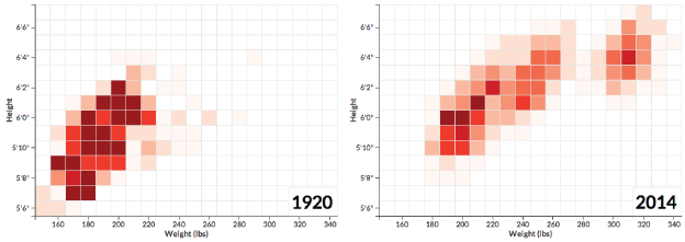
In the beginning, the league clustered in the bottom left. No one was over 300 pounds, and everyone was 6 feet and 4 inches tall or shorter. These days, player height weight are spread out more and shifted towards the top right.
-
Justin Palmer and his family have lived in a dense urban area of Portland, Oregon for the past seven years, but now they’re in the market for somewhere more spacious. He narrowed his search down to two main criteria — walking distance to a grocery store and walking distance to a rail stop. The search began with open data.
I defined walking distance as ~5 blocks, but ~10 blocks is still a pretty sane distance. I want to be close to a grocery store and close to a MAX or Streetcar stop. Unfortunately, none of the real estate applications I tried had a feature like this so I decided to create what I needed using open data that I had already been working with for some time now.
Code snippets and explainers follow for how Palmer found his target zones, using a combination of the data, a database, and TileMill.
-
How to Make Gridded, Equal-Distance Dot Maps
For when your geographic data is evenly spread rather than aggregated by government boundaries.
-
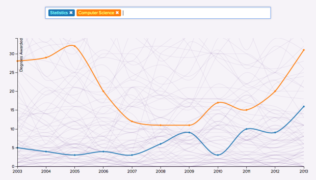
North by Northwestern looked closer at degrees awarded by their university over the past decade. Simply enter a degree to see the trend. As the makers note, the number of degrees is a lagging indictor of major popularity, since people pick their major and graduate three years later.
Be sure to keep scrolling past the interactive for some explainers. Also, you can download the time series data for your own perusal via the link in the footnote.
-
Using data from the National Heritage List for England, the London Evolution Animation shows the historical development of London. Mainly, it depicts roads and protected buildings, starting with the first road network built in 410 and into the present. The notes at the bottom provide a fine timeline quality rather than a hey-look-at-London-change video.
[via kottke]
-
In 1998, artist Eliot R. Brown created a map of Gotham City for the Batman No Man’s Land series. Brown describes the process of making the map, meant to look something like Manhattan with a lot more villains and a way for the federal government to blast the bridges and tunnels to the outside world.
[via Smithsonian]
-
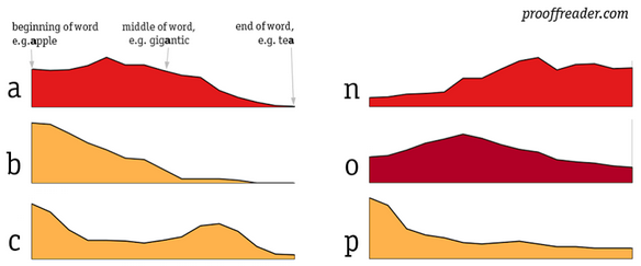
Some letters in the English language appear more often in the beginning of words. Some appear more often at the end, and others show up in the middle. Using the Brown corpus from the Natural Language Toolkit, David Taylor looked closer at letter position and usage.
I’ve had many “oh, yeah” moments looking over the graphs. For example, words almost never begin with “x”, but it’s quite common as the second letter. There’s a little hump near the beginning of “u” that’s caused by its proximity to “q”, which is most common at the beginning of a word. When you remove “q” from the dataset, the hump disappears. “F” occurs toward the extremes, especially in prepositions (“for”, “from”, “of”, “off”) but rarely just before the middle.
Next step: letter proximity.
-
As a fun learning exercise, Rob Scanlon made a dashboard that shows GitHub and Wikipedia changes in the style of graphics in Tron: Legacy.
Hello User. This is a reproduction of the graphics in the boardroom scene in Tron: Legacy. If you have not seen that movie, check out this background material on the making of that scene before proceeding.
To make this a bit more fun, the boardroom is configured to visualize live updates from Github and Wikipedia, with more streams to come. Click on a stream in the window to the right to continue.
Type “cd github” and “run github.exe” for maximum pleasure.
-
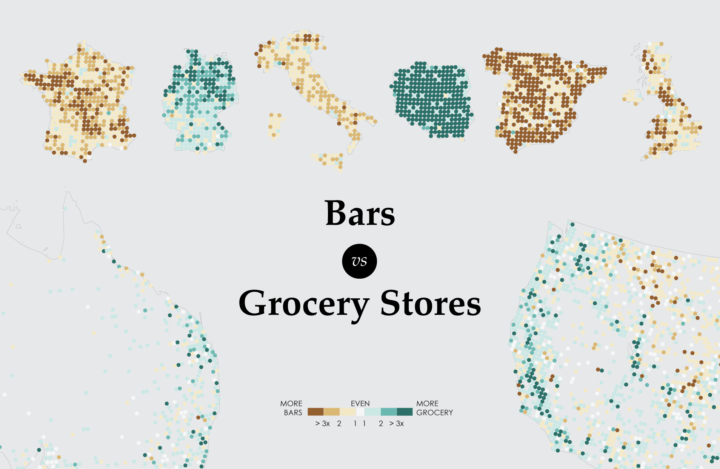
A closer look at the age old question of where there are more bars than grocery stores, and vice versa.
-
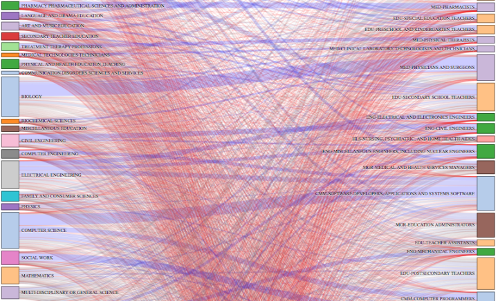
Ben Schmidt, an assistant professor of history at Northeastern University, was curious about careers after college degrees, so he used a quick Sankey diagram to look at data from the American Community Survey. College degrees are on the left, and professions are on the right. The thicker a line that connects a degree and a profession, the more people tend to go a certain route.
For example, if you click on “General Education” you see a lot of people become elementary and middle school teachers. The diagram works the other way around too, so that you can select a profession to see what people in that area tend to major in.
As Schmidt says in his description, it was just quick sketch, so the interaction is rough around the edges, but the data here is kind of interesting to look at, especially with all the graduating kids right now.
-
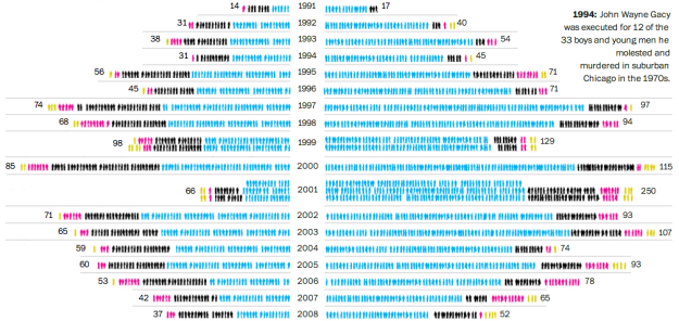
The Washington Post provides a look at the death penalty in the United States, from 1977 to present. On the left is an icon for each executed and on the right are the murderers’ victims. Be sure to read the annotation for full context.
-
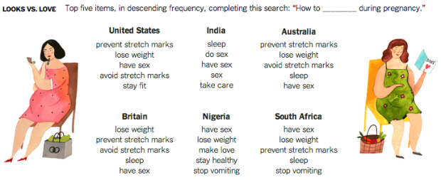
In another take on the game of what Google suggests while searching, Seth Stephens-Davidowitz for The New York Times looked at queries related to pregnant women. Some searches were similar across countries, whereas others varied culturally.
Start with questions about what pregnant women can do safely. The top questions in the United States: Can pregnant women “eat shrimp,” “drink wine,” “drink coffee” or “take Tylenol”?
But other countries don’t look much like the United States or one another. Whether pregnant women can “drink wine” is not among the top 10 questions in Canada, Australia or Britain. Australia’s concerns are mostly related to eating dairy products while pregnant, particularly cream cheese. In Nigeria, where 30 percent of the population uses the Internet, the top question is whether pregnant women can drink cold water.
Stephens-Davidowitz’s analysis is mostly anecdotal but a fun read.
I want to see something like this direct from Google, with more rigor. Now that would be interesting.
-
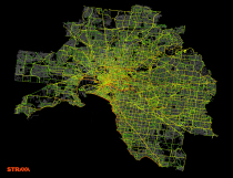 Last month, Strava, which allows users to track their bike rides and runs, launched an interactive map that shows where people move worldwide. That seems to be a lead-in to their larger project Strava Metro. Here’s the pitch:
Strava Metro is a data service providing “ground truth” on where people ride and run. Millions of GPS-tracked activities are uploaded to Strava every week from around the globe. In denser metro areas, nearly one-half of these are commutes. These activities create billions of data points that, when aggregated, enable deep analysis and understanding of real-world cycling and pedestrian route preferences.
Strava had a handful of clients before the official launch, such as the Oregon Department of Transportation. From Bike Portland:
Last fall, the agency paid $20,000 for one-year license of a dataset that includes the activities of about 17,700 riders and 400,000 individual bicycle trips totaling 5 million BMT (bicycle miles traveled) logged on Strava in 2013. The Strava bike “traces” are mapped to OpenStreetMap.
This is what I was getting at with those running maps, so it’s great to see that Strava was already on it.
It’ll be interesting to see where this goes, not just business-wise, but with data sharing, privacy, and how users react to their (anonymized) data being sold.
-
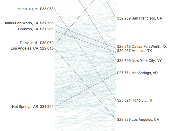
Incomes and the cost of living vary across the country. Some areas might have high median income, but the cost of living is also high. Similarly, areas might have low median income, but the cost of living is relatively low. So what happens when you take the income from the former and then move to the latter? The Bureau of Economic Analysis released estimates that help make that comparison.
Quoctrung Bui for NPR made that data more accessible with a slope graph. On the left is median income, and on the right is what it feels like. Enter your metro area to focus on your point of interest.
-
From the machine learning course on Udacity, an a cappella group sings a Thriller parody on overfitting. At first you’re like, “Is this real? Am I dreaming?” Then you’re like, “Oh my god, he has a gold glove on.” And then you’re like, “Yes! This is real! Oh internets, I adore you so.”
-
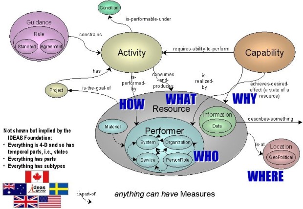
Paul Ford describes his fascination with military infographics. Here’s what he has to say about the graphic above:
Take some time with that graphic. After a while you realize that this image could be used anywhere in any paper or presentation and make perfect sense. This is a graphic that defines a way of describing anything that has ever existed and everything that has ever happened, in any situation. The United States Military is operating at a conceptual level beyond every other school of thought except perhaps academic philosophy, because it has a much larger budget.
Never mind the aesthetics and readability. It’s the content and the scale at which these graphics are presented that make them fascinating. Okay, and maybe the aesthetics and readability lend to the entertainment value, too.
-
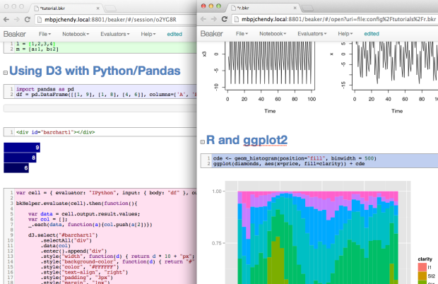
Currently in beta, Beaker lets you work and experiment with data with different languages, but in one environment.
Beaker is a code notebook that allows you to analyze, visualize, and document data using multiple programming languages including Python, R, Groovy, Julia, and Node. Beaker’s plugin-based polyglot architecture enables you to seamlessly switch between languages and add support for new languages.
Sounds like a good place to tuck away your snippets or development in the early stages of larger projects.








 Visualize This: The FlowingData Guide to Design, Visualization, and Statistics
