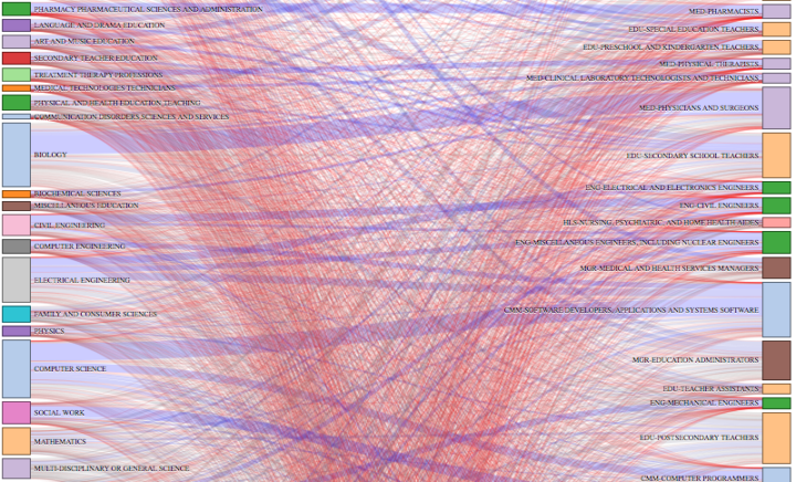
Ben Schmidt, an assistant professor of history at Northeastern University, was curious about careers after college degrees, so he used a quick Sankey diagram to look at data from the American Community Survey. College degrees are on the left, and professions are on the right. The thicker a line that connects a degree and a profession, the more people tend to go a certain route.
For example, if you click on “General Education” you see a lot of people become elementary and middle school teachers. The diagram works the other way around too, so that you can select a profession to see what people in that area tend to major in.
As Schmidt says in his description, it was just quick sketch, so the interaction is rough around the edges, but the data here is kind of interesting to look at, especially with all the graduating kids right now.

 Visualize This: The FlowingData Guide to Design, Visualization, and Statistics (2nd Edition)