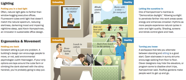
Numbers is a short film by Robert Hloz where some people see numbers appear above others’ heads. What the numbers are varies by the person with the ability, and it turns out knowing can be a blessing and a curse. Worth your nine and a half minutes of undivided attention:
-
Yelp released an amusing tool that lets you see how the use of word in reviews has changed over the site’s decade of existence.
From food trends to popular slang to short-lived beauty fads (Brazilian blowout anyone?), Yelp Trends searches through words used in Yelp reviews to show you what’s hot and reveals the trend-setting cities that kicked it all off. Our massive wealth of data and the high quality reviews contributed by the Yelp community are what allow us to surface consumer trends and behavior based on ten years of experiences shared by locals around the world.
Just type in keywords, select your city, business category, and click the search button to see the changes. For the less used words, the data looks mostly like noise, but there are also some clear trends like in craft beer and chicken and waffles.
-
John Walsh, the U.S. Senator from Montana, is in the news lately for plagiarizing a large portion of his final paper towards his master’s degree. The New York Times highlighted the portions that Walsh copied without attribution (red) and the portions he copied with improper attribution (yellow). About a third of the paper was just straight up lifted from others’ works, including the final recommendations and conclusion, which is basically the grand finale.
See also: Visualizing Plagiarism by Gregor Aisch, which shows the plagiarized PhD thesis of Germany’s former Minister of Defense.
-
One of the most annoying parts of downloading data from large portals is that you never quite know what you’re gonna get. It’s a box of chocolates. It’s government data sites. It’s lists of datasets with vague or unhelpful titles with links to download. Of course, I’d rather have a hodgepodge than nothing at all, but as with most things, there’s room for improvement.
The OECD, which maintains and provides data on the country level, takes steps towards a more helpful portal that makes data grabs less of a headache. With the help of Raureif, 9elements, and Moritz Stefaner, the new portal is still in beta, but there’s plenty to like.
Read More -
How to Make an Interactive Treemap
Treemaps are useful to view and explore hierarchical data. Interaction can help you look at the data in greater detail.
-
If you’ve played around with R enough, there comes a time when you just need some data to mess around with. Maybe it’s to learn a new method or to make one of your own. R offers some small-ish, clean datasets to poke at, but sometimes you need bigger, messier data. Hadley Wickham from RStudio released four popular large-ish datasets in package form to help you with that.
I’ve released four new data packages to CRAN: babynames, fueleconomy, nasaweather and nycflights13. The goal of these packages is to provide some interesting, and relatively large, datasets to demonstrate various data analysis challenges in R. The package source code (on github, linked above) is fully reproducible so that you can see some data tidying in action, or make your own modifications to the data.
Good.
-
Masuma Ahuja and Denise Lu for the Washington Post applied a technique called databending to a bunch of photos. The idea is that computer files — even though they represent different things like documents, images, and audio — encode data in one form or another. It’s just that sound files encode beats, notes, and rhythms, whereas image files encode hue, saturation, and brightness. So when you treat image files as if they were audio, you get some interesting results.
See Jamie Boulton’s post from a couple of years ago for a detailed description on how to do this yourself with Audacity Effects.
-
From a couple of years ago, but still relevant, I think. Matthew Epler took candidate approval ratings (again, this is from a little while ago), tossed them in a 3-D program, made the molds to match, and poured in some silicon. Boom. Butt plugs that represent data. It’s called Grand Old Party.
Epler describes his project best:
Grand Old Party demonstrates that as a people united, our opinion has real volume. When we approve of a candidate, they swell with power. When we deem them unworthy, they are diminished and left hanging in the wind. We guard the gate! It opens and closes at our will. How wide is up to us.
So true.
-
Late last year, Cameron Beccario made a wind map for earth, inspired by an earlier work by Fernanda Viegas and Martin Wattenberg. Beccario has been slowly adding overlays to the piece to show more dimensions of weather data around the world. The most recent overlay is what he calls a Misery Index, which is based on perceived air temperature.
If you’ve seen the interactive globe already, it’s worth revisiting. Click on the earth label on the bottom left to see the new stuff.
-
Personal data collection keeps getting easier and more efficient. Much of what was manual or clunky a few years ago is now automatic, done via the phone we carry every day anyway. More recently, personal data is finding a way out of the closed networks and applications and on to our own computers and servers.
Anand Sharma’s personal site is the newest example of what an individual can do with his or her own data. On a whim a few months ago, Sharma downloaded the Moves app, which tracks your location, and was hooked. Then with some design inspiration from Tony Stark, Sharma put a site together to show a feed a several aspects of his life, mostly tracked with his phone.
Read More -
The New York Times is covering Malaysia Airlines Flight 17 with a series of maps. The ones above show a sample of recent flights in the area. Some airlines, such as British Airways and Air France show a clear path around Ukraine, whereas others take a more direct route.
-
LeBron James decided to head back to Cleveland, so naturally the odds that they win the championship went up. Todd Schneider charted the betting odds as the announcement happened to see how much they went up.
Of course that 10% already had built in some likelihood that James would choose to play for the Cavaliers next season. Before Cleveland was considered a threat to land LeBron, their championship odds were around 2%, so the 10% Cleveland odds immediately before LeBron’s decision perhaps reflected market expectations that LeBron had a 50% chance of choosing Cleveland: 0.5 * 0.18 + 0.5 * 0.02 = 0.1
Houston, who was expected to pick up Chris Bosh if James went to Cleveland, also saw a spike during the announcement, but the odds quickly came back down once Bosh decided to re-sign with Miami.
-
Packing underwear for a short trip is easy. You just pack a pair for each day you’re away. However, longer trips require extra planning. Pack a pair for every day, and you get a bag that’s too heavy. Pack too few and you have to launder your dirties more often.
Reed Kennedy and Carrie Smith gave this problem some extra thought, in search for the ideal underwear count, given the number of days you leave. The result is the chart above.
Simply select your trip length on the top, and then move down to find your ideal underwear count. The numbers inside the grid cells indicate how many times you have to launder. Gold numbers indicate a perfect remainder of zero pairs of clean underwear by the time you get home.
Note: This chart assumes you do not turn your underwear inside out for another wearing. Not that’d I’ve ever done that.
See the full post for further dirty underwear details.
-
It’s around that time of year when more people than usual ask for advice about degrees in statistics, career paths in visualization, and how to get started with something that looks awesome.
The high of graduation from high school, undergrad, and grad school has settled, and it’s time to think about the future. Maybe summer brought more idle time at work to imagine what else you could do every day. I know the feeling.
I’ll try to answer the more common questions. However, keep in mind that I’m nowhere near the best person to ask about these things. I didn’t grow interested in statistics until late in college, I studied remotely for most of my graduate student life, and although I consult occasionally, I run FlowingData for a living.
So there’s your salt. Now some Q & A.
-
Shan Carter and Kevin Quealy for the Upshot have a look at sports fandom once again using Facebook usage as a proxy. This time they examined shifting fan support during the World Cup.
A new analysis by Facebook’s data science team analyzed migrations of fan support from one country to another throughout the tournament, stage by stage. It’s based partly on the contents of people’s posts, which means it is largely a reflection of the views of people who follow the World Cup at least to some degree. In the chart above showing global opinion, Brazil, the U.S. and Mexico have a strong influence on the results, because of their size, Facebook population and high interest in the World Cup.
Keep in mind World Cup posts for a specific country aren’t counted once that team dropped from the tournament. So it’s not so much shifting fandom as it is who people rooted for during each round.
Be sure to check out the whole article to see how fandom shifted by country. (Congrats, Germany.)
-
This graphic from the Gates Foundation is from a few months ago, but it was just National Mosquito Control Awareness Week. The small illustrations in this case make the graphic. Although I’m interested in seeing those “wide error margins.”
-
For small-ish amounts of hierarchical data, most JavaScript libraries can handle the load. However, it gets tricky when you get into hundreds and thousands of levels and groups. FoamTree is a library that helps you with this problem.
It’s a Voronoi Treemap, which sure, looks kind of neat, but the nice part is how well it handles large amounts of groups. It’s puts off computation and rendering until it’s needed, so it cuts down on load and run times. Just check out the Tree of Life demo and select “Homo sapiens” in the ride sidebar to see how it works.
The library is free to download, but you have to pay a license fee to get rid of the branding.
-
I’m pretty sure xkcd is the only one who gets away with showing player ratings for both basketball and chess players in the same frame, without the y-axis labels. And somehow it seems logical.
-
NPR, the Robert Wood Johnson Foundation and the Harvard School of Public Health conducted a survey about peoples’ stress levels and factors contributing to the stress. It took place for about a month. NPR started a summary of their findings, of what will be a two-week segment on the air and online.
The above shows the percent of respondents in the age brackets who said the factors (the rows in this case) contributed to their current stress. It looks like I might be in a less stressful stage of my life, between the age of 30 and 39.
It’s just an early summary of poll responses right now, so I’m hoping they go into more detail about statistically significant differences between demographics and how the 2,500-person sample correlates to the the US population.