• Membership
  • Newsletter
  • Projects
  • Learning
  • About
  • Member Login
  • Road grid orientation in major cities

    October 16, 2014

    Topic

    Maps  /  grid, roads, Stephen Von Worley

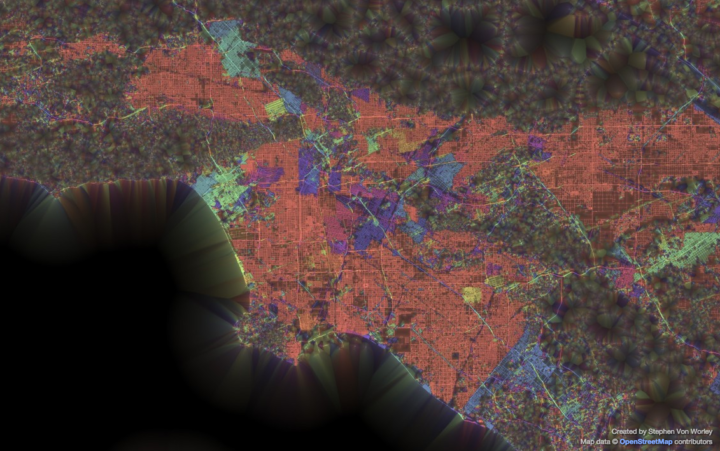
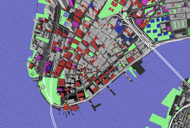
    This is what you get when you group streets by their geographic orientation and color them accordingly with a neon paintbrush. From the ever curious Stephen Von Worley:

    That’s every public street, colored by the predominant orientation of itself and its neighbors, thickened where the layout is most “grid-like” — to use an old-school woodworking metaphor, it’s as if we brushed some digital lacquer over the raw geographic transportation network data to make the grain pop.

    Above is the map for Los Angeles. You see a lot of north-south grids in the red-orange color, but head towards the center of the map in the downtown area, and you get pockets of misdirection. In cities like Tokyo and Paris it looks like there’s no order at all to the roads, whereas Chicago’s road network looks like one big grid.

    Lots to ponder, especially if you live in the cities.

    See also the level of gridded-ness by Seth Kadish.

  • How to Make Interactive Linked Small Multiples

    Small multiples are great, and the right interactions can make them even better. A primer and a how-to.

  • Geographic smell maps

    October 14, 2014

    Topic

    Data Art  /  senses, smell

    Kate McLean, a PhD candidate in Information Experience Design at the Royal College of Art, is interested in the senses. More specifically, the non-visual ones. Mainly our sense of smell. As she tags herself as an olfactory experience designer, McLean goes on smellwalks, documents aromas, and then maps the “smellscapes.”

    The map above is for Amsterdam, which you expect to smell like pot all day everyday and everywhere. But it didn’t.

    Instead spring 2013 in Amsterdam revealed an abundance of the warm, sugary, powdery sweetness of waffles. Oriental spices emanated from Asian and Surinamese restaurants and supermarkets, pickled herring from the herring stands and markets — a link to one of the city’s key historical industries. Old books were detected in basement doorways and laundry aromas drifted up into the streets from Amsterdam’s many house hotels.

    More smell maps: New York, Rhode Island, Paris, and Milan.

  • 10,000 League of Legends matches, all at once

    October 13, 2014

    Topic

    Maps  /  gaming, League of Legends, New York Times

    League of Legends is an online, free-to-play game that pits two teams of five against each other. The goal is to destroy the other team’s structures. The New York Times mapped 10,000 matches, played by 100,000 players, showing player movements over a quick thirty seconds.

    As you’d expect, you see a lot of battles in the middle of the field and if you play the game, you’re likely to recognize the paths that people usually take. The best part is the character breakouts that show how certain “champions” move about.

    Reminds me of the point cloud that shows over 11 million deaths in Just Cause 2.

  • Fallacy of point-and-click analysis

    October 10, 2014

    Topic

    Statistics  /  analysis, point-and-click

    Jeff Leek touches on concerns about point-and-click software to find the insights in your data, magically and with little to no effort.

    I understand the sentiment, there is a bunch of data just laying there and there aren’t enough people to analyze it expertly. But you wouldn’t want me to operate on you using point and click surgery software. You’d want a surgeon who has practiced on real people and knows what to do when she has an artery in her hand. In the same way, I think point and click software allows untrained people to do awful things to big data.

    Yep.
    Read More

  • Ebola spreading, a simulation

    October 9, 2014

    Topic

    Infographics  /  ebola, Washington Post

    As a way to understand the deadliness and spread of Ebola, the Washington Post runs a simplified simulation of how long it’s likely to take for the virus to infect 100 unvaccinated people. The simulation runs alongside several other diseases for comparison, which provides the main takeaway: Ebola is much more deadly than the other listed diseases, but it spreads much slower.

  • Skateboard physics

    October 9, 2014

    Topic

    Infographics  /  physics, skateboard

    Aatish Bhatia, a recent physics PhD, describes the forces involved to do a skateboard Ollie. It’s all about managing your center of gravity and applying variable amounts of torque to steer the board in the air. Yeah. It probably won’t help you skate any better, but it’ll help you appreciate the tricks a little more. [via kottke]

  • Interracial and same-sex marriage parallels

    October 8, 2014

    Topic

    Infographics  /  marriage, xkcd

    xkcd doing what xkcd does. Randall Munroe charts a brief timeline of interracial and same-sex marriage, through the lens of popular approval and population.

  • Tracking online ads

    October 8, 2014

    Topic

    Self-surveillance  /  advertising, Office of Creative Research

    We browse online, we see ads, and we buy stuff. The better-targeted the ads are, the more likely that we buy stuff. So of course advertisers continue on ways to guess who you are and what you might want to increase the chances that you click and spend. Floodwatch, a Chrome extension by the Office for Creative Research and Ashkhan Soltani, lets you turn it around ever so slightly so that you can track what the advertisers serve you.
    Read More

  • Why pursue a PhD

    October 7, 2014

    Topic

    Miscellaneous  /  PhD

    Philip Guo provides three practical reasons on why it’s worth pursuing a PhD.

    Worth considering if you’re hemming and hawing about graduate school. Then again, it’s just as easy to come up with three practical reasons on why it’s not. Let’s not get into that though. Yeah, good luck with that.

    Already on you way to a PhD? See also a survival guide to finishing.

  • Deviations from the mean

    October 7, 2014

    Topic

    Statistics  /  distributions, standard deviation

    As a way to bring context to the rarity of the 18-inning baseball game between the Washington Nationals and the San Francisco Giants this past weekend, Ross Benes compared other things that are 9.1 standard deviations from the mean.

    An NBA team losing by 83 points. A 13.4-inch penis.

    I’m not so sure how comparable those distributions are (as in deviations from the mean doesn’t always mean the same thing), but it’s an interesting exercise. At the very least, it’s a new tumblr in the making.

  • Real cities drawn as fantasy maps

    October 6, 2014

    Topic

    Maps  /  hand-drawn, Lord of the Rings

    Remember that time you were sitting by the fire reading The Lord of the Rings and thought to yourself, “Gee golly. I sure wish I could have a map of my hometown drawn in the style of J. R. R. Tolkien’s map of Middle-earth. That sure would be swell. Gee willikers. If only.” Well, your dreams have come true. Geographer Stentor Danielson has an Etsy store called Mapsburgh where he draws real cities as Tolkien maps. He also takes custom orders.

  • Ditch Excel and format your data with csvkit

    October 3, 2014

    Topic

    Software  /  csv, Python

    I thought I linked to csvkit a while ago, but apparently not. If you deal with CSV data at all, you should know about the utilities suite that helps you format and re-format in various ways. Christopher Groskopf posted a list of quick things you can do with csvkit.

    Over the last several months there have been two major releases of csvkit. These releases have brought long-awaited features such as Python 3 support, a csvformat utility and a new csvkit tutorial—not to mention a slew of bug fixes. To celebrate the latest release, here are eleven of my favorite awesome things you can do with csvkit. If you aren’t using it yet, hopefully this will convince you.

    Fun things include a quick one-liner to convert an Excel file to CSV, switching to JSON, and easy CSV export from a database.

  • Big chicken

    October 3, 2014

    Topic

    Infographics  /  chicken, food

    From Vox and research from Zuidhof et al., chickens are quite big these days.

    The one on the left is a breed from 1957. The middle one is a 1978 breed. And the one on the right is a commercial 2005 breed called the Ross 308 broiler. They’re all the same age. And the modern breed is much, much, much larger.

    When I was learning to cook, I’d follow recipes from my mom’s old cookbooks that she had when she was in college. One of my favorite dishes, steamed chicken with ginger and scallions, called for a three- to four-pound chicken. It totally screwed up my cooking times, and we ended up with many undercooked and overcooked chickens.

  • Beer family tree

    October 2, 2014

    Topic

    Network Visualization  /  beer, family tree, Quartz

    With Anheuser-Busch InBev rumored to have an interest in acquiring SABMiller and SABMiller trying to acquire Heineken, David Yanofsky for Quartz had a look at the structure of global beer distribution. The companies above, summing to six big beer distributors, accounted for half of the world’s beer sales, by volume.

    This is important. And sorry AB InBev, FlowingData county ales isn’t for sale, no matter how many millions of dollars you throw my way. I’m serious. Stop calling me.

    See also the network of beer brands and soda pop. And the bourbon family tree. And the much more dispersed wine industry.

  • Projects  /  beer, food

    Multivariate Beer

    Can you experience data? Sometimes visualization gets you part of the way there, putting data into context, serving as a trigger for your memory, and all that. But only so much can happen through the computer screen.

    Read More
  • A simulation of the traveling salesman problem

    October 1, 2014

    Topic

    Statistics  /  simulation, traveling salesman

    In a nutshell, the traveling salesman problem is as follows: “Given a list of cities and the distances between each pair of cities, what is the shortest possible route that visits each city exactly once and returns to the origin city?” Todd Schneider made an interactive that lets you punch in the cities yourself and then watch the process look for an optimum route. Fun to play with even if you’re not into processes. [Thanks, Todd]

  • Open source mapping lab

    September 30, 2014

    Topic

    Maps  /  Mapzen, open-source

    Mapzen focuses on building open source mapping components for developers.
    Read More

  • Fitbit obsessed

    September 30, 2014

    Topic

    Self-surveillance  /  David Sedaris, Fitbit

    After you’ve collected data about yourself for a while, you tend to go one of two ways. You either quit completely because it’s no longer interesting, or you obsesses over your data points constantly trying to one-up yourself. David Sedaris took the latter and wrote about his experience for the New Yorker.

    At the end of my first sixty-thousand-step day, I staggered home with my flashlight knowing that I’d advance to sixty-five thousand, and that there will be no end to it until my feet snap off at the ankles. Then it’ll just be my jagged bones stabbing into the soft ground. Why is it some people can manage a thing like a Fitbit, while others go off the rails and allow it to rule, and perhaps even ruin, their lives? While marching along the roadside, I often think of a TV show that I watched a few years back—”Obsessed,” it was called. One of the episodes was devoted to a woman who owned two treadmills, and walked like a hamster on a wheel from the moment she got up until she went to bed. Her family would eat dinner, and she’d observe them from her vantage point beside the table, panting as she asked her children about their day. I knew that I was supposed to scoff at this woman, to be, at the very least, entertainingly disgusted, the way I am with the people on “Hoarders,” but instead I saw something of myself in her. Of course, she did her walking on a treadmill, where it served no greater purpose. So it’s not like we’re really that much alike. Is it?

    I wonder which direction people choose when they start to track their heartbeat with the Apple Watch next year. My hope is for a peaceful middle ground, but I suspect it’ll fall into the category of not-that-interesting-after-first-week.

  • Flooding risk cartogram

    September 29, 2014

    Topic

    Maps  /  cartogram, environment, New York Times, Upshot

    As you may or may not know, climate change could bring with it other effects besides our average days getting warmer. Flooding is one of these other things. Based on data from research by Climate Central, Gregor Aisch, David Leonhardt and Kevin Quealy for the New York Times mapped flood risk by country with a cartogram.

    Globally, eight of the 10 large countries most at risk are in Asia. The Netherlands would be the most exposed, with more than 40 percent of its country at risk, but it also has the world’s most advanced levee system, which means in practice its risk is much lower.

    Some countries in Asia may choose to emulate the Dutch system in coming decades, but some of the Asian nations are not wealthy and would struggle to do so.

    Each rectangle represents a country, and the size represents how many people are expected to experience regular flooding by the year 2100. Color indicates the estimated percentage of a country’s population to feel the effects. So as expected, you see a lot of big rectangles and dark colors in the Asian countries.

    See also Stamen Design’s flood maps, also in collaboration with Climate Central, from a couple of years ago.

  • Page 212 of 392
  • <
  • 1
  • ...
  • 209
  • 210
  • 211
  • 212
  • 213
  • 214
  • ...
  • 392
  • >

Analyze, visualize, and communicate data usefully, beyond the defaults.

Become a member →

Recently for Members

May 8, 2025
When the data is not what it seems

May 1, 2025
Finding the Right Charts

April 24, 2025
Visualization Tools, Datasets, and Resources – April 2025 Roundup

April 17, 2025
Breaking Out of Chart Software Defaults

April 15, 2025
Line Chart with Decorative Neon Accents

Browse by Chart Type See All →

Donut Chart Surface Plot Word Cloud Stacked Area Chart Venn Diagram Alluvial Diagram Bubble Chart Chord Diagram Pie Chart

Browse By Topic

  • Visualization

    Seeing data

  • Maps

    Seeing geographic data

  • Infographics

    Explaining data

  • Networks

    Connecting data

  • Statistics

    Analyzing data

  • Software

    Working with data

  • Sources

    Getting data

  • Design

    Making data readable

Get the Book

Visualize This: The FlowingData Guide to Design, Visualization, and Statistics

Available now.

Order: Amazon / Bookshop

Made by FlowingData

  • The Process

  • Data Underload

  • Chart Everything

  • Guides

  • Books

  • Shop

  • About
  • Contact
  • Newsletter
  • LinkedIn
  • Instagram
  • Bluesky
  • RSS
Copyright © 2007-Present FlowingData. All rights reserved.