There are a lot of beards and other types of facial hair in Major League Baseball. In case you’re wondering how many and at what level, the Washington Post has you covered with a breakdown.
Read More
-
-
-
-
Jeffrey Heer, computer science professor and co-founder of Trifacta, describes the future of visualization in a short 10-minute talk. It’s one where people aren’t taken out of the analysis loop, but computers can provide a bit more help than they do now.
Watch the talk -
If you don’t want to bother with JavaScript but want to publish interactive graphics for the web or use interaction to explore your data, htmlwidgets might be for you.
Read More -
In a straightforward map, Seth Kadish shows the percentage of county residents who commute out of state, according to estimates from the American Community Survey.
Read More -
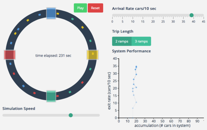
I hate all things commute- and traffic-related, and it’s probably why I like to learn about what makes commutes painful. Maybe if I know more about what’s happening, I won’t get so frustrated when I have to drive.
Transportation engineering PhD candidate Lewis Lehe has a look at bottlenecks and gridlock, creating simulations of both. The former is when too many cars want to do the same thing at once, like enter at a freeway entrance. Gridlock is when a bottleneck in one direction causes a bottleneck in the other direction, and then the same happens the other way around, starting a horrible, horrible cycle.
-
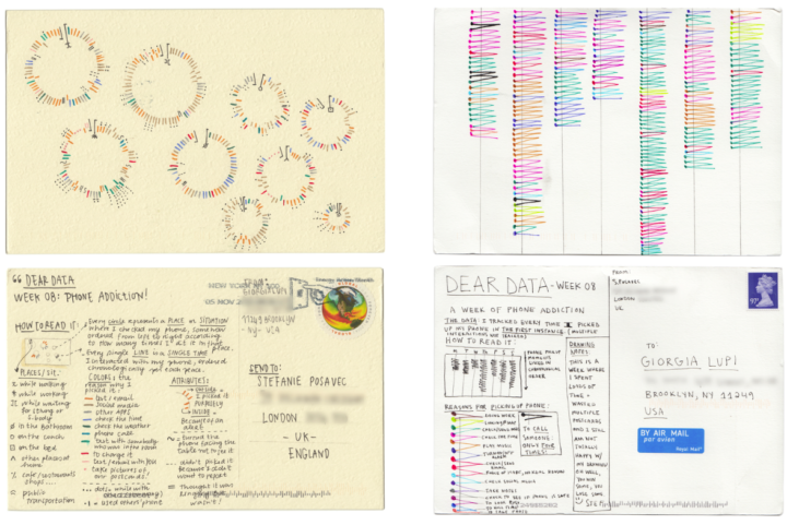
Stefanie Posavec, known around these parts for her manual data design and Giorgia Lupi, known for constantly drawing and searching for complexity, are sending each other data postcards once a week for a year. They call the data-drawing project Dear Data.
Read More -
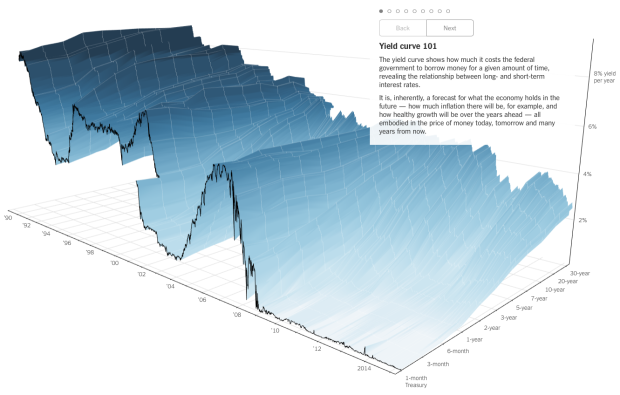
People like to poke fun at 3-D charts, mostly because they don’t work or a third dimension just isn’t needed. However, this chart by Gregor Aisch and Amanda Cox for the Upshot is a fine exception to the rule.
Read More -
For a class project, Katie Kowalsky, Dylan Moriarty, and Robin Tolochko examined changes in abortion policy since Roe v. Wade in 1973.
Read More -
 The Elements of Data Analytic Style by John Hopkins biostatistics professor Jeff Leek is a non-technical guide to the stuff they don’t always cover in Stat 101, and it’s priced as pay-what-you-want. In short, it tells you how to be a good data analyst.
I just started flipping through it, and the text is straightforward with a lot of practical advice, based on experience. It takes you from tidying your data, to exploratory analysis, causality, presenting your results, and reproducibility. Lots of bullet points and common pitfalls.
Get it now. And while you’re at it, you might also be interested in the Data Science specialization from Leek and his John Hopkins cronies on Coursera.
-
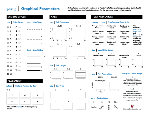
R Cheat Sheet and Guide for Graphical Parameters
You can customize graphics in R with
par(), but the docs are mostly text and just organized alphabetically. Here is a more visual reference, categorized by what you can change. Plus, a one-page printout. -
In their continued work on the No Ceilings project, Fathom describes the current iteration of the site that shows 20 years of data, across hundreds of indicators.
Read More -
Unlike traditional bracket-picking, the Upshot’s bracket game has a twist. You still want to pick the winners, but you get rewarded extra points if you choose a winning team that’s less of a crowd favorite.
Read More -

March Madness starts this week in the states, which means it’s time for bracket predictions and picks. It’s when everyone in the office puts in 20 bucks, makes their picks, and whoever knows the least about basketball wins. FiveThirtyEight has their predictions ready.
Read More -
For the most part, air pollution is invisible, so Stefanie Posavec and Miriam Quick created data objects to help see and experience the stuff you breathe. The glasses above represent large particulates, small particulates, and nitrogen dioxide.
Read More -
For the folks who have to make graphics for all devices under the sun, any time that can be saved is worth saving. The Illustrator script ai2html, from New York Times graphics editor Archie Tse, converts Illustrator files to HTML and CSS.
In case you’re wondering why:
Text in images and SVGs scale as you scale the image — so your text becomes unreadable pretty quickly as the artwork scales down, or looks hilariously large as it scales up. By rendering the text as html, we can scale the “graphic” up and down, but keep the text readable at the same font-size and line-height. This is important because we are trying to reduce the number of versions of the artwork that we have to create in order to accommodate viewports that range from mobile phones up to giant desktop monitors.
There are plenty of examples of the script in use by NYT.
-
Your standard choropleth map shows geographic areas colored by a single variable. You’re reading this, so you’ve seen them before. What if you have two variables? Then maybe a bivariate choropleth map. Cartographer Joshua Stevens describes the method and how to make one in open-source mapping software QGIS.
Read More -
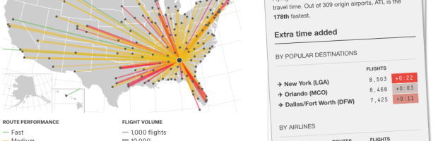
Flight arrival and departure times are often thought of in terms of “on time” or “delayed.” To determine the “best” airline, we look for the airline with the highest rate of on time flights. That makes sense, until you consider that many airlines pad their schedules with extra minutes.
Read More -
Sisi Wei and Charles Ornstein for ProPublica highlight reported data breaches to the U.S. Department of Health and Human Services that affected at least 500 people, since October 2009. Of the 1,142 reports, there were only seven fines.
Read More
Recently for Members
Second Edition
 Visualize This: The FlowingData Guide to Design, Visualization, and Statistics (2nd Edition)
 Visualize This: The FlowingData Guide to Design, Visualization, and Statistics (2nd Edition)
New tools, refined process.
Browse by Chart Type See All →


