There were some blips on Twitter last week for the DrunkTufte hashtag for which people made some not so readable charts. I’m really hoping it becomes a thing. The entry below is by Matt Fogel. Makes sense to me.
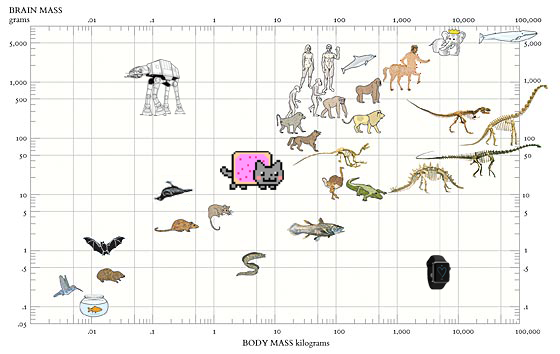
There were some blips on Twitter last week for the DrunkTufte hashtag for which people made some not so readable charts. I’m really hoping it becomes a thing. The entry below is by Matt Fogel. Makes sense to me.
Virginia Eubanks for Slate describes the dangers of relying too heavily on black-boxed algorithms to create and enforce policies.
Policy algorithms promise increased efficiency, consistent application of rules, timelier decisions, and improved communication. But they also raise issues of equity and fairness, challenge existing due process rules, and can threaten Americans’ well-being. Predictive policing relies on data built upon a foundation of historical racial inequities in law enforcement. Remote eligibility systems run on the questionable assumption that lacking a single document—in a process that often requires dozens of pages of supporting material—is an affirmative refusal to cooperate with the welfare determination process.
For a while, somewhere in between 2007 and 2011, infographics — in the everyday person’s sense, not the statistician’s — were all the rage. They came in lots of shapes and sizes and covered a wide span of useful to useless topics. While these sort of graphics are still around, they’re dwarfed by a different brand of work these days. A more mature one.
Mark Wilson for FastCompany describes the evolution. (Disregard the “What Killed The Infographic?” title of the article. Spammy embedded infographics are slowly dying, but the good stuff is a young whippersnapper discovering its powers.)
Read More
Eric Benson for FiveThirtyEight delves into cattle theft, which can cost an owner millions of dollars overnight, and the link to rising beef prices.
Most cuts of beef increased in cost since 1995, but brisket, while still not the most expensive cut, has really increased in value in the past couple of years. It peaked in January 2015 at $3.52 per pound wholesale. It was only $2.26 in January 2014. That’s kind of big deal considering you’re buying a 10-pound piece of meat at the grocery store, versus a couple of pounds of steak.
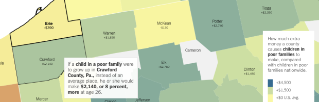
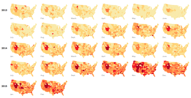
An analysis by Raj Chetty of Harvard University and Nathaniel Hendren of NBER estimates increased income and education for poverty-level households, based on where one lives. The results are based on tax data — 1040 and W-2 forms — from the IRS, and the focus of the analysis is on those who moved from one county to another.
The main finding was that location matters. The Upshot mapped the results, with an article whose text changes based on the county you select.
Read More
Where to start? What to learn next? Here’s a course to help take you from beginner to advanced.
There’s a lot of data readily available online. We know this. However, there’s also a lot of data available that’s offline, sitting on people’s hard drives. You just have to ask for it — in the right way. Christian Kreibich, a researcher for the International Computer Science Institute, provides a guide.
Read More
The Economist made a simple yet effective comparison of Black America and White America against metrics of countries that are part of the Human Development Index and the OECD. In incarcerations and homicides, you see Black America (red line) at and towards the bottom.
Read More
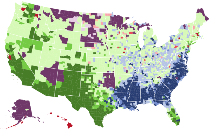
Select one or more races for a quick comparison. Counties are colored by the most prevalent.
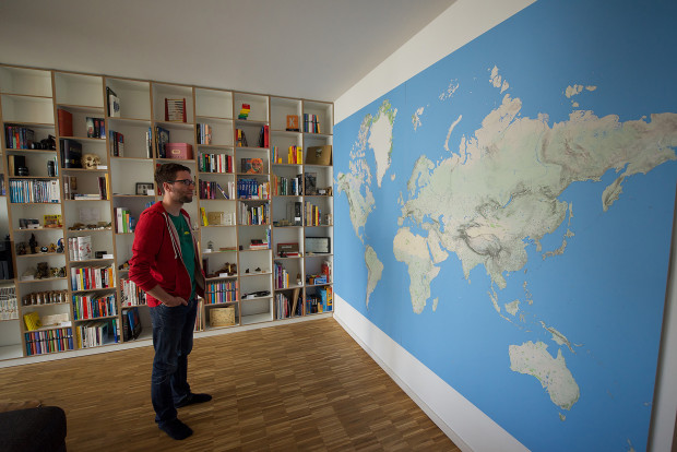
Dominik Schwarz wanted a big world map. A really big one that covered his entire wall in high detail.
You can get great world maps up to around 1,50m (~59 inches) width. However, this size seems to be a tipping point. From here on the bigger the maps get, the less detailed they are. And it makes sense. Such big maps are normally used in classrooms and even the people in the last row should see the large printed city names.
But that’s not what I wanted. Not at all. I envisioned a gigantic poster that would show the smallest villages, the most detailed coast lines and the highest level of information density possible.
He outlined his process from grabbing the data to printing to final mount.
The median home in America has changed in a variety of ways. Square footage increased, number of bedrooms and bathrooms shifted, heating changed from electrical to gas, and cost went up. CNNMoney provides an animated graphic that shows these changes over the past four decades.
Read More
The earthquake in Nepal was big, but there’s a discrepancy in just how big. The United States Geological Survey (USGS) measured the earthquake at 7.8 magnitude, whereas the China Earthquakes Network Center (CENC) measured it at 8.1. The three-tenths difference doesn’t seem like much, but the latter is actually an earthquake that exerts twice the energy of the former. Akshat Rathi and David Yanofsky for Quartz explain in a lesson of the logarithmic scale and earthquake magnitude.
Fashion trends, such as skinny jeans and Palazzo pants, can spike and fall quickly year over year, and it can be tough to keep up. Maybe trends in Google searches for specific fashions can help. Hiroko Tabuchi and Josh Katz for the New York Times mapped a handful of fashion searches over time so you can see some of the regional changes.
Read More
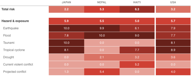
An earthquake with a magnitude of 7.8 can affect countries differently, depending on the people’s ability to withstand and recover from such a disaster. INFORM attempts to assess this risk, so that organizations can make better-informed decisions about what relief to send. Greg Myre for NPR explains with a heatmap. [via @onyxfish]
As Supreme Court hearings for same-sex marriage start today, Alex Tribou and Keith Collins for Bloomberg look back at timelines for past social issues, such as interracial marriage and abortion.
Read More

Stereotropes, made by the Bocoup Data Visualization Team, explores the many tropes in films and the the adjective used to describe them. Some are unique to a trope and some words span multiple tropes and genders.
Read More
The talks from OpenVisConf 2015 went up, so I’m slowly making my way through. In this one Danyel Fisher from Microsoft Research talks about the challenges of working with data that doesn’t quite fit into your standard CSV data model. The visualization has to account for the mess.
Watch the talk
Winter is over and it’s shorts weather these days in California. This is good for relaxing outdoor lunches but not so good for the drought. It’s sad to drive down the state and see a bunch of barren farm land. Victor Powell shows this shift in water supply through reservoir data from the California Department of Water Resources.
Read More
 A while back Alex Reinhart, a statistics instructor and PhD student at Carnegie Mellon University, was working on a guide for doing statistics right. The goal was to teach through anecdotes of statistics done wrong, from statistical significance and p-values to regression and confounding factors.
Statistics Done Wrong is a book now. If you analyze data with any regularity but aren’t sure if you’re doing it correctly, get this book. It’s a concise guide with interesting examples and a light, easy-to-read tone.
Read More
 Visualize This: The FlowingData Guide to Design, Visualization, and Statistics (2nd Edition)
New tools, refined process.


