It’s always tough to pick my favorite visualization projects. Nevertheless, I gave it a go.
Results for moritz
-
The Best Data Visualization Projects of 2014
-
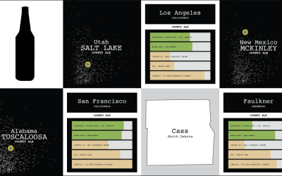
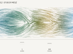
Multivariate Beer
Can you experience data? Sometimes visualization gets you part of the way there, putting data into context, serving as a trigger for your memory, and all that. But only so much can happen through the computer screen.
-
A more visual world data portal →
One of the most annoying parts of downloading data from large portals is…
-
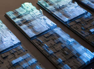
Data Cuisine uses food as the medium
Ditch the computer screen for your data. It’s all about the food. Moritz…
-
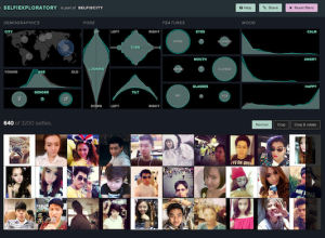
An exploration of selfies
Selfiecity, from Lev Manovich, Moritz Stefaner, and a small group of analysts and…
-
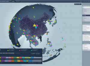
FIFA development work around the world →
Studio NAND and Moritz Stefaner, along with Jens Franke explore FIFA development programs…
-
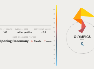
Data sculpture shows emotional response to Olympics
During the Olympics, Studio NAND, Moritz Stefaner, and Drew Hemment tracked Twitter sentiment…
-
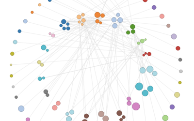
How to Make an Interactive Network Visualization
Interactive network visualizations make it easy to rearrange, filter, and explore your connected data. Learn how to make one using D3 and JavaScript.
-
Link
Text Processing Excursion →
Working from the command line [via]
-
Worldwide mood around London 2012
No doubt there is going to be a lot of tweeting about the…
-
River flow simulation
In Newcastle, there’s a floating tide mill building on the River Tyne. The…
-
Link
Network Grid →
Force nodes into grid format; see demo
-
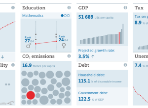
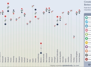
Updated OECD Better Life index
The OECD’s Better Life Index which debuted last year to much fanfare has…
-
Data and visualization blogs worth following
About three years ago, I shared 37 data-ish blogs you should know about,…
-
Learning data visualization
I listen to a lot of podcasts. They make my workouts much more…
-
Link
Statistics One →
Free Princeton course “designed to be a friendly introduction to very simple, very basic, fundamental concepts in statistics” [via]
-
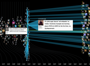
Watching ‘wtf Wikipedia’ as SOPA/PIPA blackout begins
While SOPA and PIPA are no laughing matter (join the strike), the reaction…
-
The Best Data Visualization Projects of 2011
I almost didn’t make a best-of list this year, but as I clicked…
-
Link
Force-based label placement →
Moritz Stefaner automates label placement in D3 so that the text is more readable
-
Data visualization freelancing
In an interview with Enrico Bertini, Moritz Stefaner, whose work you’ll probably recognize,…






 Visualize This: The FlowingData Guide to Design, Visualization, and Statistics
