There are lots of people on Twitter who talk visualization. Moritz Stefaner had…
Results for moritz
-
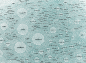
The Vizosphere
-

Challenge: Visualize the impact of Wikipedia
If you’re like me, you’ve probably used Wikipedia at least once in the…
-
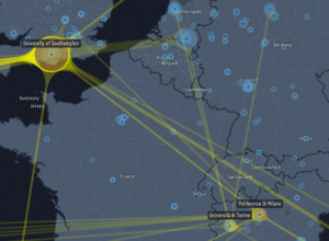
Custom maps in Processing
Till Nagel teaches you how to design custom maps in Processing with TileMill.…
-
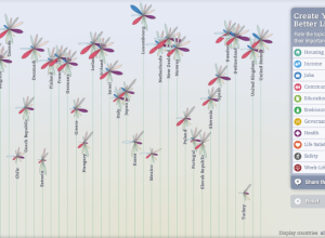
Better Life Index measures well-being across countries
OECD, with the help of Moritz Stefaner and Raureif, promote a well-being index…
-

Ben Fry on visualization future and data literacy
Ben Fry, co-creator of Processing and head of Fathom Design, talks data visualization…
-
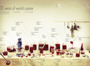
A century of deaths and a lot of fake blood
Rather than bars, bubbles, and dots, Clara Kayser-Bril, Nicolas Kayser-Bril, and Marion Kotlarski…
-
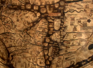
Beauty of Maps available in its entirety
Almost a year ago, the BBC aired the Beauty of Maps, but we…
-
Review: Beautiful Visualization – Looking at Data through the Eyes of Experts
I finally got a chance to take a closer look at O’Reilly’s most…
-
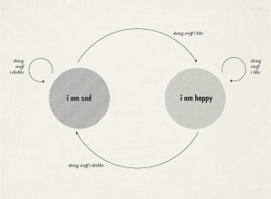
Life cycle of sad and happy
Along the same lines of the happiness flowchart, this graphic by Moritz Resl…
-
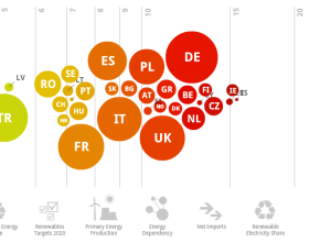
Europe’s energy targets in perspective
Designer Gregor Aisch has a look at energy usage in Europe. Click on…
-
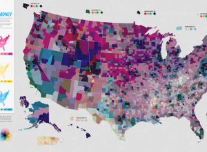
Open thread: Is this map too confusing?
This map, a collaboration between Good and Gregory Hubacek, shows three metrics from…
-
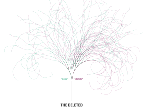
Visualizing deletion discussions on Wikipedia
Fact is not always clear cut. Sometimes fact is driven by opinion. People…
-
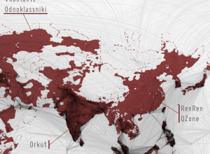
Filling in the black holes of the Facebook friendship map
While it was fun looking at the worldwide connections on Facebook, I thought…
-
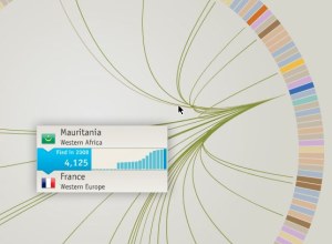
Where refugees come from
Thousands of people flee their country every year, and the travel patterns are…
-
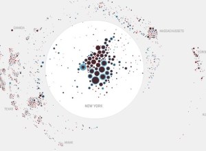
Mapping the moves of New York residents
A couple of months back, WNYC’s The Brian Lehrer Show asked listeners who…
-
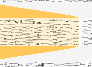
Understanding Shakespeare with visualization
Shakespeare literature is confusing. That’s not even an opinion. It’s a fact. Stephan…
-
Visualization underneath the surface
Moritz Stefaner of Well-formed data gives thought to propositional density as it pertains…
-
Elastic Lists code open-sourced
Moritz Stefaner, whose work we’ve seen a few times here on FD, just…
-
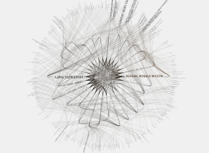
Conversational Twitter threads visualized
Add another piece to the ever-growing list of Twitter visualizations. What makes Moritz…
-
Elastic Lists Celebrates Five Years of Information Aesthetics
In celebration of Information Aesthetics’ birthday, Moritz Stefaner of Well-formed Data adapted his…
Recently for Members
Browse by Chart Type See All →


Browse By Topic
Get the Book
 Visualize This: The FlowingData Guide to Design, Visualization, and Statistics
 Visualize This: The FlowingData Guide to Design, Visualization, and Statistics
Available now.