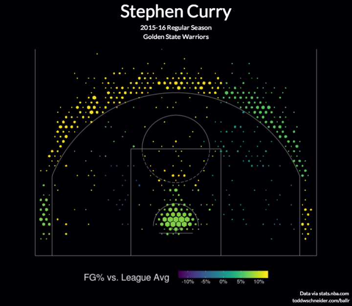
• Membership
  • Newsletter
  • Projects
  • Learning
  • About
  • Member Login
  • Lessons in statistical significance, uncertainty, and their role in science

    August 20, 2015

    Topic

    Statistics  /  FiveThirtyEight, p-value, uncertainty

    Science is hard. Statistics is hard. Proving cause and effect is hard. Christie Aschwanden for FiveThirtyEight, with graphics by Ritchie King, discusses the uncertainty in data and the challenge of answering seemingly straightforward questions via the scientific method.

    Leading the article is a description of p-hacking. Mess around with variables enough, and you too can get a p-value low enough to publish results in a distinguished journal.

    A fine interactive lets you try this yourself, showing that the political party in office affects the economy. The funny part is that you can easily “prove” that both parties are good for the economy.

    Which political party is best for the economy seems like a pretty straightforward question. But as you saw, it’s much easier to get a result than it is to get an answer. The variables in the data sets you used to test your hypothesis had 1,800 possible combinations. Of these, 1,078 yielded a publishable p-value, but that doesn’t mean they showed that which party was in office had a strong effect on the economy. Most of them didn’t.

    The p-value reveals almost nothing about the strength of the evidence, yet a p-value of 0.05 has become the ticket to get into many journals. “The dominant method used [to evaluate evidence] is the p-value,” said Michael Evans, a statistician at the University of Toronto, “and the p-value is well known not to work very well.”

    I guess that means we have to think more like a statistician and less like a brainless, hypothesis-testing robot.

    Worth the full read.

  • Hearing color instead of seeing it

    August 20, 2015

    Topic

    Self-surveillance  /  audiolization, color

    Artist Neil Harbisson is completely colorblind, so he sees in black and white. But he still perceives color. Harbisson has an implant in the back of his head that’s essentially an antenna with a color sensor attached. The sensor signals are transposed to audio and he listens through bone conduction.
    Watch the video

  • Where the checked luggage goes

    August 19, 2015

    Topic

    Self-surveillance  /  airport, luggage, video

    Schiphol Airport in Amsterdam put a camera on a piece of checked luggage and recorded the winding path of conveyer belts and luggage lifts. It’s like a scene straight out of a cartoon.

    Be sure to check out the 360 version too. It’s the same route as above but you can click and drag to see all around as the luggage moves through. [via Laughing Squid]

  • Nuclear detonations from 1945 to present

    August 19, 2015

    Topic

    Maps  /  animation, bomb, nuclear

    There have been over 2,000 nuclear detonations since 1945. Orbital Mechanics mapped each documented test in animated form. It’s mostly about mood and the individual explosions. More journal-like, although not much annotation unfortunately.

    Red represents atmospheric explosions, yellow represents underground, and blue represents underwater.

    See also artist Isao Hashimoto’s rendition from a few years ago. It’s the same data with an entirely different feel.

    [iframe id=”https://www.youtube.com/embed/cjAqR1zICA0?rel=0&showinfo=0″ autoplay=”no”]

    [via kottke]

  • Mapped: Solar energy and savings if you got panels

    August 18, 2015

    Topic

    Maps  /  Google, solar

    If you own a home or have gone to a home improvement store recently (in California at least), you’ve probably heard the solar panel pitch by now. They always start by asking about your electric bill and then provide rough estimates for what you might save if you got solar panels. For a more accurate estimate, you schedule a consultation. Project Sunroof from Google aims to provide a more objective summary.

    Currently providing information for the San Francisco Bay Area, Fresno, and Greater Boston, the project lets you punch in an address to see both potential energy and potential savings if you were to lease solar panels, pay for them in installments, or to buy outright.

    The project calculates estimates based on 3-d models of rooftops, shade from nearby trees and structures, sun positions over a year, and historical cloud and temperature patterns.

    The Sustainable Design Lab at MIT and MoDe Studio did something similar to this a few years ago for the Cambridge, Massachusetts area. I’m guessing their project served as inspiration for Sunroof. Hopefully Google can expand to more areas. [via Ars Technica]

  • Game tests your color-matching skills

    August 18, 2015

    Topic

    Design  /  color, game

    Color in visualization can be a finicky process. You want colors to correspond with the topic at hand, you must make sure that readers can actually see the palette you choose, and people must decode appropriate differences between shades.

    So here’s a game to help hone your skills.

    The straightforward game by Method of Action shows you a color palette, and the goal is simply to match. Each stage gets a bit more difficult and surprisingly more challenging.

  • Surveillance selfie with cell phone metadata

    August 17, 2015

    Topic

    Self-surveillance  /  government, mobile, privacy

    How much can you find out from “just the metadata” about your cell phone? ABC News in Australia aims to find out.

    Australia’s new data retention laws mean phone and internet companies have to save this information for two years: that’s every time you call someone, where you call them from, which cell tower your phone pings every time it connects to the internet, and more.

    On a mission to find out what that data might reveal, ABC reporter Will Ockenden took a ‘surveillance selfie’: he got access to his own metadata, and now for the first time you can see what an individual Australian’s metadata actually looks like.

    They’ve started with a few summary interactives that show where Ockenden goes during the week through cell tower connections and who he communicates with through call logs. They’ll be going deeper in the coming weeks. Also, Ockenden’s data is available to download so that you can look for information too.

    The Paul Revere example came to mind. Just metadata?

  • Using Amazon’s $5 button for personal data collection

    August 14, 2015

    Topic

    Self-surveillance  /  Amazon, button

    Ted Benson used a straightforward hack to repurpose Amazon’s quick-order button. Its intended use is to automatically order an item from Amazon when you push the button. Benson avoided that part, and instead used a button press to trigger other things.

    A lot of people made fun of Dash Buttons when Amazon launched them on the day before April Fool’s Day. But regardless of what you think about Dash as a consumer product, it’s an undeniably compelling prototype of what the Internet of Things is going to look like.

    If you have the right setup, you could be up and running with a button data collector in about ten minutes.

  • Demographics of laughter on the web

    August 13, 2015

    Topic

    Statistics  /  facebook, laughing

    There are a handful of ways to express laughter online, and it appears there are subtle differences in demographics, based on what you use. After reading an anecdotal story in the New Yorker by Sarah Larson, Facebook Research looked at the data.
    Read More

  • Fitbit during sex

    August 13, 2015

    Topic

    Self-surveillance  /  Fitbit, humor

    Reddit user noveltysin wore a Fitbit during sex, and then posted a screenshot of her heart rate estimates.

    So yeah. There that is. See the reddit thread for a mature and academic discussion of the data, including a line-by-line adult parody of Eminem’s Lose Yourself.

    Doesn’t quite beat the marriage proposal heartbeat.

  • Statistical Atlas  /  government, United States

    The Statistical Atlas that Keeps On Going

    I already revived the first Statistical Atlas of the United States from 1870 with modern data, but there’s still more data to look at. So I kept on going.

    Read More
  • Guides  /  pitfalls, rules

    Real Chart Rules to Follow

    There are rules—usually for specific chart types meant to be read in a specific way—that you shouldn’t break. When they are, everyone loses. This is that small handful.

    Read More
  • The Price is Right winner and cancer survivor calculates the odds

    August 11, 2015

    Topic

    Statistics  /  cancer, game theory, probability, survival, The Price is Right

    Elisa Long, a professor in Decisions, Operations, and Technology Management at the University of California, Los Angeles, was diagnosed with breast cancer. The Price is Right films a breast cancer awareness episode every August. Long wanted to get on that show. So she watched episodes during her 6-hour chemotherapy sessions to familiarize herself with games and rules, and most importantly, to maximize her odds of winning.

    Long describes her thought process and probability calculations on her way to surviving cancer and winning it all on The Price is Right.

    My goal in going on “The Price Is Right” was to play the best I possibly could given tremendous uncertainty about the outcome. The same was true for my breast cancer. The stakes were just higher.

    Ah, the uncertainty of life.

  • Denver Broncos testing in-game analytics

    August 10, 2015

    Topic

    Statistics  /  football, sports

    Analytics continues its spread into the various facets of sports. Just recently, the Denver Broncos hired a director of analytics, Mitch Tanney, who will be available to coaches on the field to provide probabilities that inform in-game decisions.
    Read More

  • Disappearing Arctic reflected in National Geographic maps

    August 10, 2015

    Topic

    Maps  /  Arctic, global warming, National Geographic

    In the most recent update to their atlas coming in September, National Geographic explains the shrinking Arctic through the lens of previous atlas maps. It’s not looking good.
    Read More

  • Data cleaning tips

    August 7, 2015

    Topic

    Statistics  /  cleaning

    When you first learn statistics, visualization, or any data-related subject, the data usually is given to you in a ready-to-use format. This is so that you can spend most of your time on the topic of interest. But once you step outside the learning bubble, data rarely comes in the format you want.

    Marc Bellemare, an associate professor in the Department of Applied Economics at the University of Minnesota, provides some practical tips on how to deal with this. Bellemare’s parting advice:

    Really, there is no big secret to cleaning data other than “Document everything” and to save everything in different files and in different locations (i.e., your computer, Dropbox, Google Drive), and there is no other way to learn data cleaning than by doing it.

    Yep.

    Some of the tips are in the context of specific software environment, but you can easily apply them to more general situations.

  • Page 193 of 392
  • <
  • 1
  • ...
  • 190
  • 191
  • 192
  • 193
  • 194
  • 195
  • ...
  • 392
  • >

Analyze, visualize, and communicate data usefully, beyond the defaults.

Become a member →

Recently for Members

May 15, 2025
Step Chart, Enhanced

May 8, 2025
When the data is not what it seems

May 1, 2025
Finding the Right Charts

April 24, 2025
Visualization Tools, Datasets, and Resources – April 2025 Roundup

April 17, 2025
Breaking Out of Chart Software Defaults

Browse by Chart Type See All →

Line Map Voronoi Diagram Square Pie Chart Mosaic Plot Area Chart Radar Chart Grid Map Box Plot Histogram

Browse By Topic

  • Visualization

    Seeing data

  • Maps

    Seeing geographic data

  • Infographics

    Explaining data

  • Networks

    Connecting data

  • Statistics

    Analyzing data

  • Software

    Working with data

  • Sources

    Getting data

  • Design

    Making data readable

Get the Book

Visualize This: The FlowingData Guide to Design, Visualization, and Statistics

Available now.

Order: Amazon / Bookshop

Made by FlowingData

  • The Process

  • Data Underload

  • Chart Everything

  • Guides

  • Books

  • Shop

  • About
  • Contact
  • Newsletter
  • LinkedIn
  • Instagram
  • Bluesky
  • RSS
Copyright © 2007-Present FlowingData. All rights reserved.