Daang, NASA. Using images of the sun taken in space, NASA constructed this super-detailed view of what the star looks like.
In space, NASA’s Solar Dynamics Observatory, or SDO, keeps an eye on our nearest star 24/7. SDO captures images of the sun in 10 different wavelengths, each of which helps highlight a different temperature of solar material. In this video, we experience SDO images of the sun in unprecedented detail. Presented in ultra-high definition, the video presents the dance of the ultra-hot material on our life-giving star in extraordinary detail, offering an intimate view of the grand forces of the solar system.
The results are mesmerizing.

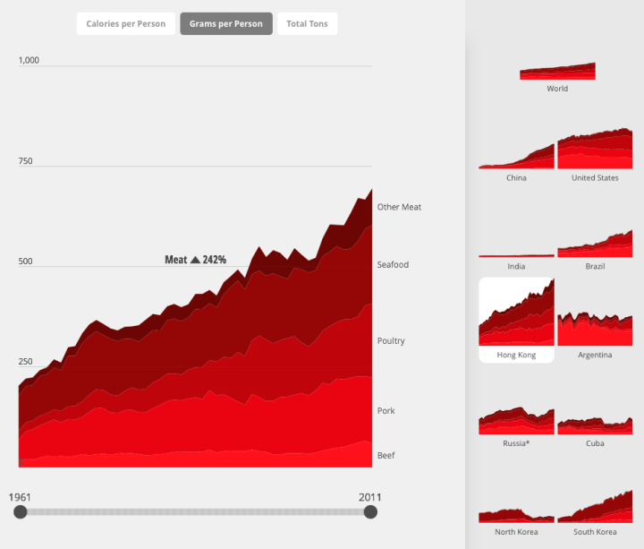


 Visualize This: The FlowingData Guide to Design, Visualization, and Statistics (2nd Edition)


