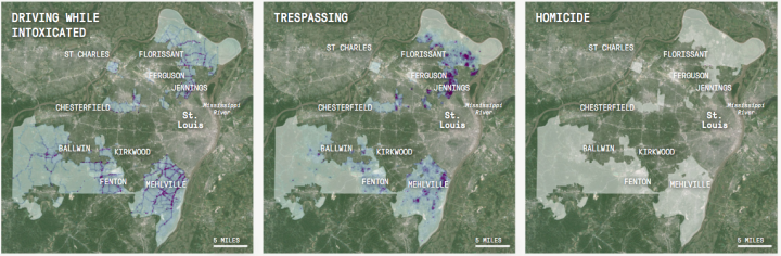
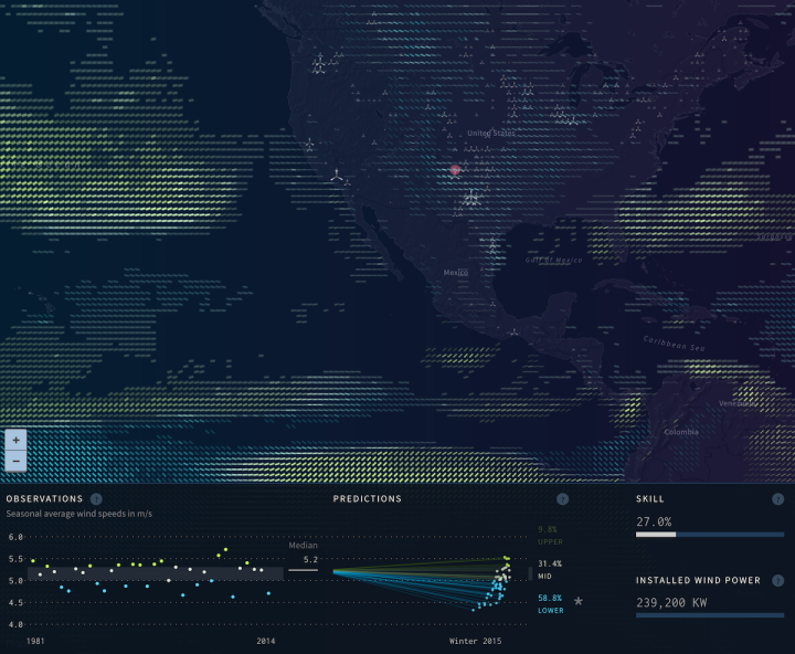
• Membership
  • Newsletter
  • Projects
  • Learning
  • About
  • Member Login
  • Way more trees than previously thought, new estimates show

    September 10, 2015

    Topic

    Maps  /  environment, nature, trees

    There are a lot of trees on this planet. But how many trees there actually are is still kind of fuzzy, because the estimates are based on satellite imagery. It’s hard to gauge density. Research by T. W. Crowther et al., recently published in Nature, used on-the-ground sampling to estimate more accurately.

    The global extent and distribution of forest trees is central to our understanding of the terrestrial biosphere. We provide the first spatially continuous map of forest tree density at a global scale. This map reveals that the global number of trees is approximately 3.04 trillion, an order of magnitude higher than the previous estimate. Of these trees, approximately 1.39 trillion exist in tropical and subtropical forests, with 0.74 trillion in boreal regions and 0.61 trillion in temperate regions.

  • Death of apps via tweets

    September 10, 2015

    Topic

    Statistics  /  BuzzFeed, Twitter

    Apps peak and die on a regular basis. One day everyone is giving an app a go and your feed fills up with links to the service, and the next it’s business as usual. BuzzFeed took a straightforward look at such trends through the eyes of tweets. All they had to do was count tweets that linked to particular service over time.

  • Searching for stock market spoofers

    September 9, 2015

    Topic

    Infographics  /  Bloomberg, stepper, stock market

    Stock market spoofers put in orders to buy with the intent to cancel. This can shift prices up with fake interest, or it can shift prices down with a wave of cancellations. The spoofers then take advantage of the shifts by buying and selling accordingly. Bloomberg has an interesting stepper that walks you through the process for how one might catch such spoofers.

    It starts with an overview. A minute of buying, selling, and cancellations whiz across the screen, and all looks hunky-dory. But then it zooms in on the details to show you what to look for, and it doesn’t look like such a flurry anymore.

    The challenge is that regular people cancel orders all the time, and the activity itself is not illegal. More data needed.

  • Guides  /  venn diagram

    Venn Diagrams: Read and Use Them the Right Way

    Venn diagrams seem straightforward, but why all the mistakes? Here’s a guide to avoid the snafus.

    Read More
  • Maps to understand tennis

    September 8, 2015

    Topic

    Maps  /  cartography, sports, tennis

    Damien Saunder, a cartographer at ESRI, likes to use mapping methods to evaluate tennis player patterns and tendencies.

    When I look at tennis, I see it moving on a grid. I see space and x/y coordinates [position] and I see z values [height], and I see trajectories of the balls, and space opening up. I started GameSetMap to try and educate people of the value of mapping where people are on the court, storing the data in a GIS, and visualizing it.

  • Focusing on the full picture with data

    September 8, 2015

    Topic

    Statistics  /  Hans Rosling, ignorance

    I don’t know the full context of this discussion, but in the interview below, Hans Rosling talks to media person Adam Holm about why we shouldn’t use the media to form our opinions about the world. Media person disputes. Rosling puts foot on table and says Holm is wrong.

    Hard to argue with that.

    See also Rosling’s 2014 TED talk on how to not be ignorant about the world.

  • Bayesian fantasy football 101

    September 4, 2015

    Topic

    Statistics  /  football, sports

    There’s a small site dedicated to Bayesian-informed fantasy football decisions, because of course there is. Here’s the 101 intro.

    Here’s the crux of thinking probabilistically about fantasy football: for any given week, when you start a player you’re picking out one of these little x’s at random. Each x is equally likely to get picked. Each score, however, is not. There are a lot more x’s between 0-10 points than there are between 20 and 30.

  • Weevmee: Your Instagram photos turned artistic images

    September 4, 2015

    Topic

    Data Art  /  Instagram

    Weevmee autogenrates a woven-like image, based on your Instagram photos.

    A lot of us are pretty into photographing our lives. We can look back at each individual image and it magically transports us back in time and engenders a memory. That’s great. But at the end of a long, fun year, we had no creative way to evoke the many memories contained in an entire year’s worth of images. We were hungry to create a single, personal manifestation of a year in photos – one that feels artistic enough to grab our attention, but contains enough clarity that it feels uncannily familiar.

    Link your account, set some criteria, and you’re off to the races.

  • Be a tennis line judge: Interactive tests your skills

    September 3, 2015

    Topic

    Infographics  /  game, tennis, Wall Street Journal

    The job of a tennis line judge can be though when you have to judge the difference of a few millimeters as a ball speeds by. Sure, it’s easy to complain about bad calls at home, where we get to see replays in slow motion, but it’s more challenging in real life. The Wall Street Journal provides a bit of the experience with an interactive game. Watch video clips from a line judge’s point of view, and try to make the right call.

  • Immigrant America

    September 3, 2015

    Topic

    Maps  /  immigration

    Similar in spirit to dot density maps we’ve seen before, this one from Kyle Walker, an assistant professor of geography at Texas Christian University, uses immigrant data from the American Community Survey to show the makeup of immigrant America.

    Each dot represents approximately 20 immigrants in that Census tract from a given region, and the dots are placed randomly within Census tracts. The project was inspired by other interactive dot map implementations including The Racial Dot Map at the University of Virginia; Ken Schwenke’s Where the renters are; and Robert Manduca’s Where Are The Jobs?.

    Color represents origin, such as red for Mexico, cyan for South Asia, and green for Southeast Asia.

    The tools used to make this map? A combination of R, QGIS, ArcGIS, and Python for data processing and Mapbox for the web presentation.

  • Lessons from the Student’s Dilemma, the extra credit version of the Prisoner’s

    September 2, 2015

    Topic

    Statistics  /  game theory, Prisoner's Dilemma

    Dylan Selterman, a psychology lecturer at the University of Maryland, presents the above problem—a variation of the Prisoner’s Dilemma—as extra credit on his exams. He’s done this since 2008, but a student recently posted a picture of the question and it spread through the networks of social media.

    The question amuses, but naturally, it evokes another: How do students answer? For Quartz, Selterman describes the results and the overarching moral lessons we can learn from them.

    It’s important to note that most students in my class (around 80% each semester) end up choosing two points. While many students choose the “rational” six-point option, they are still in the minority.

    I believe this is because most people do understand the importance of being communal. In other words, most people are happy to behave in a way that benefits others around them.

    The problem is that there is still many who don’t. With the exception of one year, no class received extra points, because more than 10 percent of students selected the greater six-point option.

  • 8 years of dating as a chart

    September 1, 2015

    Topic

    Self-surveillance  /  dating

    Robin Weis recollected her dating record over the past eight years, and made a simple chart to show the data. Purple represents an established relationship, green represents a causal one, and black lines represent first dates. Darker shades of purple and green represent days We saw the corresponding person in real life.

    The short anecdotes for each record make it.

  • How to Make Maps in R That Include Alaska and Hawaii

    The conterminous United States always gets the attention, while Alaska and Hawaii are often left out. It is time to bring them back into view.

  • Guides  /  baseline, rules

    Bar Chart Baselines Start at Zero

    There are visualization rules and there are visualization suggestions. Most are suggestions. The ones that are rules exist because of how our brains process visual information. There’s just no getting around it.

    Read More
  • Square mile grid-ness of the United States

    August 28, 2015

    Topic

    Maps  /  grid, Thomas Jefferson

    Named after the grid system Thomas Jefferson used to apportion land acquired through the Louisiana purchase, the Jefferson Grid Instagram account highlights remnants of the system through satellite shots from Google Earth. Each picture is the land that fits into one square mile.

    The most fun ones more me are the desert shots. It’s a square mile of development and just dirt everywhere else.

  • Minimum Wage Machine pays in pennies

    August 28, 2015

    Topic

    Data Art  /  minimum wage, perspective

    The Minimum Wage Machine by Blank Fall-Conroy places minimum wage in the context of seconds and pennies. Turn the crank, and every 4.5 seconds a penny drops out of the plexiglass case, which is the equivalent of eight dollars an hour. Stop cranking and you get nothing. [via Boing Boing]

  • Extracting NBA player movement data

    August 27, 2015

    Topic

    Coding  /  API, basketball, Python, sports

    NBA basketball teams have tracking systems installed in their arenas called SportVu, essentially a system of cameras pointed at the court to track player movements. Some of that data is browsable through the NBA site, but there’s understandably no direct download link. However, there is an API. Savvas Tjortjoglou wrote a thorough tutorial on how to grab data via the API and plot it Python.

    This will be fun.

  • Page 191 of 392
  • <
  • 1
  • ...
  • 188
  • 189
  • 190
  • 191
  • 192
  • 193
  • ...
  • 392
  • >

Analyze, visualize, and communicate data usefully, beyond the defaults.

Become a member →

Recently for Members

May 8, 2025
When the data is not what it seems

May 1, 2025
Finding the Right Charts

April 24, 2025
Visualization Tools, Datasets, and Resources – April 2025 Roundup

April 17, 2025
Breaking Out of Chart Software Defaults

April 15, 2025
Line Chart with Decorative Neon Accents

Browse by Chart Type See All →

Ternary Plot Chord Diagram Density Plot Baseline Chart Slope Chart Beeswarm Spike Map Glyph Chart Box Plot Bar Chart Race

Browse By Topic

  • Visualization

    Seeing data

  • Maps

    Seeing geographic data

  • Infographics

    Explaining data

  • Networks

    Connecting data

  • Statistics

    Analyzing data

  • Software

    Working with data

  • Sources

    Getting data

  • Design

    Making data readable

Get the Book

Visualize This: The FlowingData Guide to Design, Visualization, and Statistics

Available now.

Order: Amazon / Bookshop

Made by FlowingData

  • The Process

  • Data Underload

  • Chart Everything

  • Guides

  • Books

  • Shop

  • About
  • Contact
  • Newsletter
  • LinkedIn
  • Instagram
  • Bluesky
  • RSS
Copyright © 2007-Present FlowingData. All rights reserved.