
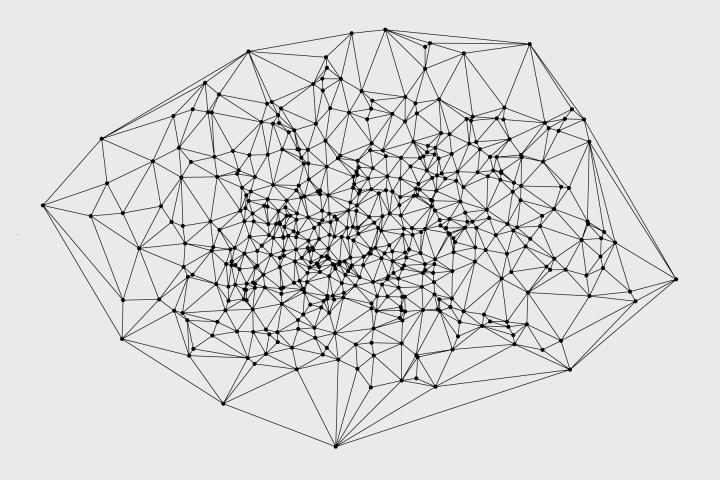
A group of researchers are studying how all the galaxies in the universe are connected, network-style.
Read More
A group of researchers are studying how all the galaxies in the universe are connected, network-style.
Read More
Visualization of time is usually about compression so that you can see more in less minutes. This animation, however, shows the Titanic sinking in near real-time, over 2 hours and 40 minutes.
My knee-jerk reaction was, wow, that’s a long time for everyone to get to safety, but let’s not forget this was in the freakin’ ocean in 1912. So you know, there’s that. [via kottke]
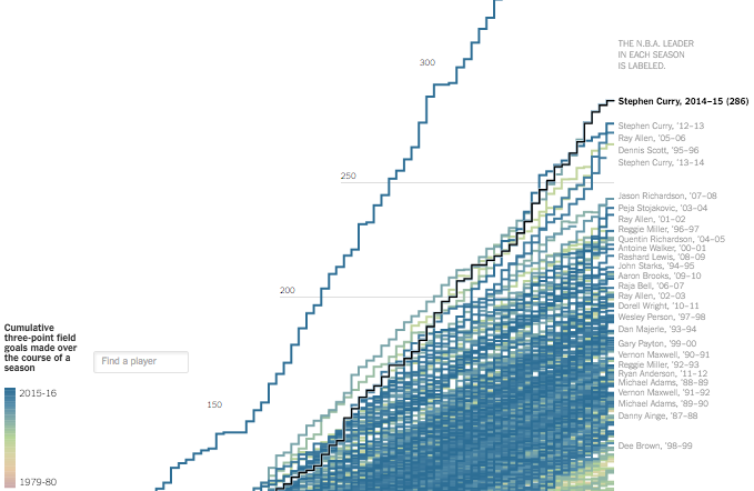
Stephen Curry made 402 three-pointers this regular season, which is ridiculous. Gregor Aisch and Kevin Quealy put the record into context showing just how much far ahead of others Curry was. No one has even made at least 300 three-pointers.
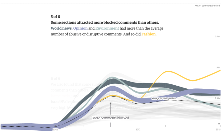
Online comments are an odd entity that can get out of hand quickly, and it only takes one or two sour comments to sully an entire thread. To shed some light on the dark side of online commenting, the Guardian commissioned research for their own archive of 70 million comments.
Although the majority of our regular opinion writers are white men, we found that those who experienced the highest levels of abuse and dismissive trolling were not. The 10 regular writers who got the most abuse were eight women (four white and four non-white) and two black men. Two of the women and one of the men were gay. And of the eight women in the “top 10”, one was Muslim and one Jewish.
This is why I closed comments a couple of years ago. I wasn’t get any abuse, but at some point it was like every comment was either really negative, self-promotion, or just straight-up spam. I don’t even want to imagine what comments look like for mainstream sites.
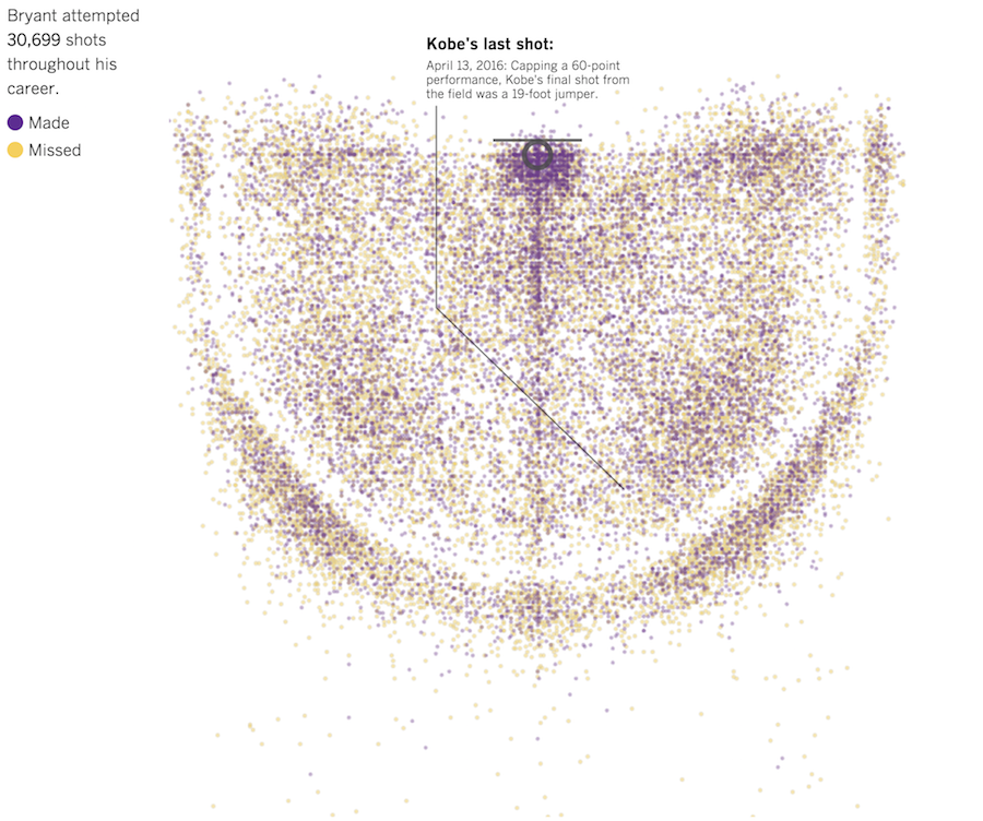
In celebration of Kobe Bryant’s final game, the Los Angeles Times charted all 30,699 field goals threw up over his twenty-year career. A tour feature takes you through some of Bryant’s most significant shots, and an exploration mode lets you filter down to the shots you’re interested in, like buzzer beaters, jump shots, or just makes.

Eleanor Lutz made some trading cards — for viruses.
To make the 3D animations I used UCSF Chimera, a free molecular modeling program. When scientists discover a new protein structure they upload it to the worldwide Protein Data Bank. Each entry is assigned a unique ID number, which you can use to call up the structure in programs like Chimera or PyMol.
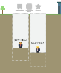 The tax plans of Ted Cruz and Donald Trump might seem fine if you don’t think about the actual values. Tax cuts. Less government spending. But then it gets tricky when you look at what they’re actually proposing. Alvin Chang for Vox provides a simple interactive to show what the Cruz and Trump and budgets require.
They want to cut so much government spending that it’s virtually impossible to figure out how they’d do it. Cruz wants to cut spending by $8.6 trillion over the next decade, according to a Tax Policy Center analysis, and Trump wants to cut it by $9.5 trillion. To put this in perspective, the entire budget for this fiscal year is $3.9 trillion.
Be sure to go to the bottom to try to balance the the budgets yourself.

R makes it easy to add squares and rectangles to your plots, but it gets a little tricky when you have a bunch to draw at once. The key is to break it down to the elements.
The deldir package by Rolf Turner makes the calculations and plotting straightforward, with a few lines of code.
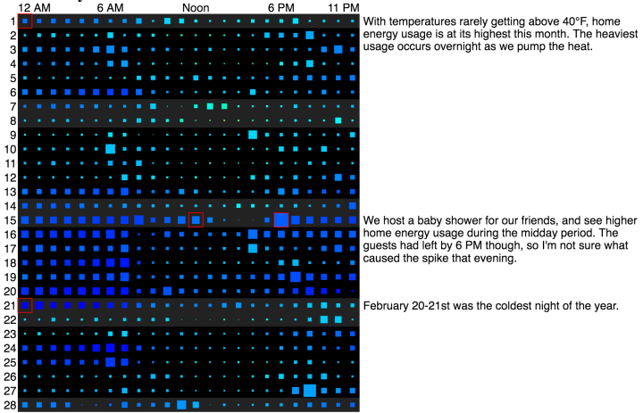
Michael VanDaniker found that his energy provider, Baltimore Gas and Electric, provides customers with an easy-to-use tool to export their home’s energy usage by the hour. So he downloaded the CSV and had a look back at 2015, through the eyes of heating and cooling. Fun.
Read More
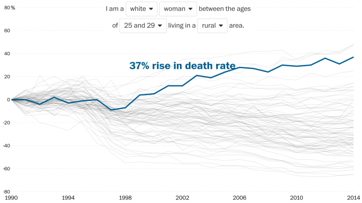
Overall life expectancy continues to increase, but looking at it from the other end — mortality rates — show different trends for different groups, especially women who live in rural areas. Dan Keating and Kennedy Elliott for the Washington Post explain with a collection of time series charts.
For younger age groups, drug overdose and suicide account for virtually all of the increases in death rate. For older groups, additional causes of death are also increasing, particularly heart and lung diseases for rural women, and cirrhosis for people over 45.
Rather than show mortality rates over time, the charts focus on the actual percentage change from 1990. A line that trends upwards is bad.
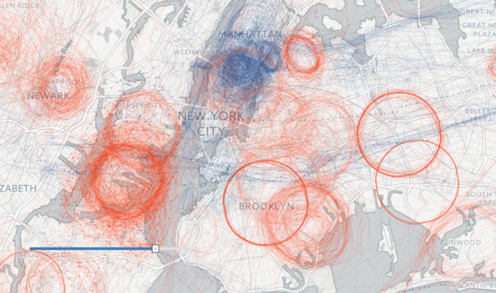
Peter Aldhous and Charles Seife dug into flight path data, specifically looking for flights manned by the FBI and the Department of Homeland Security.
The government’s airborne surveillance has received little public scrutiny — until now. BuzzFeed News has assembled an unprecedented picture of the operation’s scale and sweep by analyzing aircraft location data collected by the flight-tracking website Flightradar24 from mid-August to the end of December last year, identifying about 200 federal aircraft. Day after day, dozens of these planes circled above cities across the nation.
BuzzFeed’s searchable, animated map shows these circular paths, red for FBI and blue for DHS. There was no definite answer for what those planes are doing. Maybe routine surveillance or maybe lookouts for specific people or events. But still, so interesting.
Many people think of visualization as a plug-in tool that spits out something to look at. Microsoft Excel comes to mind. Some think of visualization as just that final chart to put on a presentation slide. However, there’s always a backstory about how it was made, who made it, why it was made, and most importantly, how the data came about. This is often more important than the finished product.
Artist Jer Thorp wrote about this a while back — about how visualization is a process. More recently, Jake Porway, the director of DataKind, wrote more about the process and how it ties into more rigorous analyses.
When data visualization is used simply to show alluring infographics about whether people like Coke or Pepsi better, the stakes of persuasion like this are low. But when they are used as arguments for or against public policy, the misuse of data visualization to persuade can have drastic consequences. Data visualization without rigorous analysis is at best just rhetoric and, at worse, incredibly harmful.
You need that analysis to figure out what you actually see in a visualization.
For those who make data graphics, this means picking and prodding at the data before you throw up a graph. For example, mean and median can mean a lot of things for a distribution. For those on the consumption side, this means questioning each graphic you see and don’t take every at face value. The bars and lines are usually much more squishy than they appear on the screen.
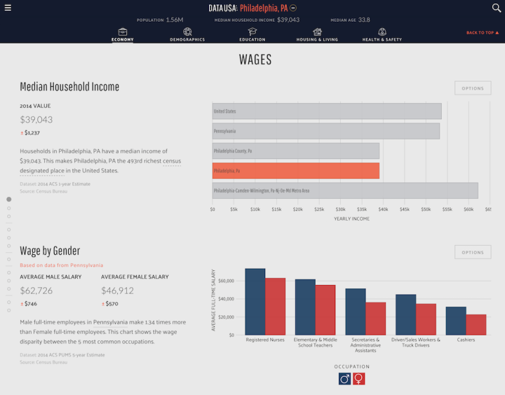
Government data is, shall we say, not the easiest to use and look at, which is why there are so many ongoing efforts to make it more accessible to both practitioners and the average citizen. There’s no doubt that the data is useful. The Sunlight Foundation does fine work with various projects, Census Reporter provides data at a glance, and efforts like IPUMS make certain large datasets easier to subset and grab.
Data USA, a collaboration between Deloitte, Macro Connections at the MIT Media Lab, and Datawheel, is another hefty project that aims to make government data feel less hairy. It uses data from a number of sources — the American Community Survey, the Bureau of Economic Analysis, and the Bureau of Labor Statistics, to name a few — to create profiles for locations, industries, occupations, and education.
Read More

This is beautiful work by digital art and design studio onformative. They recreate the driving experience with racing data from various tracks.
Read More
 The WeMo Insight Switch from Belkin lets you remotely control a power outlet and tells you how much power the devices you plug into it use. More interested in the latter, I got one to see how well it works. Here are my first impressions with about a month of use and a week of data.
Read More
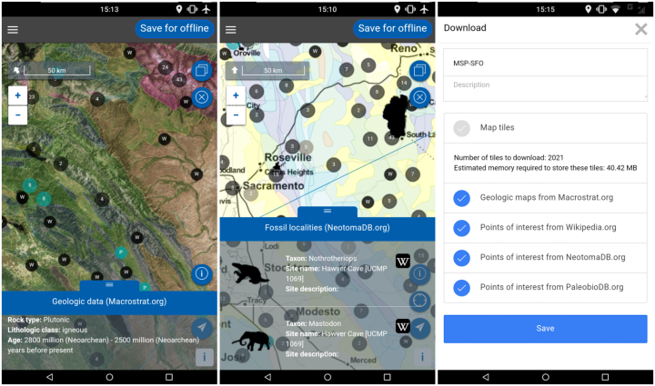
Before your next flight, road trip, or hike, download the Flyover Country app available for Android and iPhone. The app tells you information about where you are at any given moment, or if you’re flying, the ground beneath.
The app exposes interactive geologic maps from Macrostrat.org, fossil localities from Neotomadb.org and Paleobiodb.org, core sample localities from LacCore.org, Wikipedia articles, offline base maps, and the user’s current GPS determined location, altitude, speed, and heading. The app analyzes a given flight path and caches relevant map data and points of interest (POI), and displays these data during the flight, without in flight wifi.
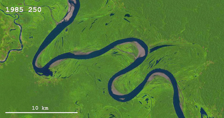
Sedimentary geologist Zoltan Sylvester downloaded Landsat data using Earth Explorer and strung together images of the Ucayali River to see the changes over thirty years.
Thanks to the Landsat program and Google Earth Engine, it is possible now to explore how the surface of the Earth has been changing through the last thirty years or so. Besides the obvious issues of interest, like changes in vegetation, the spread of cities, and the melting of glaciers, it is also possible to look at how rivers change their courses through time.
Yeah, I’m gonna have to look at other areas of the world now. Brb.

We know when people usually get married. We know who never marries. Finally, it’s time to look at the other side: divorce and remarriage.
Data checking is a pain and can be what stands between you and a good analysis or visualization session. Data Proofer aims to take away some of the pain by automating some of the process.
Every day, more and more data is created. Journalists, analysts, and data visualizers turn that data into stories and insights.
But before you can make use of any data, you need to know if it’s reliable. Is it weird? Is it clean? Can I use it to write or make a viz?
This used to be a long manual process, using valuable time and introducing the possibility for human error. People can’t always spot every mistake every time, no matter how hard they try.
Data proofer is built to automate this process of checking a dataset for errors or potential mistakes.
Gonna have to take this out for a spin.
 Visualize This: The FlowingData Guide to Design, Visualization, and Statistics (2nd Edition)
New tools, refined process.


