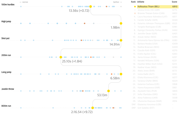
The Guardian covered the rankings for the women’s heptathlon, specifically how Nafissatou Thiam from Belgium pulled off a surprise gold.
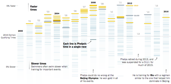
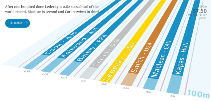
The main chart is a variant of a parallel coordinates plot. However, the chart type, which is usually read left to right, is rotated for vertical reading, and instead of straight connecting lines, a path of right angles is used instead. Nice. [Thanks, Matthew]


 Visualize This: The FlowingData Guide to Design, Visualization, and Statistics (2nd Edition)


