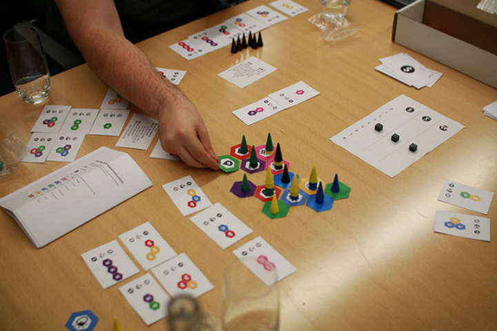
• Membership
  • Newsletter
  • Projects
  • Learning
  • About
  • Member Login
  • Coastline across the ocean, from where you’re standing

    March 25, 2016

    Topic

    Maps  /  Andy Woodruff, coastline

    A couple of years ago, Eric Odenheimer wondered: If you stand on the beach looking out to the ocean and traveled straight until you reach land, what country would you reach? He only used latitude though. However, in real life, coastline is jagged and points in all directions, so you don’t always face east and west. Cartographer Andy Woodruff took these directions into account and drew a more accurate picture.
    Read More

  • Stephen Curry statistical dominance

    March 25, 2016

    Topic

    Statistics  /  basketball, Stephen Curry

    Robert O’Connell for the Atlantic ponders basketball analytics and the rise of Stephen Curry.

    Like every sport, basketball has recently undergone a statistical overhaul. A new generation of analysts has pored over the game and come to conclusions about the efficacy of certain players and techniques. Their findings have met mixed acceptance from the old guard of coaches and executives, but at least one of their takeaways is now visible every night in the NBA. The three-point shot, for much of its history a novelty or minor part of teams’ strategies, has become an essential component of almost every team’s offensive attack. As recently as 2012, the average team took about 1,200 threes over the course of a season; last year, that number ballooned to over 1,800.

    The difference between the Golden State Warriors and most other teams is that the shots go in, often in spectacular fashion. For this 2015-16 season, the Warriors put up more threes than anyone, but they made 41.5 percent of them so far, whereas everyone else is below 40.

  • Visualization Books in the Queue

    March 24, 2016

    Topic

    Site News  /  books

    I don’t read visualization books nearly as much as I wish I did, but there are a handful I keep on the shelf for a rainy day, which until recently was basically never here in California. I updated the books page to show some of my favorites.

    I also added a few books in my queue that I hope to get to one day. Two are new visualization books that I heard good things about, one is an introduction to statistics (mostly for teaching reasons), and the last is a not-so-new one on design.

    By the way, the statistics textbook is available for free as a PDF download.

  • Weather data basket weaving

    March 23, 2016

    Topic

    Data Art  /  weather, weaving

    “Weather data is this endless box of LEGO pieces that arise every day. It’s always a different box.” Sculptor Nathalie Miebach makes these ornate baskets based on weather data.

  • Guides  /  base graphics, ggplot2, R

    Comparing ggplot2 and R Base Graphics

    Figure out which is best with a side-by-side comparison.

    Read More
  • Tarot cards for complex network concepts

    March 21, 2016

    Topic

    Network Visualization  /  illustration, tarot

    Peter Dodds teaches a course on complex networks, and he put together a set of tarot cards to illustrate concepts. Fun.

    P.S. You can also watch the entire lecture series on YouTube.

  • Regional news coverage around the world

    March 18, 2016

    Topic

    Maps  /  Google, news

    Popular news topics change depending on where you are, as what’s important to some isn’t so important to others. Unfiltered.news from Google’s Jigsaw team shows what’s covered everywhere.

    Every day, tens of thousands of publishers report the news world wide. Unfiltered News allows you to explore Google News data across all publishing languages and locations to find important global stories and perspectives that may not be covered in your location. Discover which locations report on similar topics, compare different perspectives on an issue, and track issue coverage over time.

  • Counting the numbers in the news

    March 17, 2016

    Topic

    Data Art  /  natural language, NPR

    Truth & Quantity by Gregor Hochmuth is what happens when you strip out all context from an NPR newscast and only look at the numbers.

    Every day at 8am and 8pm, Truth & Quantity transcribes NPR’s hourly news update using speech recognition & natural language analysis. It then selects all plural nouns from the news script and generates two compilations: one for each month (going back to 2009) and another for various quantities, such as all instances of “7” or “100 million.”

    Click on any number to get more of a sentence.

    Good stuff. Find out more here.

  • How people read books

    March 16, 2016

    Topic

    Statistical Visualization  /  Jellybooks, New York Times, reading

    Jellybooks is an analytics company that evaluates how people read book, in a similar fashion in how a company like Netflix evaluates how customers watch shows.
    Read More

  • Adding Legends in R

    Make sure you explain your visual encodings so that others can interpret them.

  • Greater access to clean water

    March 15, 2016

    Topic

    Statistical Visualization  /  bestiario, National Geographic, water

    National Geographic, in collaboration with Bestiario, looks at the improving accessibility to clean water around the world.

    In 1990, as part of the Millennium Development Goals, the UN set a target to halve the proportion of people without access to safe drinking water. The world hit this goal in 2010, and as of 2015, some 90 percent of the world’s people now have access to “improved” water—water from sources such as pipes or wells that are protected from contamination, primarily fecal matter.

    There’s still a lot of work to do though. In some places, such as Haiti and Mongolia, conditions worsened from a percentage perspective and about of third of the populations still don’t have access.

  • Simulation shows why polls don’t always match future results

    March 14, 2016

    Topic

    Infographics  /  polling, simulation, uncertainty

    With election season in full swing, as far as the news is concerned at least, we get to see poll after poll in the beginning of a voting day and then reports the next day about which ones were wrong. Based on the news alone, it feels like almost every poll is just plain wrong. Maarten Lambrechts shows what’s going on here with Rock ‘n Poll. It simulates a poll and then multiple polls, showing how small differences in the numbers can seem like a lot once the voting results come in.

  • Moving to the “worst” place in America

    March 11, 2016

    Topic

    Statistics  /  ranking

    In 1999, the Department of Agriculture published a Natural Amenities Scale that took into account “six measures of climate, topography, and water area” to help identify desirable places to live for most people.

    More recently, Christopher Ingraham for the Washington Post took a quick look at the data, and declared Red Lake County the “worst” place to live in America. That’s when it got interesting. Life in a metro area started to wear.
    Read More

  • Evolving graphics department at the New York Times

    March 11, 2016

    Topic

    News  /  New York Times

    Ken Doctor for Nieman Lab had a chat with Steve Duenes from the New York Times about the evolving, top-notch graphics department.

    Fifteen or twenty years ago, Graphics was more of a service desk. It’s not a service desk anymore. The graphics department is really a news desk and works in parallel with the other news desks like Metro and National and International.

    These days graphics are often the main part of the story, if not the entire thing.

    I feel like a few years ago, media took a hard swing towards the visual, and then a little bit after took a short swing back to words. Now things seem to be balancing out. I’m curious what it looks like another twenty years from now (as I selfishly wonder if FlowingData looks anything like its current self).

  • Data Underload  /  marriage

    Never Been Married

    Some people never get married, and some wait longer than others. Let’s look at these people.

    Read More
  • Basketball shot charts, make your own

    March 9, 2016

    Topic

    Statistical Visualization  /  basketball, shot chart

    Based on data from the NBA stats API and using the visual layout popularized by Kirk Goldsberry, Todd Schneider gives you BallR, made with R and Shiny.

    BallR lets you select a player and season, then creates a customizable chart that shows shot patterns across the court. Additionally, it calculates aggregate statistics like field goal percentage and points per shot attempt, and compares the selected player to league averages at different areas of the court.

    Fun.

    The best part though is that Schneider made the code available on GitHub. See how it was done or roll your own.

  • Guides  /  tools

    What I Use to Visualize Data

    “What tool should I learn? ” I hesitate to answer, because I use what works best for me, which isn’t necessarily the best for someone else or the “best” overall. Nevertheless, here’s my toolset.

    Read More
  • Page 182 of 392
  • <
  • 1
  • ...
  • 179
  • 180
  • 181
  • 182
  • 183
  • 184
  • ...
  • 392
  • >

Analyze, visualize, and communicate data usefully, beyond the defaults.

Become a member →

Recently for Members

May 8, 2025
When the data is not what it seems

May 1, 2025
Finding the Right Charts

April 24, 2025
Visualization Tools, Datasets, and Resources – April 2025 Roundup

April 17, 2025
Breaking Out of Chart Software Defaults

April 15, 2025
Line Chart with Decorative Neon Accents

Browse by Chart Type See All →

Small Multiples Density Plot Baseline Chart Voronoi Diagram Streamgraph Dot Plot Network Graph Moving Bubbles Mosaic Plot Step Chart

Browse By Topic

  • Visualization

    Seeing data

  • Maps

    Seeing geographic data

  • Infographics

    Explaining data

  • Networks

    Connecting data

  • Statistics

    Analyzing data

  • Software

    Working with data

  • Sources

    Getting data

  • Design

    Making data readable

Get the Book

Visualize This: The FlowingData Guide to Design, Visualization, and Statistics

Available now.

Order: Amazon / Bookshop

Made by FlowingData

  • The Process

  • Data Underload

  • Chart Everything

  • Guides

  • Books

  • Shop

  • About
  • Contact
  • Newsletter
  • LinkedIn
  • Instagram
  • Bluesky
  • RSS
Copyright © 2007-Present FlowingData. All rights reserved.