Make a Moving Bubbles Chart to Show Clustering and Distributions
Use a force-directed graph to form a collection of bubbles and move them around based on data.
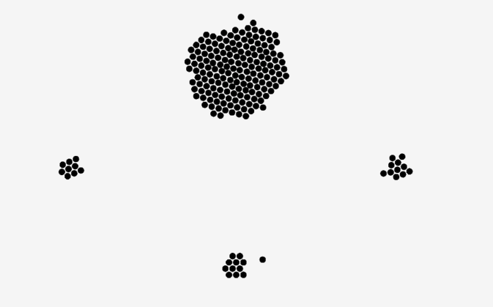
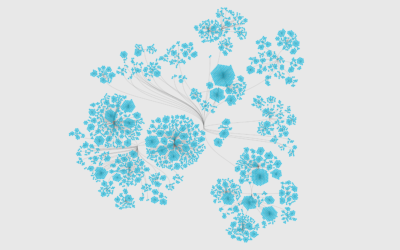
I’ve been playing around with moving bubbles lately. While they are perhaps not the most perceptually accurate way to show data, they do seem to help a lot of people grab on to the concept of distributions and how individual items, things, and events can add up to a bigger picture.
I used it show the simulated days of 1,000 people, household types in America, and even used them in lieu of histograms to show income distributions.
To access this full tutorial, you must be a member. (If you are already a member, log in here.)
Get instant access to this tutorial and hundreds more, plus courses, guides, and additional resources.
Membership
You will get unlimited access to step-by-step visualization courses and tutorials for insight and presentation — all while supporting an independent site. Files and data are included so that you can more easily apply what you learn in your own work.
Learn to make great charts that are beautiful and useful.
Members also receive a weekly newsletter, The Process. Keep up-to-date on visualization tools, the rules, and the guidelines and how they all work together in practice.
See samples of everything you gain access to:
About the Author
Nathan Yau is a statistician who works primarily with visualization. He earned his PhD in statistics from UCLA, is the author of two best-selling books — Data Points and Visualize This — and runs FlowingData. Introvert. Likes food. Likes beer.