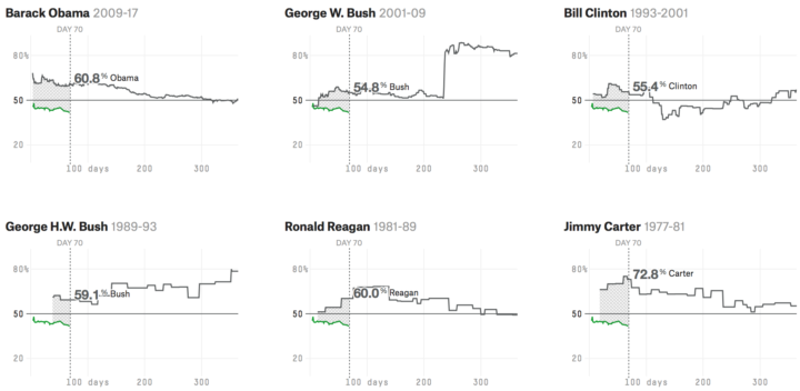
Missing data is everywhere. Or, I guess technically it’s nowhere. You know what I mean. Missing data is common, especially with temporal data over long periods of time. Just look at country-level estimates for anything over ten years, and you’ll understand. Peter Beshai for Bocoup provides five solutions for line charts with missing data, using d3.js.
-
This is what happens when there is a disconnect between data and what it represents. So much wrong.
Read More -
A challenge of using geographic maps to show data is that larger regions inevitably get more visual real estate. Cartograms try to solve this problem by sizing regions by the data instead of land mass. Tilegrams by Pitch Interactive makes it easy to construct tiled versions at the US state level.
Upload your data, adjust the resolution to your liking, and export for your own purposes. Nice.
-
In case you didn’t know, there’s a drought here in California so there are rules for when you can and can’t water your grass and plants. Not everyone adheres to those rules though. And some households really don’t follow the rules. In Los Angeles, or more specifically, Bel Air, there are a handful of households using millions of gallons per year. Michael Corey and Lance Williams for Reveal used satellite data to guess which ones.
I mainly share this though for the title of their post that explains how they did it: Now this is a story all about how we found the Wet Princes of Bel Air. Genius.
-
Nate Cohn for the Upshot provides a statistics lesson in the context of election forecasts and why they differ so much.
[P]ollsters make a series of decisions when designing their survey, from determining likely voters to adjusting their respondents to match the demographics of the electorate. These decisions are hard. They usually take place behind the scenes, and they can make a huge difference.
To make the point, the Upshot gave four pollers the same raw data to interpret. Results varied.
-
In a 2005 paper “If I look at the mass I will never act”: Psychic numbing and genocide, Paul Slovic discusses big numbers, how we perceive them as they increase, and the importance of designing for our emotional and analytical systems.
[W]e are incapable of feeling the humanity behind the number 1,198,500,000. The circuitry in our brain is not up to this task. This same incapacity is echoed by Nobel prize winning biochemist Albert Szent Gyorgi as he struggles to comprehend the possible consequences of nuclear war: “I am deeply moved if I see one man suffering and would risk my life for him. Then I talk impersonally about the possible pulverization of our big cities, with a hundred million dead. I am unable to multiply one man’s suffering by a hundred million.”
Chris Jordan’s work immediately comes to mind.
This of course is in the context of individual numbers. What does 100 look like? What does a billion look like? It soon gets more complicated when you try to compare a lot of big numbers or small numbers against big numbers. Our brains are weird things, and we must accommodate.
-
In a collaborative effort, the Geena Davis Institute on Gender in Media computed screen time for men and women algorithmically, in contrast to the more crude measurement of script lines. Key findings:
Male characters received two times the amount of screen time as female characters in 2015 (28.5% compared to 16.0%).
When a film has a male lead, this gender gap is even wider, with male characters appearing on screen nearly three times more often than female characters (34.5% compared to 12.9%).
In films with a female lead, male characters appear about the same amount of time as female characters (24.0% compared to 22.6%). This means that even when women are featured in a leading role, male characters appear on screen just as often.
Interesting work here. I just wish they included movie names in their charts. It would’ve provided a better connection to the data.
-
Based on 2014 estimates from the U.S. Department of Education, the Chronicle of Higher Education compiled a straightforward searchable and sortable table that shows the race percentages for more than 4,600 institutions.
FYI: The search function is basic, and you have to enter a school’s name to match as it is entered in the system. For example, a search for “Berkeley” only shows the schools that start with that but not University of California at Berkeley. And a search for “University of California” pulls up zero results, because it’s listed as “U. of California.”
-
Horace Mitchell for NASA’s Scientific Visualization Studio mapped the massive drainage basin that is the Mississippi Watershed.
The Mississippi Watershed is the largest drainage basin in North America at 3.2 million square kilometers in area. The USGS has created a database of this area which indicates the direction of waterflow at each point. By assembling these directions into streamflows, it is possible to trace the path of water from every point of the area to the mouth of the Mississippi in the Gulf of Mexico.
Redirect to California, please. Thanks.
-
Jan Willem Tulp, in collaboration with the European Space Agency, produced the ESA Star Mapper. It shows nearly 60,000 stars in a combination of different scales and projections. Be sure to switch to “explore” mode and click on the play button to see a prediction for how the stars will move over many years. [Thanks, Jan]
-
Visualization is complex, but if I were to break it down simply, I’d say it’s something like the process below.
Start with real life, the environment, or the actual phenomenon you want to measure. Collect data to estimate and record, because it can be a challenge to observe things right as they happen. Then visualize the data.
Read More -
Glenn Smith and Andrew Knapp for the Post and Courier investigate the current police practice of keeping digital record of people’s activities.
Law enforcement agencies have for decades used what’s known as field interview or contact cards to document everything from sketchy activity to random encounters with people on the street. But the digital age has greatly expanded the power and reach of this tool, allowing police to store indefinitely reams of data on those who draw their interest — long after any potential link to a crime has evaporated.
As you might expect, there are certainly advantages for law enforcement to have access to such a database when they try to solve crimes. But it gets weird when data is incorrectly recorded or perhaps recorded too much.
-
It keeps getting hotter on this planet, and the oceans are absorbing most of the heat. Tim Wallace for the New York Times shows several decades of changes.
-
In classic xkcd-fashion, Randall Munroe timelines the Earth’s temperature, dating back to 20,000 BCE up to present. Slow changes, slow changes, history, slow changes, still slow changes, and then, oh shoot.
-
Co.Design picked the winners for their annual Innovation by Design Awards. My series on mortality and causes of death won for the graphic design and data visualization category. Very cool.
This year’s entries represented an astonishingly strong survey of innovation around the globe—over 1,700 designs. In the eyes of our esteemed judges, the projects you’ll find below were the best of the best. There were only 15 winners anointed in the entire competition; we also crowned about 231 finalists. Each of those projects represent what’s best about design today: Big ideas, meticulously thought-out details, and a clear viewpoint about how we live now—and how it could be better. We hope that you’ll dig in and be inspired.
-
Scientists at Harvard University setup the MEGA-plate, essentially a giant petri dish, with varying levels of antibiotic. Then they let the bacteria have a go, and you can see the bacteria actually evolve. Ed Yong for the Atlantic:
What you’re seeing in the movie is a vivid depiction of a very real problem. Disease-causing bacteria and other microbes are increasingly evolving to resist our drugs; by 2050, these impervious infections could potentially kill ten million people a year. The problem of drug-resistant infections is terrifying but also abstract; by their nature, microbes are invisible to the naked eye, and the process by which they defy our drugs is even harder to visualise.
Until you watch the video, that is.
-
Here’s a fun one from the Guardian. They go over the change in political landscape, leading in with a map that shows states flip around like cards each election cycle.
Relying on the same handful of states to decide the outcome of presidential elections is a fairly recent phenomenon. Just three decades ago, when politics weren’t yet so polarized, all 50 states were up for grabs, swinging between parties from one election to the next.
-
There is a ton of election-related data pushed out every day, so much it’s hard to keep track. ProPublica provides the Election DataBot to help bubble up the more interesting data points.
Today ProPublica is launching a new tool, created in partnership with the Google News Lab, that makes it easier for journalists, researchers and citizens to quickly find newsworthy information about the presidential race and congressional campaigns in their states. We’re calling it the Election DataBot because it collects huge amounts of data and reports the most interesting details, in real time — details about campaign finance filings, congressional votes, polls and Google Trends data, among other things.
Probably the best part is that you can quickly filter down to your state and election race. See what your representatives are doing and what’s trending.
-
Serena Williams, who plays tonight in the U.S. Open semifinal, might be the greatest tennis player of all time. Kyle Kim for the Los Angeles Times provides a numbers rundown to make the case.