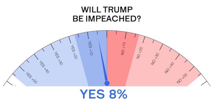
• Membership
  • Newsletter
  • Projects
  • Learning
  • About
  • Member Login
  • Transitioning Map, Part 3: Animate Change Over Time

    How to make a bunch of maps and string them together to show change.

  • Visual connections between art pieces

    November 16, 2016

    Topic

    Data Art  /  art, Google, machine learning, vision

    This is neat. A Google Arts & Culture Experiment, X Degrees of Separation shows a path of visual connections between two art pieces of your choosing. It’s like Six Degrees of Kevin Bacon but with art, computer vision, and machine learning.

  • Google A.I. Experiments

    November 16, 2016

    Topic

    Statistics  /  artificial intelligence, Google

    In an effort to get people more interested in and to learn about artificial intelligence, Google just launched A.I. Experiments to showcase the technology in fun ways.

    With all the exciting A.I. stuff happening, there are lots of people eager to start tinkering with machine learning technology. A.I. Experiments is a showcase for simple experiments that let anyone play with this technology in hands-on ways, through pictures, drawings, language, music, and more.

    You can also download the code for each project and have a go yourself.

  • Glow map

    November 15, 2016

    Topic

    Design  /  cartography, glowing, John Nelson

    John Nelson has a knack for making maps that glow, where the base map serves as a dark backdrop and the data of interest sort of lights up. In a recent talk, he calls it Firefly Cartography and explains its use in presentation and in education.

    A firefly map is to regular thematic maps the way that a lightsaber is to swords. Thematic layers that look like they are etched with white hot plasma tend to draw eyeballs and provide a sense of intensity that solid Boolean symbology just doesn’t offer. I think we are wired to notice and note things that glow. Whether it is marking time by the sun or moon, staring into embers, watching for nighttime travelers by the open flame they carry, or noting the churned phosphorescence of the sea, we historically have done well to note the things that glow.

    I suspect firefly charts would be equally expressive.

  • Showing uncertainty during the live election forecast

    November 15, 2016

    Topic

    Statistical Visualization  /  election, New York Times, uncertainty

    During the election, The New York Times showed a live gauge to show the current forecast for Clinton and Trump. It moved to show a 25th to 75th percentile band of uncertainty:

    Jittery gauge

    A lot of people didn’t get it, and it seemed to upset plenty of people too. Gregor Aisch, an NYT graphics editor, explains what they tried to accomplish with the gauges.
    Read More

  • Generate color palettes automatically

    November 14, 2016

    Topic

    Apps  /  color

    Default color schemes are often horrible, but spending a lot of time putting together color schemes when you don’t have a lot of minutes is also horrible. I Want Hue by Mathieu Jacomy at the Sciences-Po Medialab lets you set a few options, and it spits out a palette for your visualization.

  • Data Sketches, a monthly visualization matchup

    November 11, 2016

    Topic

    Data Art  /  collaboration, contrast

    Data Sketches, a collaboration between Nadieh Bremer and Shirley Wu, aims to visualize a monthly topic in two different ways.

    Each month, we choose a topic and aim to have a visualization completed by the end of the month. Within the topic, we’re free to do whatever we want; a perfect opportunity to create, experiment, and have fun. The collaboration also gives us an encouraging sounding board, and a motivating pressure: a mutual reluctance of letting the other down.

    They’re four months into the project with some fun results, and it’s a good example of how similar things can be shown in very different ways.

  • Guides  /  datasets, resources

    Resources to Find the Data You Need, 2016 Edition

    This is an update to the guide I wrote in 2009, which as it turns out, is now mostly outdated. So, 2016. Here we go.

    Read More
  • Transitioning Map, Part 2: Refining the Format and Layout

    How to make a more readable and more visually accurate map, before you dive into the big transitions.

  • Peaks and valleys of presidential support

    November 9, 2016

    Topic

    Maps  /  election, Washington Post

    This is some fine map work by Lazaro Gamio and Dan Keating for the Washington Post. It shows total votes and margin of victory for each county with a peaks and valleys metaphor. Taller means more votes, and wider means greater margin. The Post rotated the United States map so that the east coast is on top and the west coast is on the bottom, which allows for scrollability and provides more space horizontally to show margins.

    Nice.

  • Randomness of scientific impact

    November 9, 2016

    Topic

    Statistical Visualization  /  randomness, science

    A group of researchers wondered if there was a trend or predictability for when a scientist’s most impactful work came about. It’s random.
    Read More

  • Together

    November 9, 2016

    Topic

    Sketchbook

    Here we go.

  • Textured SVG patterns in JavaScript

    November 8, 2016

    Topic

    Coding  /  fills, JavaScript, patterns

    In case you didn’t get the memo, pattern fills are back and so hot right now. In the category of new-to-me, Textures.js by Riccardo Scalco is a JavaScript library that makes adding lines and dots in place of boring solid colors a trivial task.

  • Nuclear war is on the ballot

    November 7, 2016

    Topic

    Infographics  /  election, nuclear

    [arve url=”https://youtu.be/Fqo5xPDCts8″]

    Neil Halloran, creator of the interactive World War II documentary focused on deaths, is working on another focused on the cost of nuclear war. With the election tomorrow, Halloran pushed out an “election cut” to highlight what’s at stake. Very scary.

  • Newspaper endorsements since 1980

    November 7, 2016

    Topic

    Data Sources  /  election, endorsement, newspaper

    Noah Veltman put together a history of newspapers’ presidential endorsements since 1980 for about 100 publications. There’s a simple table showing Republican, Democrat, or other endorsement over the years, and you can download the data too.

  • Majority minorities

    November 5, 2016

    Topic

    Sketchbook  /  animation, population, R, race

    We saw the changing percentage of white people in the United States and how whites are not the majority in a lot of places. Who is the majority in these areas? Here’s a breakdown for the main three races that make up majorities.
    Read More

  • Percentage of white people

    November 4, 2016

    Topic

    Sketchbook  /  animation, population, race

    Below is the estimated percentage of white population in the United States from 1970 to 2010, based on data from the Census Bureau and made more accessible by NHGIS. I like the evaporative quality coming up in the southwest.

    white-people

    Mostly though, this is just me trying out a new toy, and the form fascinates me at the moment.

    Members: I’m working on a set of tutorials for how to make these. There are a few steps involved, so I’m breaking it down to make it more digestible. Part 1 is here.

  • All the ways to map election results

    November 3, 2016

    Topic

    Maps  /  election, New York Times

    Every election, there’s a slew of election maps that come in all shapes and sizes. The maps have evolved with the web, the amount of data available, and the level of reader interest, and it’s about finding a balance between the new and what works. To see the evolution, you can look to The New York Times portfolio over the decades. The Upshot has the rundown.

  • Data Underload  /  America, population

    Two Centuries of Population, Animated

    A visual history of a growing United States.

    Read More
  • Impact of Obamacare in maps

    November 1, 2016

    Topic

    Maps  /  insurance, Upshot

    It’s been three years since the Affordable Health Care Act. Margot Sanger-Katz and Quoctrung Bui for The Upshot look at how this changed the percentage of those who were uninsured in this country. In some places the percentages didn’t change much, but in many others, there are much fewer uninsured.

  • Page 171 of 392
  • <
  • 1
  • ...
  • 168
  • 169
  • 170
  • 171
  • 172
  • 173
  • ...
  • 392
  • >

Analyze, visualize, and communicate data usefully, beyond the defaults.

Become a member →

Recently for Members

May 15, 2025
Step Chart, Enhanced

May 8, 2025
When the data is not what it seems

May 1, 2025
Finding the Right Charts

April 24, 2025
Visualization Tools, Datasets, and Resources – April 2025 Roundup

April 17, 2025
Breaking Out of Chart Software Defaults

Get the Book

Visualize This: The FlowingData Guide to Design, Visualization, and Statistics

Available now.

Order: Amazon / Bookshop

Browse by Chart Type See All →

Square Pie Chart Ternary Plot Dot Map Sankey Diagram Pie Chart Spike Map Timeline Parallel Sets Slope Chart Bump Chart

Browse By Topic

  • Visualization

    Seeing data

  • Maps

    Seeing geographic data

  • Infographics

    Explaining data

  • Networks

    Connecting data

  • Statistics

    Analyzing data

  • Software

    Working with data

  • Sources

    Getting data

  • Design

    Making data readable

Made by FlowingData

  • The Process

  • Data Underload

  • Chart Everything

  • Guides

  • Books

  • Shop

  • About
  • Contact
  • Newsletter
  • LinkedIn
  • Instagram
  • Bluesky
  • RSS
Copyright © 2007-Present FlowingData. All rights reserved.