Jer Thorp visualized 10,151 species of birds as feathers, with colors based on specifications extracted from Wikipedia.
This would look great as a big poster on your wall. Thorp also made versions with just hummingbirds, parrots, and passerines.
Jer Thorp visualized 10,151 species of birds as feathers, with colors based on specifications extracted from Wikipedia.
This would look great as a big poster on your wall. Thorp also made versions with just hummingbirds, parrots, and passerines.

At the beginning of this year, most people probably had little awareness or had even heard of tariffs. That changed quickly with the start of the current administration. For the New York Times, Lazaro Gamio, Keith Collins, and Ana Swanson show the big shifts, which have varied widely by country.
The layers in the series of stacked area charts are mostly minding their own business pre-inauguration, and then suddenly they are not.

The U.S. is buying a lot less from China this year, but China has found more business just about everywhere else in the world. For the New York Times, Agnes Chang and Daisuke Wakabayashi have the charts.
China has offset the decline from America with breathtaking speed. Shipments to other parts of the world have surged this year, demonstrating that China’s manufacturing dominance will not be easily slowed. Chinese exports are on track to reach another record this year.
That’s because China was prepared. It has been seeking out new customers for years, and its massive manufacturing investment allows it to sell goods at low prices.

This week is about highlighting differences and visualizing characteristics over the data itself.

The administration aims to make it harder to claim disability insurance. Eli Hager, reporting for ProPublica, describes why that will hit states differently.
These changes would fall disproportionately on some of Trump’s most loyal supporters in red states. Most affected would be 50- to 60-year-olds without a high school or college education who have, for decades, toiled in physically grueling jobs, including coal mining, logging, and factory and construction work. The five states where the highest proportions of people rely on these benefits are West Virginia, Arkansas, Kentucky, Mississippi and Alabama. Unlike New York, California and a few others, these states do not have their own disability insurance programs for workers to turn to amid federal cuts.

In May, NOAA’s disaster database was canceled because it is related to climate. Climate Central has resurrected the project. Sophie Hurwitz for Grist reports:
Last week, Climate Central resurrected one of the most prominent of those lost records: the National Oceanic and Atmospheric Administration’s billion-dollar disaster database. The tool allowed policymakers, insurers, and regular people to track how hurricanes, floods, and other catastrophes are growing more expensive — until the agency said in May that it would no longer update the database “in alignment with evolving priorities, statutory mandates, and staffing changes.” The move was part of the administration’s broader effort to roll back climate action and push more of the cost of disaster monitoring and response on to states.
Access the database here. I hope more organizations can follow suit.

Women and men tend to spend their days differently in the United States. Varying responsibilities and priorities will do that.

Peter Oppenheimer, the chief global equity strategist for Goldman Sachs, points to the ratio of stock price to earnings (P/E ratio) of current major tech stocks compared against the ratios of stocks during past bubble bursts. Financial Times uses a variable width bar chart to show the difference.
Besides the meme-ish Tesla stock, the rest (of the Magnificent 7) seem low in comparison. If you’re looking for a sign that there’s more room for the bubble to grow, this would be it.
On the other hand, we talk in trillions of dollars now for these giant corporations while other areas of the economy seem less great. So use that information as you like.

For the Washington Post, Travis M. Andrews, Jeremy B. Merrill, and Shelly Tan with the analysis:
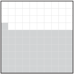
According to the spending data, drawn from 40 million credit and debit cards analyzed by the consumer data and analytics company Consumer Edge, less than half as much money was spent on tickets in September and the first half of October 2025 as during that same period in 2024. This is less than people spent on the center during any other year since 2018, except 2020, when the venue was locked down for most of the year.
Nice touch with the square pies as seats. That’s a lot of empties.

During the Camp Mystic flooding, radio communication issues may have contributed to the death of 25 children. For the New York Times, Mike Baker, Danny Hakim, and Blacki Migliozzi report on the problems, even though the radio communication system was recently overhauled by Motorola Solutions through a $7m contract.
The nonprofit utility Lower Colorado River Authority had put in a proposal for a cheaper and more complete system, but lost the bid to Motorola. The map above, based on an NYT analysis, shows the difference in coverages between the two bidders.

The Community Geography Lab in Ohio organized a mapping project for Kent residents to map historical Census data:
This map was created working closely with South End residents, including three mapping workshops in Summer 2025 where folks could research the history of their homes and print 3D houses to add to the map. These houses were designed using the open source software program Blender to approximate the houses that were there in the decades shown on the map. Their location was estimated using Sanborn Maps, and their style is primarily identified using houses that exist today. Houses that no longer exist are signified with a generic monopoly-style house.
This seems fun. I kind of want a giant cork board and a big box of thumbtacks now.

Based on estimates from health research group KFF, Margot Sanger-Katz and Alicia Parlapiano, for NYT’s the Upshot, show how much premiums rise if there is no tax subsidy extension. It varies by location, income, and age, with monthly premiums going up by more than $1,000 dollars in some places for older folks.
Democrats want an extension now. Republicans say they’ll discuss when the government reopens. Until they can agree, the government shutdown continues.
For Bloomberg, Jarrell Dillard and Michael Sasso report on the effects of the government shutdown on federal data.
BLS collects the prices of around 80,000 items over three 10-day periods each month; most are still gathered manually in person. The agency was able to release the September CPI report on Oct. 24, more than a week later than scheduled, after recalling staff to prepare it so that the Social Security Administration could tally its annual cost-of-living adjustment.
Economists generally weren’t concerned about the quality of the September inflation report because data collection was done before the government closed. But the fate of the October report, which normally would be released on Nov. 13, is up in the air. BLS hasn’t been able to collect new price information since the shutdown began, and a White House-affiliated X account said on Oct. 24 that “there will likely NOT be an inflation release next month for the first time in history.”
It does not seem like a great idea to cut off the data supply during these uncertain times, but maybe that’s what some people want.
Todd Feathers, for Wired, reports on Alpha School, an education system for children that emphasizes software and optimizing metrics over giving a nine-year-old a snack.
But in interviews with WIRED, more than a dozen former employees, students, and parents say what they expected from Alpha School wasn’t what it delivered. Former “guides” from different campuses, many of whom requested anonymity because they fear negative consequences, say Alpha’s educational philosophy was driven by software metrics and, sometimes, Liemandt’s whims. One guide said they believed Alpha wanted to prepare students for a hypercompetitive “late capitalism, dog-eat-dog” environment. Parents like Kristine Barrios say the school impacted their children, left them with glaring gaps in their education, and is now using them to sell a story of success. “They set her up for failure,” Barrios says, and then it felt like “they punished her for failing.”
If you’re going to optimize, you better make sure you’re adjusting for the right things.

This is the good stuff for October.

Alina Birjuk collected croissants around the city:
I got a push into starting the project by getting inspired with an exhibition in ZHdK by Tulio Bühler. He made ceramic shapes from croissants he found in Zürich. That made me see how one “simple” thing can be so different. I wanted to take a closer look and give some light to croissants of Zürich. Every bakery has its own way, recipe and it’s own handwriting. So I went to as many bakeries as I could and here is what I found.
Joys in the everyday is my favorite kind of personal data collection.
NBA basketball players, most notably Terry Rozier, were arrested for illegal sports betting. Rozier allegedly told associates that he would underperform during a game that he sat out of early. The associates made outlier bets that triggered cheating detection systems. Dian Zhang and Ignacio Calderon, for USA Today, reported on the usage of statistical models:
“When you do the odds compiling, you have a predicted model for how you expect the game to go,” said Chris Rasmussen, who teaches sports integrity at the University of New Haven and has spent years investigating sports betting fraud for the World Lotteries Association.
Based on the data behind the teams and players in the game, the model expects certain points for those players and predicts “expected behaviors.” When real-world betting behavior starts to deviate from the model’s prediction, that’s when “we are starting to look,” Rasmussen explained. “Why does it deviate, and how much does it deviate, and what’s going on?”
The key is to figure out regular betting patterns and deviate within reason. Avoid the outlier stuff, because of course a concentrated set of bets for a few hundred thousand are going to trigger the systems.
These people need a data guy. Or maybe the good cheaters already have a data guy, and that’s why no one hears about them. See? Math is useful.
Science Friday had mathematician Paulina Rowińska as guest to talk maps.
It’s easy to take maps for granted. After all, most of us have a pretty good map in our pockets at all times, ready to show us how to get anywhere on the globe. But to make a map useful, you have to decide what to keep in and what to leave out—and, most importantly, which mathematical equations to use. Beyond navigating from point A to point B, math and maps come together for a wide variety of things, like working out the most efficient route to deliver packages, calculating the depth of the ocean floor, and more.

Various shields are designed to block specific forces or mechanisms. For example, armor is good at blocking swords and shark cages are good at protecting divers from sharks. You’ve probably wondered, as most people have, how these shields work against forces they are not designed for. xkcd has a pairwise matrix for you.

As fashion changes, so do the colors used each season. Sarah Constantin likes to count the color usage every year in Vogue Magazine’s ready-to-wear collections. Pastels (and red) are so hot right now.
 Visualize This: The FlowingData Guide to Design, Visualization, and Statistics (2nd Edition)
New tools, refined process.