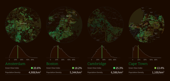
Treepedia, from the MIT Senseable City Lab, estimates perceived tree cover at the street level. They used panorama views from Google Street View to form a “Green View Index”, which they then mapped for major cities.
Treepedia measures the canopy cover in cities. Rather than count the individual number of trees, we’ve developed a scaleable and universally applicable method by analyzing the amount of green perceived while walking down the street. The visualization maps street-level perception only, so your favorite parks aren’t included! Presented here is preliminary selection of global cities.
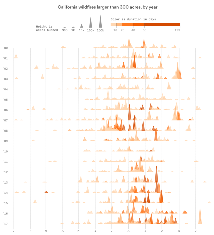
 Fire spread over Los Angeles, but the famous art works in the Getty Center stayed put. John Schwartz and Guilbert Gates


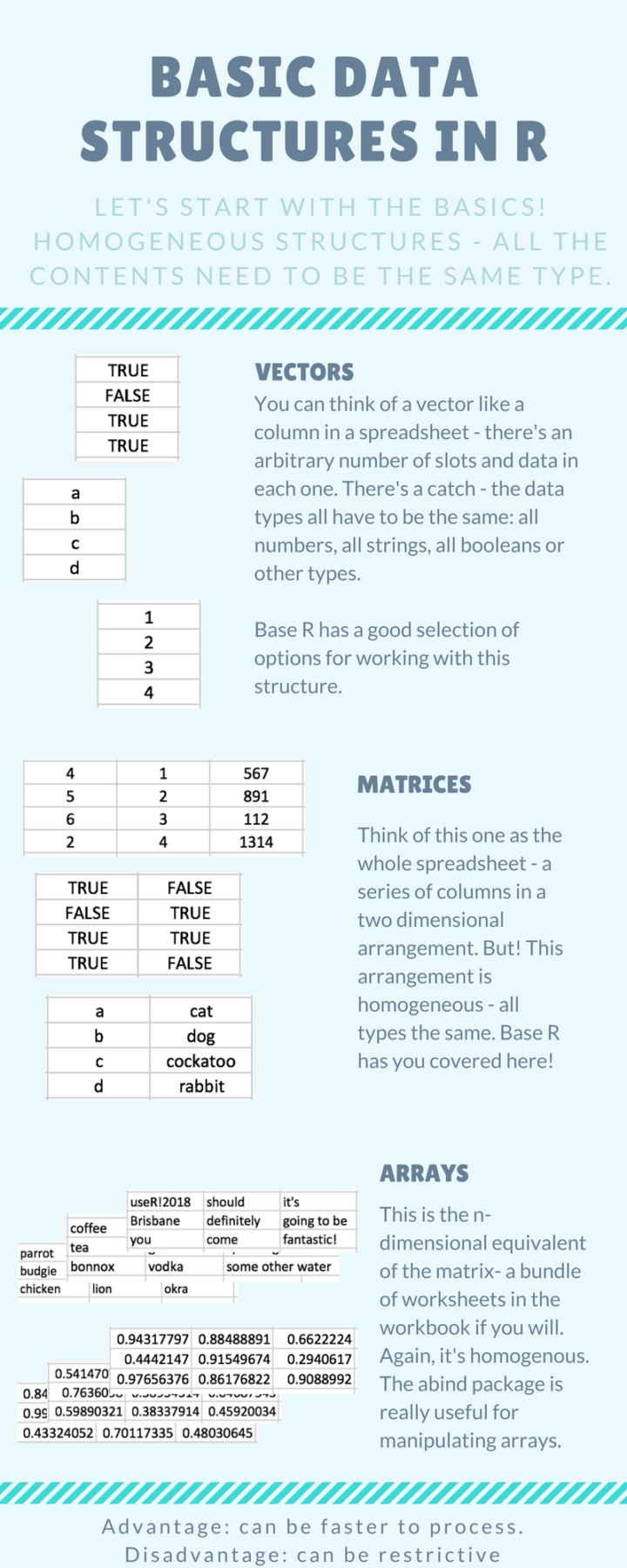 Introducing yourself to R as an Excel user can be tricky, especially when you don’t have much programming experience. It requires that you switch from one mental model of the data that exists in an interactive spreadsheet to one that exists in vectors and lists. Steph de Silva provides a
  Visualize This: The FlowingData Guide to Design, Visualization, and Statistics (2nd Edition)


