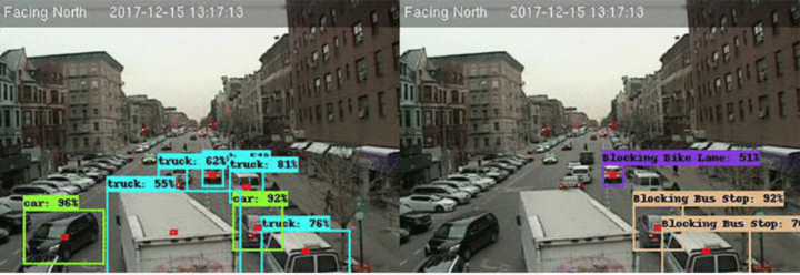
Collective Debate from the MIT Media Lab gauges your moral compass with a survey and then tries to “debate” with you about gender bias using counterpoints from the opposite side of the spectrum. The goal isn’t to be right. Instead, it’s to try to understand the other side. At the end, you see how you compare to others.
-
Getting Started with Network Graphs in R
Add the vertices. Connect them with edges. Repeat as necessary.
-
-
The House Republicans will vote on a tax bill soon that adds about $1.4 trillion to the federal debt. Alicia Parlapiano and Adam Pearce, reporting for The New York Times, look at every change in this scroller.
I like that the visual is kept simple with a two-column, stacked bar chart as the backdrop. The chart provides scale, but the focus in on the text.
-
Generative music comes from the design of a system that produces notes that follow a set of rules. Tero Parviainen provides a detailed, interactive explainer for how this works in practice using ample examples. Take your time with this one.
-
Because you can never have enough time series charts that show increases of CO2 and temperature over decades. By Kevin Pluck:
[arve url=”https://www.youtube.com/watch?v=WEGwCPmELh8″ /]
Differing from the variations we’ve seen before, time is on the circle, and the metrics are on the vertical. Then it rotates for dramatic effect.
See also the the two-dimensional Cartesian version from Bloomberg and the polar coordinate version by Ed Hawkins. There are also plenty more temperature charts. I think after this, we’re set for a while.
-
Photographer Bernhard Lang takes pictures in small planes and helicopters, pointing his camera towards the ground. In the ongoing project Aerial Views, he focuses on patterns and structures, which makes for interesting visuals that you’d miss on the ground.
-
Planet monitors Earth with hundreds of satellites, and after six years, they’ve built out their pipeline to piece together a full image on the daily.
At Planet, we’ve been pursuing Mission 1: to image the entire Earth’s landmass every day. I couldn’t be more excited to announce that we have achieved our founding mission.
Six years ago, our team started in a garage in Cupertino. Mission 1 was the north star: we needed to build the satellites and systems, secure the launches, bring down the data to capture a daily image of the planet at high resolution, and make it easy to access for anyone. It became the heart and soul of our company and guiding light for Planeteers.
-
Josh Katz, Claire Cain Miller, and Kathleen A. Flynn for The Upshot plotted words used in essays above love submitted to The New York Times, focusing on a comparison between men and women’s word usage.
When writing about love, men are more likely to write about sex, and women about marriage. Women write more about feelings, men about actions.
Even as gender roles have merged and same-sex romance has become more accepted, men and women still speak different languages when they talk about love — at least, if Modern Love essays submitted to The New York Times are any indication.
-
Lena Groeger, writing for Source, shifts attention upstream from analysis to the design of forms in the data collection process.
Whether you’re filling out a form or building it yourself, you should be aware that decisions about how to design a form have all kinds of hidden consequences. How you ask a question, the order of questions, the wording and format of the questions, even whether a question is included at all—all affect the final result. Let’s take a look at how.
Census surveys, election ballots, and racial profiling. Oh my.
-
The internet changed how sex workers and clients find each other and how the former does business. Allison Schrager, Christopher Groskopf, and Scott Cunningham, reporting for Quartz, delve into actual numbers using scraped data from The Erotic Review:
Sex work is as old as civilization, but in the past 20 years the market for illegal sex services has undergone a radical transformation thanks to the internet, upending how it is sold and priced. There are now more women selling sex, more overall encounters, and—unlike in many other industries disrupted by the web—higher wages for workers.
Also safer (although still with its inherent risks).
-
Google equipped their Street View cars with air quality sensors and sent them around several California areas.
We’re just beginning to understand what’s possible with this hyper-local information and today, we’re starting to share some of our findings for the three California regions we’ve mapped: the San Francisco Bay Area, Los Angeles, and California’s Central Valley (the Street View cars drove 100,000 miles, over the course of 4,000 hours to collect this data!) Scientists and air quality specialists can use this information to assist local organizations, governments, and regulators in identifying opportunities to achieve greater air quality improvements and solutions.
Maps.
-
How to Make (and Animate) a Circular Time Series Plot in R
Also known as a polar plot, it is usually not the better option over a standard line chart, but in select cases the method can be useful to show cyclical patterns.
-
Using Climate Central sea-level rise estimates, The Guardian plots and maps the potential consequences of a 3.2-degree rise in temperature by 2100.
One of the biggest resulting threats to cities around the world is sea-level rise, caused by the expansion of water at higher temperatures and melting ice sheets on the north and south poles.
Scientists at the non-profit organisation Climate Central estimate that 275 million people worldwide live in areas that will eventually be flooded at 3C of global warming.
-
Brad Plumer and Nadja Popovich reporting for The New York Times:
Under the Paris deal, each country put forward a proposal to curtail its greenhouse-gas emissions between now and 2030. But no major industrialized country is currently on track to fulfill its pledge, according to new data from the Climate Action Tracker. Not the European Union. Not Canada. Not Japan. And not the United States, which under President Trump is still planning to leave the Paris agreement by 2020.
A series of charts shows the path we’re headed, what we need to do to reach the goals of the Paris Agreement, and what we need to keep warming under 2 degrees Celsius above pre-industrial levels.
-
David C. Brock writing for IEEE Spectrum delves into the origins of PowerPoint.
PowerPoint is so ingrained in modern life that the notion of it having a history at all may seem odd. But it does have a very definite lifetime as a commercial product that came onto the scene 30 years ago, in 1987. Remarkably, the founders of the Silicon Valley firm that created PowerPoint did not set out to make presentation software, let alone build a tool that would transform group communication throughout the world. Rather, PowerPoint was a recovery from dashed hopes that pulled a struggling startup back from the brink of failure—and succeeded beyond anything its creators could have imagined.
Little did the creators know, they would be responsible for so many kittens’ lives.
-
Ukranian band Obiymy Doschu released a new song Razom. “It’s a uplifting and tender song about being afraid of your own hapiness and holding your feelings inside, and that sometimes just a little step in the direction of a loved one will help you find yourself again.” Sounds good to me.
The lead singer is also an engineer at Mapbox, and he made a visualization to accompany a song. Each circle represents a musician, and they size based on the person’s prominence during the song.
-
Choropleth maps, the ones where regions are filled with colors based on data, grow easier to make. However, choosing colors, the number of colors, and the breakpoints is often less straightforward, because the answer is always context-specific. Lisa Charlotte Rost, now at Datawrapper, provides a rundown of the decision process.
The explanation is in the context of the Datawrapper tool, but you can easily apply the logic to your own workflow.
-
Or, given your age, the percentage of fish left in the sea. Here’s a chart.