People show up unannounced at John and his mother Ann’s home in South Africa, looking for stolen property, but John and Ann didn’t steal anything. For Gizmodo, Kashmir Hill investigates another case of IP address and geolocation mistaken for exactness:
John and Ann’s problems weren’t necessarily caused by one bad actor, but by the interaction of a bunch of careless decisions that cascaded through a series of databases. The NGA provides a free database with no regulations on its use. MaxMind takes some coordinates from that database and slaps IP addresses on them. Then IP mapping sites, as well as phone carriers offering “find my phone” services, display those coordinates on maps as distinct and exact locations, ignoring the “accuracy radius” that is supposed to accompany them.
The victims of theft, police officers, private investigators, the Hawks (South Africa’s FBI), and even foreign government investigators showed up mistakenly at John and Ann’s door, and none of them ever tried to figure out why.
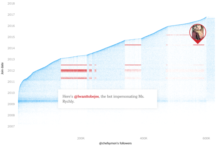
Remember when we thought Kansas had unusually high porn views per capita?


 Visualize This: The FlowingData Guide to Design, Visualization, and Statistics (2nd Edition)


