
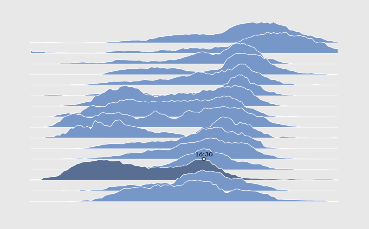
Ridgeline charts or frequency trails use parallel lines that overlap on the fluctuations, which creates a 3-D effect at the peaks. Andrei Kashcha used this method to show elevation around the world in an interactive map.
Click-and-drag to any location, and you get something like the above. You can also change parameters like maximum peaks, line density, and color. Even get your results printed on a mug.
Kashcha posted his code on GitHub.
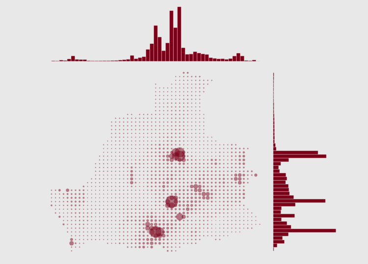
See also James Cheshire’s population lines from 2014.


 Visualize This: The FlowingData Guide to Design, Visualization, and Statistics (2nd Edition)


