• Membership
  • Newsletter
  • Projects
  • Learning
  • About
  • Member Login
  • Cost of a Census undercount

    July 8, 2019

    Topic

    Infographics  /  census, Reuters, undercount

    The citizenship question for the upcoming Census is still stuck in limbo. One of the arguments against the question is that it could lead to a significant undercount in population, which can lead to less funding. For Reuters, Ally J. Levine and Ashlyn Still show how this might happen with a highlight on federal programs that rely on population estimates.

  • What is R, what it was, and what it will become

    July 5, 2019

    Topic

    Statistics  /  history, R, Roger Peng

    Roger Peng provides a lesson on the roots of R and how it got to where it is now:

    Chambers was referring to the difficulty in naming and characterizing the S system. Is it a programming language? An environment? A statistical package? Eventually, it seems they settled on “quantitative programming environment”, or in other words, “it’s all the things.” Ironically, for a statistical environment, the first two versions did not contain much in the way of specific statistical capabilities. In addition to a more full-featured statistical modeling system, versions 3 and 4 of the language added the class/methods system for programming (outlined in Chambers’ Programming with Data).

    I’m starting feel my age, as some of the “history” feels more like recent experience.

    You can also watch Peng’s keynote in the video version.

  • Members Only

    Failure to Communicate (The Process #47)

    July 3, 2019

    Topic

    The Process  /  communication, tradeoffs, whizbang

    It’s about purpose. It’s about who your work is for. It’s about what you’re trying to show.

  • Amazon stores voice recordings indefinitely

    July 3, 2019

    Topic

    Statistics  /  Amazon, ethics, privacy

    Alfred Ng for CNET:

    Sen. Chris Coons, a Democrat from Delaware, sent a letter to Amazon CEO Jeff Bezos in May, demanding answers on Alexa and how long it kept voice recordings and transcripts, as well as what the data gets used for. The letter came after CNET’s report that Amazon kept transcripts of interactions with Alexa, even after people deleted the voice recordings.

    The deadline for answers was June 30, and Amazon’s vice president of public policy, Brian Huseman, sent a response on June 28. In the letter, Huseman tells Coons that Amazon keeps transcripts and voice recordings indefinitely, and only removes them if they’re manually deleted by users.

    Marvelous.

  • Machine learning to steal baseball signs

    July 2, 2019

    Topic

    Statistics  /  baseball, machine learning, Mark Rober

    Mark Rober, who is great at explaining and demonstrating math and engineering to a wide audience, gets into the gist of machine learning in his latest video:

    [arve url=”https://www.youtube.com/watch?v=PmlRbfSavbI” /]

  • Data Underload  /  parenthood, time use

    Differences Between Women and Men’s Everyday with Kids

    The day-to-day changes a lot when you have kids. However, it seems to change more for women than it does for men.

    Read More
  • Guide to manipulated video

    June 28, 2019

    Topic

    Infographics  /  fake, video, Washington Post

    I have a feeling we’re in for a lot of manipulated videos as we get closer to the election. The Washington Post provides a guide for the different types. I hope they keep building on this with a guide on how to spot the fakes, but as they say, knowing is half the battle.

  • Members Only

    Visualization Tools and Resources, June 2019 Roundup (The Process #46)

    June 27, 2019

    Topic

    The Process  /  roundup

    Here is the good stuff for June 2019.

  • Unproven aggression detectors, more surveillance

    June 27, 2019

    Topic

    Statistics  /  artificial intelligence, ethics, ProPublica, school, surveillance

    In some public places, such as schools and hospitals, microphones installed with software listen for noise that sounds like aggression. The systems alert the authorities. It sounds useful, but in practice, the detection algorithms might not be ready yet. For ProPublica, Jack Gillum and Jeff Kao did some testing:

    Yet ProPublica’s analysis, as well as the experiences of some U.S. schools and hospitals that have used Sound Intelligence’s aggression detector, suggest that it can be less than reliable. At the heart of the device is what the company calls a machine learning algorithm. Our research found that it tends to equate aggression with rough, strained noises in a relatively high pitch, like D’Anna’s coughing. A 1994 YouTube clip of abrasive-sounding comedian Gilbert Gottfried (“Is it hot in here or am I crazy?”) set off the detector, which analyzes sound but doesn’t take words or meaning into account. Although a Louroe spokesman said the detector doesn’t intrude on student privacy because it only captures sound patterns deemed aggressive, its microphones allow administrators to record, replay and store those snippets of conversation indefinitely.

    Marvelous.

  • Wikipedia views and every line of Billy Joel’s “We Didn’t Start the Fire”

    June 26, 2019

    Topic

    Statistical Visualization  /  Billy Joel, humor, Wikipedia

    In the biggest crossover event of the century, Tom Lum used the Wikipedia API to chart the number of views for every reference in Billy Joel’s We Didn’t Start the Fire. Yes. [via @waxpancake]

  • A view on despair

    June 25, 2019

    Topic

    Data Art  /  nature, suicide

    Sonja Kuijpers used abstract imagery to represent some sobering numbers:

    You might be wondering what you are viewing here. This landscape, each element in it represents a person who committed suicide in the Netherlands in the year 2017.

    The cityscape leads into more traditional views, which in turn feel much more heavy.

  • Machine boss

    June 25, 2019

    Topic

    Statistics  /  artificial intelligence, ethics, management

    For The New York Times, Kevin Roose on the possibility of machines becoming your boss:

    The goal of automation has always been efficiency, but in this new kind of workplace, A.I. sees humanity itself as the thing to be optimized. Amazon uses complex algorithms to track worker productivity in its fulfillment centers, and can automatically generate the paperwork to fire workers who don’t meet their targets, as The Verge uncovered this year. (Amazon has disputed that it fires workers without human input, saying that managers can intervene in the process.) IBM has used Watson, its A.I. platform, during employee reviews to predict future performance and claims it has a 96 percent accuracy rate.

    Splendid.

  • Four Cs of data and design

    June 24, 2019

    Topic

    Design  /  Ben Fry, purpose

    Ben Fry using the “tropiest of design tropes”, describes his goals for visualization. On communication:

    Communication is the most basic part: the table stakes of information design. If the piece doesn’t communicate, then it’s useless. A lot of time, attention, and effort goes into creating PDF documents that few people will ever read. In the past this was even more expensive, because the result was elegant printed reports that would go straight to someone’s shelf. If you create something that nobody uses, you’ve failed to communicate.

  • Scale of the Hong Kong protest

    June 21, 2019

    Topic

    Infographics  /  Hong Kong, New York Times, photography, protest

    You know those sped up videos where there’s a long line for something and someone walks the length of it? The New York Times did the scrolly equivalent for the recent Hong Kong protest, using snaps from aerial video and stringing them together geographically. A lot of people showed up.

  • Members Only

    Publishing Data Graphics Online (The Process #45)

    June 20, 2019

    Topic

    The Process  /  publishing, sharing

    After you’ve made your carefully designed data graphics, you probably want to share them online at some point. This is how I do it.

  • Millions of dollars in tax breaks — because of a mapping error

    June 20, 2019

    Topic

    Mistaken Data  /  error, housing, ProPublica, shapefile

    A small discrepancy in a couple of shapefiles led to a misclassification of land. Wealthy investors are taking advantage. For ProPublica, Jeff Ernsthausen and Justin Elliott:

    They have President Donald Trump’s 2017 tax overhaul law to thank. The new law has a provision meant to spur investment into underdeveloped areas, called “opportunity zones.” The idea is to grant lucrative tax breaks to encourage new investment in poor areas around the country, carefully selected by each state’s governor.

    But Port Covington, an ambitious development geared to millennials to feature offices, a hotel, apartments, and shopping, is not in a census tract that is poor. It’s not a new investment. And the census tract only became eligible to be an opportunity zone thanks to a mapping error.

  • Home zoning in major cities

    June 19, 2019

    Topic

    Maps  /  housing, New York Times, zoning

    The single-family home. It’s part of the American dream, but it can be awfully expensive when land grows scarce. Emily Badger and Quoctrung Bui for The Upshot map and discuss the current approaches of major cities:

    A reckoning with single-family zoning is necessary, they say, amid mounting crises over housing affordability, racial inequality and climate change. But take these laws away, many homeowners fear, and their property values and quality of life will suffer. The changes, opponents in Minneapolis have warned, amount to nothing less than an effort to “bulldoze” their neighborhoods.

    Using building footprints instead of just colored polygons provide nice depth and detail.

  • Getting Started with D3.js

    Learn how to build a custom visualization using D3.js and get acquainted with the popular JavaScript library.

  • Help people find themselves in the data

    June 18, 2019

    Topic

    Design  /  personal

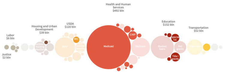
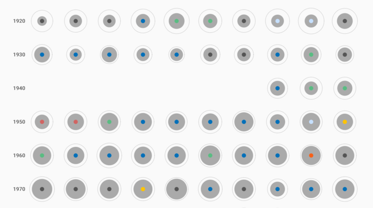
    Researchers went around rural Pennsylvania, showing people the charts above and asking what they thought about them. Evan Peck with one of the main findings from the study:

    As we analyzed and coded our interviews, we were reminded of something that we often forget — data can be intimate and personal. If someone found a personal connection to any graph, it didn’t matter the color, the style or the technique. For the people we talked to, charts with personal connections superseded all other design dimensions.

    Small data caveat: there were only 42 interviews.

    But still, ever since I got into visualization for an audience, this was always my thought. Some say people are self-centered so readers want to know about themselves first. Maybe that’s partially true, but I also think we just like to start with what’s familiar.

    So, if the data allows for it, make that familiarity and quick connection to the data easy to access.

  • Story formats for data

    June 17, 2019

    Topic

    Design  /  Financial Times, journalism, template

    Financial Times, in an effort to streamline a part of the data journalism process, developed templates for data stories. They call it the Story Playbook:

    The Playbook is also an important driver of culture change in the newsroom. We have a rich and familiar vocabulary for print: The basement (A sometimes light-hearted, 350-word story that sits below the fold on the front page), for example, or the Page 3 (a 900–1200 word story at the top of the third page that is the day’s most substantive analysis article). For FT journalists, catflaps, birdcages, and skylines need no explanation.

    The story playbook creates the equivalent for online stories, by introducing a vocabulary that provides a shared point of reference for everyone in the newsroom.

    Check them out on GitHub.

  • Page 122 of 392
  • <
  • 1
  • ...
  • 119
  • 120
  • 121
  • 122
  • 123
  • 124
  • ...
  • 392
  • >

Analyze, visualize, and communicate data usefully, beyond the defaults.

Become a member →

Recently for Members

May 8, 2025
When the data is not what it seems

May 1, 2025
Finding the Right Charts

April 24, 2025
Visualization Tools, Datasets, and Resources – April 2025 Roundup

April 17, 2025
Breaking Out of Chart Software Defaults

April 15, 2025
Line Chart with Decorative Neon Accents

Browse by Chart Type See All →

Donut Chart Word Cloud Parallel Coordinates Barcode Chart Timeline Dot Plot Sankey Diagram Spike Map Unit Chart Moving Bubbles

Browse By Topic

  • Visualization

    Seeing data

  • Maps

    Seeing geographic data

  • Infographics

    Explaining data

  • Networks

    Connecting data

  • Statistics

    Analyzing data

  • Software

    Working with data

  • Sources

    Getting data

  • Design

    Making data readable

Get the Book

Visualize This: The FlowingData Guide to Design, Visualization, and Statistics

Available now.

Order: Amazon / Bookshop

Made by FlowingData

  • The Process

  • Data Underload

  • Chart Everything

  • Guides

  • Books

  • Shop

  • About
  • Contact
  • Newsletter
  • LinkedIn
  • Instagram
  • Bluesky
  • RSS
Copyright © 2007-Present FlowingData. All rights reserved.