A chart from Business Insider makes a poor attempt to compare the death rates, by age, for the common flu against Covid-19:
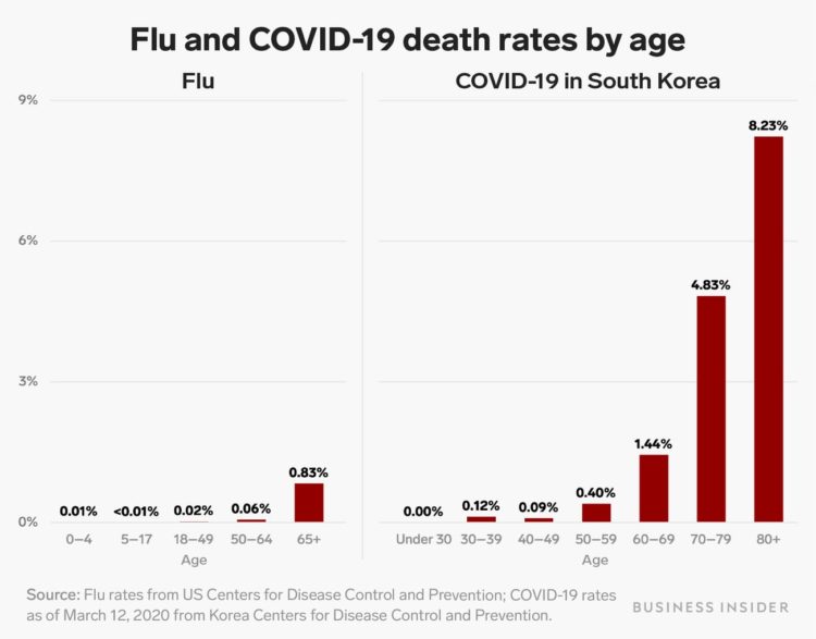
The age groups on the horizontal axes are different, so you can’t make a fair side-by-side comparison. For example, the flu chart has a 50-64 age group. The Covid-19 chart has a 50-59 group and a 60-69 group.
Ann Coulter’s interpretation of the chart might be worse than the chart itself:
For people under 60, coronavirus is LESS dangerous than the seasonal flu: pic.twitter.com/3EFzUSaOVo
— Ann Coulter (@AnnCoulter) March 24, 2020
No.
The values for people under 60, other than for the “under 30” group, are greater for Covid-19 than for the flu. Coulter’s interpretation is wrong no matter which way you cut it. Also, the article that the chart comes from points out the opposite.
I get it. It’s Twitter. There will be mistakes. But at least correct or delete them, instead of dangling it out there for people to spread.
For those making charts, please think about how others will interpret them. These are weird times and we don’t need to add more confusion. For those sharing charts, please think for a second before you put it out there.


 Visualize This: The FlowingData Guide to Design, Visualization, and Statistics (2nd Edition)


