• Membership
  • Newsletter
  • Projects
  • Learning
  • About
  • Member Login
  • FiveThirtyEight launches new NBA metric for predictions

    October 14, 2019

    Topic

    Statistics  /  basketball, FiveThirtyEight

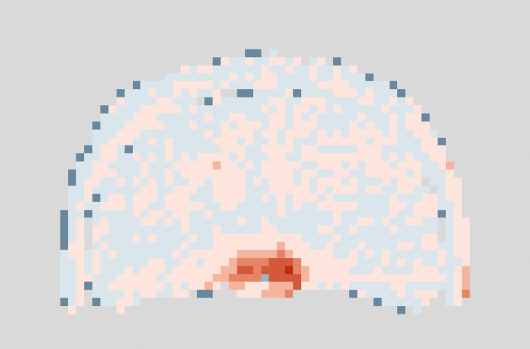
    FiveThirtyEight has been predicting NBA games for a few years now, based on a variant of Elo ratings, which in turn have roots in ranking chess players. But for this season, they have a new metric to predict with called RAPTOR, or Robust Algorithm (using) Player Tracking (and) On/Off Ratings:

    NBA teams highly value floor spacing, defense and shot creation, and they place relatively little value on traditional big-man skills. RAPTOR likewise values these things — not because we made any deliberate attempt to design the system that way but because the importance of those skills emerges naturally from the data. RAPTOR thinks ball-dominant players such as James Harden and Steph Curry are phenomenally good. It highly values two-way wings such as Kawhi Leonard and Paul George. It can have a love-hate relationship with centers, who are sometimes overvalued in other statistical systems. But it appreciates modern centers such as Nikola Jokić and Joel Embiid, as well as defensive stalwarts like Rudy Gobert.

    I’ve mostly ignored sports-related predictions ever since the Golden State Warriors lost in the 2016 finals. There was a high probability that they would win it all, but they did not. That’s when I realized the predictions would only lead to a neutral confirmation or severe disappointment, but never happiness.

    I’m sure this new metric will be different.

  • Fall foliage colors mapped

    October 11, 2019

    Topic

    Maps  /  color, fall, foliage, Washington Post

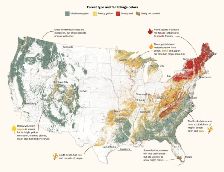
    For The Washington Post, Lauren Tierney and Joe Fox mapped fall foliage colors across the United States:

    Forested areas in the United States host a variety of tree species. The evergreens shed leaves gradually, as promised in their name. The leaves of deciduous varieties change from green to yellow, orange or red before letting go entirely. Using USDA forest species data, we mapped the thickets of fall colors you may encounter in the densely wooded parts of the country.

    Nice. Be sure to click through to the full story to see leaf profiles and an animation of the changing colors as fall arrives.

  • Members Only

    How Intentions Changed How People Read the Same Map (The Process #60)

    October 10, 2019

    Topic

    The Process  /  intention

    Visualization has a way of making things feel more concrete and definite. So how is it that interpretation gets so fuzzy?

  • PG&E providing shapefiles, instead of a working map for shutoffs

    October 9, 2019

    Topic

    Data Sources  /  PG&E, shapefile

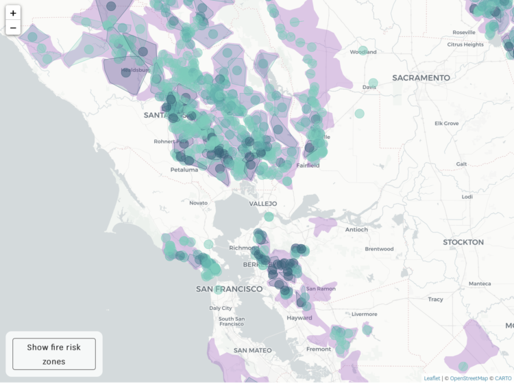
    Here in northern California, PG&E is shutting off power to thousands of households in efforts to prevent wildfires. Luckily, the area I live is just outside of the shutoff areas, but for others, a map of what’s up would be useful, right?

    However, instead of a map, which is “temporarily unavailable” at the time of this writing, PG&E is providing shapefiles. I mean, that’s kind of nice for people who like to make maps, but it’s not so great for the rest. There’s a metaphor in there somewhere.

    At least you can keep track with the San Francisco Chronicle:

  • GitHub contribution graph to show burnout

    October 9, 2019

    Topic

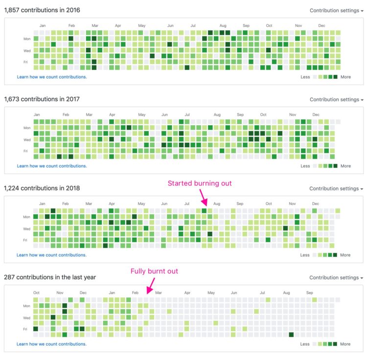
    Self-surveillance  /  annotation, burnout, GitHub

    A quick annotation by Jonnie Hallman on Twitter: “GitHub is really good at visualizing burnout.”

  • Fixing the ‘impeach this’ map with a transition to a cartogram

    October 8, 2019

    Topic

    Maps  /  election, impeachment

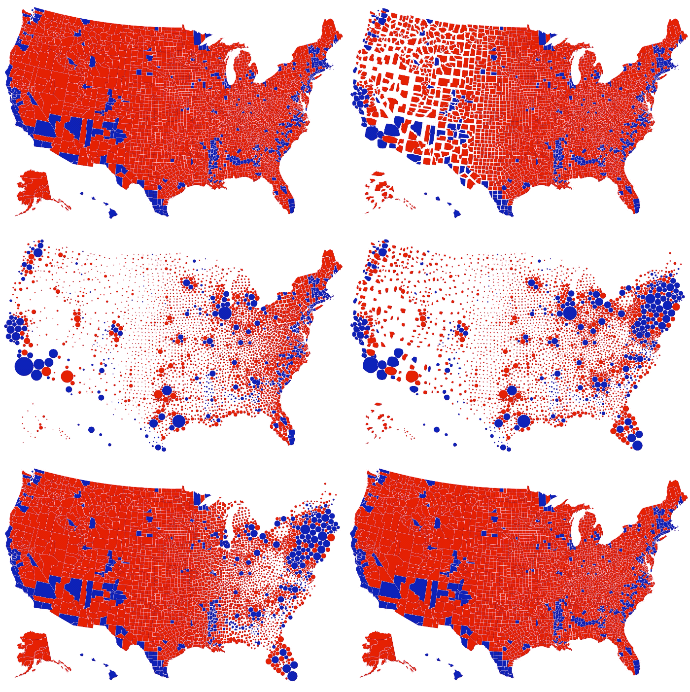
    As discussed previously, the “impeach this” map has some issues. Mainly, it equates land area to votes, which makes for a lot of visual attention to counties that are big even though not many people live in them. So, Karim Douïeb used a clever transition to change the bivariate map to a cartogram. Now you can have a dual view.

  • How to Make Animated Visualization GIFs with ImageMagick

    Using the library command-line gets you more flexibility to highlight the important parts of the data.

  • With terminal cancer, a patient tracks drug dose in a dashboard over her final days

    October 8, 2019

    Topic

    Self-surveillance  /  dashboard, mortality

    Kelly Martin died of cancer on September 30. She was able to enjoy her final days at home, and as she knew the end was near, she kept track of her drug doses in a dashboard:

    Brain tumors are unpredictable. I don’t want my last days with a personality that isn’t mine. I wanted to laugh, to enjoy the days, and fart around in the garden as much as possible. We added in a variety of medications to use as needed to manage symptoms and tracked what worked and what didn’t in a Tableau dashboard. It was the only way to see the patterns and to get more good days.

    From Bridget Cogley, Martin’s friend who took over the writing as Martin grew too ill:

    63% of Canadians with a terminal illness want to die at home. Only about 15% do. Kelly Martin died on September 30, 2019 in her home with her son and me (Bridget) at her side and her mother on the phone. A true honor she gifted us knowingly. We used this dashboard to provide care and communicate with providers. It was crafted in a couple of hours, edited with Kelly’s feedback, and used to provide a better death. Seeing the data can truly be life-changing.

    I… just. Wow.

  • Animated line chart to show the rich paying less taxes

    October 7, 2019

    Topic

    Statistical Visualization  /  New York Times, rich, Stuart A. Thompson, taxes

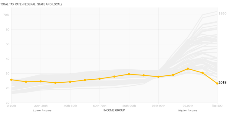
    David Leonhardt, for The New York Times, discusses the relatively low tax rates for the country’s 400 wealthiest households. The accompanying animated line chart by Stuart A. Thompson shows how the rates have been dropping over the years, which are now “below the rates for almost everyone else.” Oh.

  • The early beginnings of visual thinking

    October 7, 2019

    Topic

    Statistical Visualization  /  history, Howard Wainer, Michael Friendly, visual thinking

    Visualization is a relatively new field. Sort of. The increased availability of data has pushed visualization forward in more recent years, but its roots go back centuries. Michael Friendly and Howard Wainer rewind back to the second half of the 1800s, looking at the rise of visual thinking.

    On the first construction of the periodic table of elements:

    On February 17, 1869, right after breakfast, and with a train to catch later that morning, Mendeleev set to work organizing the elements with his cards. He carried on for three days and nights, forgetting the train and continually arranging and rearranging the cards in various sequences until he noticed some gaps in the order of atomic mass. He later recalled, “I saw in a dream, a table, where all the elements fell into place as required. Awakening, I immediately wrote it down on a piece of paper.” (Strathern, 2000) He named his discovery the “periodic table of the elements.”

    I sometimes wonder what they will say about current visualization work a couple of centuries from now. At what point will the historians say, “This is when visualization crashed and burned, never to be seen again.” Or, maybe it’ll go the other way: “This is when everyone understood and communicated with data, and visualization was the vehicle to do it.”

  • Differences between enterprise data visualization and data journalism

    October 4, 2019

    Topic

    Design  /  Bloomberg, business, data journalism

    Toph Tucker used to make graphics for Bloomberg Businessweek. Now he does enterprise visualization for finance. He wrote about the major differences between the two jobs. On the iconic Bloomberg Terminal:

    There are more things in Bloomberg than are dreamt of in your meetings. This was not the consensus when I worked at Bloomberg, but I now believe the Terminal is incredibly well-designed. Folks reply, “I get that it’s useful, but I don’t think that means it’s well-designed,” and I rejoin: No! It is well-designed in every way that matters, even visually! (Such nice high-contrast easy-to-spot color-coded inputs and affordances! So nice that it stretches rather than reflow critical content off the screen!) I want people to look, and recoil, and then remind themselves that Bloomberg is wiser than that disgust. If you haven’t been in the position it’s built for, it’s a deep-set Chesterton’s fence; only after you’ve understood it can you disagree with it.

    On Excel:

    One large hedge fund shows every new young software engineer a particular Excel spreadsheet that makes hundreds of millions of dollars a year as part of their orientation, to beat the programmer’s “Excel isn’t serious” hubris out of them upon arrival. At this level, Excel is not interchangeable with Google Sheets or Apple Numbers or even Excel for Mac.

    I love how there are these clusters of visualization that exist in the world, all making charts, but with completely different approaches and usage.

  • Members Only

    Visualization for Analysis vs. Visualization for an Audience (The Process #59)

    October 3, 2019

    Topic

    The Process  /  analysis, audience

    The visualizations are used and read differently, which requires that you approach their design differently.

  • Game: How many US cities can you name?

    October 3, 2019

    Topic

    Maps  /  city, game, population

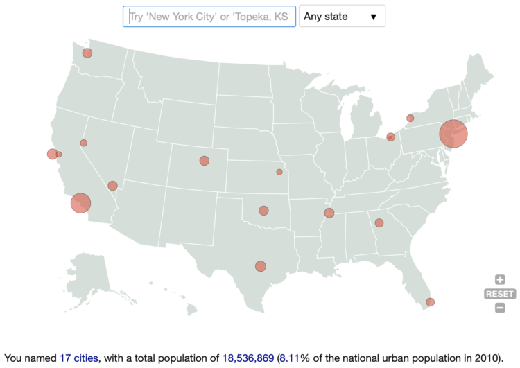
    How many US cities can you name? Here’s a quick and fun game by Ian Fisher to find out. Simply start entering as many as you can think of and rack up population counts as a sort of point system.

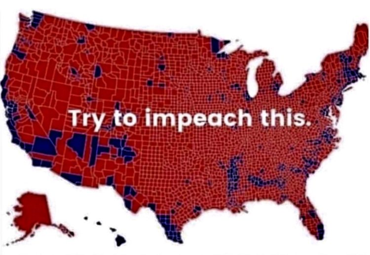
  • The ‘impeach this’ map has some issues

    October 2, 2019

    Topic

    Mistaken Data  /  election

    Philip Bump explains why the “impeach this” map is a bit dubious:

    By now, this criticism of electoral maps is taught in elementary schools. Or, at least, it should be. Those red counties in Montana, North Dakota, South Dakota and Wyoming, for example, are home to 1.6 million 2016 voters — fewer than half of the number of voters in Los Angeles County. Trump won 1 million votes in those states, beating Hillary Clinton by a 580,000-vote margin. In Los Angeles, Clinton beat Trump by 1.7 million votes.

    As Alberto Cairo already went into, it’s not so much that the map itself is incorrect. It’s a bivariate map. It shows which counties voted more for one person versus another. It’s more about the context of how the map is used. It’s the visualization equivalent of pulling a quote out of context and people seeing what they want to see.

  • Animating a lot of dots with WebGL and REGL.js

    October 2, 2019

    Topic

    Coding  /  JavaScript, REGL, WebGL

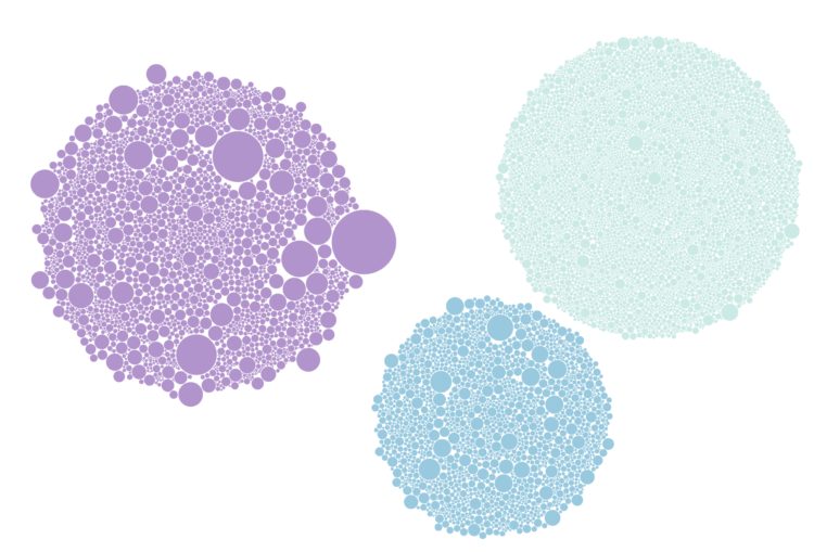
    A couple of weeks ago, The Washington Post visualized 13,000 school districts using moving bubbles. Post graphics reporter Armand Emamdjomeh describes how they did it.

    Saving this for later.

  • Diverging line plot as the perfect comic

    October 1, 2019

    Topic

    Infographics  /  comic, Willikin Wolf

    This is perfect. Willikin Wolf made characters out of two dots moving along their paths of productivity and wages.

    Something’s wrong pic.twitter.com/tMhNPk85pH

    — Willikin Wolf (@WillikinWolf) September 23, 2019

    More data+comics, please.

  • Pixelation to represent endangered species counts

    September 30, 2019

    Topic

    Data Art  /  animals, endangered, pixels

    In 2008, the World Wildlife Fund ran a campaign that used pixelation to represent the number of animals left for endangered species. One pixel represents an animal, so an image appears more pixelated when there are fewer animals left. Imgur user JJSmooth44 recently used more recent numbers to show the images for 22 species (sourced from the Animal Planet endangered species list).
    Read More

  • Detailed generative art in R

    September 27, 2019

    Topic

    Data Art  /  generative art, R, Thomas Lin Pedersen

    Thomas Lin Pedersen has been sharing his generative art pieces as of late:

    All my systems and visualisations are programmed in R, an open source programming language for statistics and data analysis. I’ve developed and released many tools that are central to my work, and help maintain others.

    Beautiful work. It really gets the imagination going for what else R can do. Check out Pedersen’s Instagram for more, and you can also grab a print from him directly.

  • Members Only

    Visualization Tools and Resources, September 2019 Roundup (The Process #58)

    September 26, 2019

    Topic

    The Process  /  roundup

    Every month I collect the latest visualization tools and resources on how to make the most of your data. Here’s the good stuff for September.

  • Street suffixes show the organization of cities

    September 26, 2019

    Topic

    Maps  /  names, roads

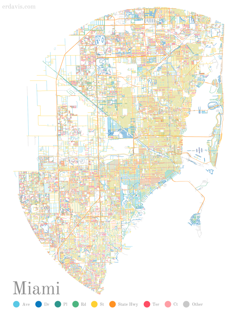
    The suffixes on street names can say a lot about a neighborhood. A Boulevard elicits a business-centric area whereas a Road or Court might mean a more residential area. So, Erin Davis mapped the suffixes of all the streets in some major cities. [via @NadiehBremer]

  • Page 117 of 392
  • <
  • 1
  • ...
  • 114
  • 115
  • 116
  • 117
  • 118
  • 119
  • ...
  • 392
  • >

Analyze, visualize, and communicate data usefully, beyond the defaults.

Become a member →

Recently for Members

May 8, 2025
When the data is not what it seems

May 1, 2025
Finding the Right Charts

April 24, 2025
Visualization Tools, Datasets, and Resources – April 2025 Roundup

April 17, 2025
Breaking Out of Chart Software Defaults

April 15, 2025
Line Chart with Decorative Neon Accents

Browse by Chart Type See All →

Slope Chart Pyramid Chart Horizon Graph Timeline Dot Plot Organogram Moving Bubbles Baseline Chart Histogram Beeswarm

Browse By Topic

  • Visualization

    Seeing data

  • Maps

    Seeing geographic data

  • Infographics

    Explaining data

  • Networks

    Connecting data

  • Statistics

    Analyzing data

  • Software

    Working with data

  • Sources

    Getting data

  • Design

    Making data readable

Get the Book

Visualize This: The FlowingData Guide to Design, Visualization, and Statistics

Available now.

Order: Amazon / Bookshop

Made by FlowingData

  • The Process

  • Data Underload

  • Chart Everything

  • Guides

  • Books

  • Shop

  • About
  • Contact
  • Newsletter
  • LinkedIn
  • Instagram
  • Bluesky
  • RSS
Copyright © 2007-Present FlowingData. All rights reserved.