• Membership
  • Newsletter
  • Projects
  • Learning
  • About
  • Member Login
  • Fashion runway color palette

    December 2, 2019

    Topic

    Statistical Visualization  /  color, fashion, Google, The Business of Fashion

    From Google Arts & Culture:

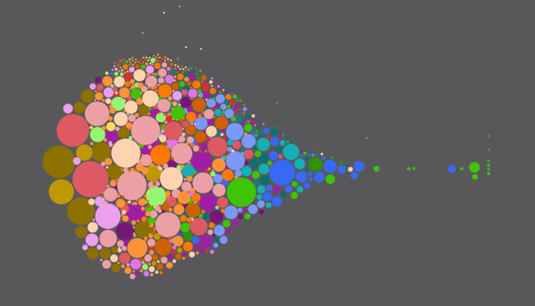
    We came together with The Business of Fashion to view their collection of 140,000 photos of runway looks from almost 4,000 fashion shows around the world. If you could attend one fashion show per day, it would take you more than 10 years to see them all. This experiment makes this library easy and fun to explore in one single visualization. By extracting the main colors of each look, we used machine learning to organize the images by color palette, resulting in an interactive experiment of four years of fashion by almost 1,000 designers.

    The interactive lets you see all of the color palettes and click through to see photos that match the palette.

    You can also upload an image to fetch fashions that match the color usage in the image. So in case you want to match your wardrobe to say, your dog’s fur, that’s totally doable now. Nice.

  • Traveling Salesman art

    November 27, 2019

    Topic

    Data Art  /  traveling salesman

    Robert Bosch likes to use the Traveling Salesman Problem to draw famous portraits with a single continuous line. Nice.

    If you want to fall down a Traveling Salesman rabbit hole, be sure to check out the main pages of the site above. You’ll find code, datasets, challenges, and other re-generated art pieces.

    Also, if you’re interested in doing something similar in R, Antonio Sánchez Chinchón kicked the tires a while back. [via kottke]

  • Teaching R to 7th graders

    November 26, 2019

    Topic

    Coding  /  education, R

    Joshua Rosenberg describes his one-day experience teaching R to 7th graders:

    [T]he activity worked albeit, as a very gradual introduction to using R. In combination with starting with modest goals, having the right tools (R Studio Cloud, R Markdown, and a suitable data set), I think, helped to make this work. 7th-graders can (start to) use R. The goal that Alex and I have is for students to be able to analyze data that they collect (and already-collected scientific data).

    Lucky kids. All I got was a scientific calculator.

  • 2,774 miles traveled by a lone wolf

    November 25, 2019

    Topic

    Maps  /  GPS, nature, wolf

    From the Voyageurs Wolf Project, a map shows the travels of a lone wolf over an 11-month period. Check out the animated version for full effect.

  • How parents spend time with their kids

    November 25, 2019

    Topic

    Statistical Visualization  /  parenting, Quartz, time use

    For Quartz, Dan Kopf and Jenny Anderson on how time spent with kids changes with age:

    In the very beginning, it’s all about physical care, otherwise known as the stuff that makes your arms tired. A fifth of time parents spend with kids before their first birthday is on what could be described as keep-them-alive tasks. At age 1, this falls dramatically and it becomes playtime: peek-a-boo, stack the box, dinging and singing, making art, dancing, hide and seek, jumping in puddles. The share of time spent playing with children peaks around age 1, and then is then slowly replaced by a variety of other activities, including socializing and watching TV. Overall, time spent with children declines as kids get older.

    Sounds about right. Although it makes me a bit nervous for the future.

  • Hours of daylight mapped as a function of latitude and time of year

    November 22, 2019

    Topic

    Maps  /  daylight

    Reddit user harpalss animated hours of day light by latitude and day of year. Just let it hypnotize you. They used this formula to calculate daylight hours.

  • Members Only

    Bar Chart Baselines Don’t Have to Start at Zero? (The Process #66)

    November 21, 2019

    Topic

    The Process  /  baseline, zero

    False.

  • Quietest highway route in each state

    November 21, 2019

    Topic

    Maps  /  driving, quiet

    Geotab made a rough estimate of the quietest route in each state, based on average traffic. The methodology:

    To find the quietest road in each US state, we gathered the latest available (2015) traffic count data from the Highway Performance Monitoring System. Quietness was calculated as the annual average daily traffic (AADT, measured in # of vehicles), and routes with the lowest AADT in each state were deemed the quietest. Lengths of routes were gathered from local transport authorities in each state. The data covers Interstates, US Routes, and State Routes over 10 miles long.

    I feel like they should’ve normalized by length of route, especially since they had it already. But hey, I’m always down for some peace and quiet.

  • Data life cycle

    November 20, 2019

    Topic

    Design  /  life cycle, Xaquín G.V.

    Summarizing a talk by Xaquín G.V., Natalie Gerhardstein for Delano:

    Among González’ takeaways were that, in order to avoid misunderstandings or bias in data visualisation, it helps to be aware of the pitfalls across the lifecycle–from collection through analysis, to the visualisation itself–and, of course, the final story the data is helping to tell. Question, for example, whether correlations being made are legitimate, be transparent and be aware of the visuals aligning with words in the story, he argues.

    There are always compromises and possible mistakes upstream before the data comes out as a nicely formatted delimited text file. The more you understand about what happens upstream, the more you can do downstream.

  • KPI overload

    November 19, 2019

    Topic

    Infographics  /  humor, KPI, Marketoonist

    From Tom Fishburne, the Marketoonist. Maybe a dashboard isn’t the answer you’re looking for.

  • How to Make a Bump Chart in R, with ggplot

    Visualize rankings over time instead of absolute values to focus on order instead of the magnitude of change.

  • How to Make a Multi-Series Dot Plot in Excel

    Easily compare multiple categories and spot differences between two or more series.

  • Data Underload  /  income, salary, work

    Salary and Occupation

    Salaries vary across occupations. Here are some charts that show by how much for 800 of them.

    Read More
  • Making the most detailed map of auto emissions in America

    November 15, 2019

    Topic

    Design  /  climate, human, Nadja Popovich

    Using estimates from the Database of Road Transportation Emissions, Nadja Popovich and Denise Lu for The New York Times mapped auto emissions at high granularity. Popovich described their process on Storybench:

    I want to make graphics that really resonate with people. If that is your goal as a visual journalist, something to think through is just how you can tie data back to a more human experience. To kind of go past the dataset as a dataset and reveal the humanity of it. I think one way that you can do that is by zooming into it in this way. You suddenly don’t just see, “Oh, this line of emissions has gone up.” We set out for a more personal view that says, “You know, you can actually see the roads that you might be driving on every day. That’s where the emissions are coming from.” It ties it back to a much more human experience and makes the data less abstract. Thinking a lot more through how to tie (the data) back to human-lived experiences is something that is really important and really we found resonates with readership.

  • Members Only

    The Best Visualization Course I Ever Took; Membership Update with New Points of View (The Process #65)

    November 14, 2019

    Topic

    The Process  /  tools

    This week I reminisce back to when I didn’t know anything about visualization, and all I wanted to do was solve analysis problems. Also, some fun updates on the way, exclusively for members.

  • Why scientists need to be better at visualization

    November 14, 2019

    Topic

    Design  /  science

    For Knowable Magazine, Betsy Mason looks at the state of (not so good) data visualization in science and offers some direction for how it can improve:

    [S]cience is littered with poor data visualizations that confound readers and can even mislead the scientists who make them. Deficient data visuals can reduce the quality and impede the progress of scientific research. And with more and more scientific images making their way into the news and onto social media — illustrating everything from climate change to disease outbreaks — the potential is high for bad visuals to impair public understanding of science.

  • Growing Your Visualization Toolset (and Mine), a FlowingData Membership Update

    November 13, 2019

    Topic

    Site News

    It’s time to kick the tires on some new tools.
    Read More

  • Map of nighttime lights normalized by population

    November 13, 2019

    Topic

    Maps  /  lights, population, Tim Wallace

    You’ve probably seen the composite map of lights at night from NASA. It looks a lot like population density. Tim Wallace adjusted the map for population, so that you can see (roughly) the areas that produce more light per person.

    Adjusting NOAA nighttime lights for population reveals areas that create an outsized amount of light per person living there. pic.twitter.com/k91cGyWvLd

    — Tim Wallace (@wallacetim) November 10, 2019

  • Data Underload  /  money, retirement

    How Much You Should Be Saving for Retirement

    There are a lot of variables to consider, but for people of middle income, here’s a suggestion, based on when you start saving and when you want to retire.

    Read More
  • xkcd-style charts in JavaScript

    November 11, 2019

    Topic

    Coding  /  JavaScript, xkcd

    For xkcd fans, here’s a JavaScript library by Tim Qian that lets you style your charts like xkcd.

    There’s something about sketchy, comic-style charts that makes the data feel more approachable. Maybe just because it’s different or looks more casual? I mean, I would use the style sparingly and maybe not in your next business meeting, but it’s kind of fun to mess with. You can also do this in R and Python of course.

  • Page 115 of 392
  • <
  • 1
  • ...
  • 112
  • 113
  • 114
  • 115
  • 116
  • 117
  • ...
  • 392
  • >

Analyze, visualize, and communicate data usefully, beyond the defaults.

Become a member →

Recently for Members

May 15, 2025
Step Chart, Enhanced

May 8, 2025
When the data is not what it seems

May 1, 2025
Finding the Right Charts

April 24, 2025
Visualization Tools, Datasets, and Resources – April 2025 Roundup

April 17, 2025
Breaking Out of Chart Software Defaults

Browse by Chart Type See All →

Bubble Chart Dot Density Map Chord Diagram Difference Chart Sankey Diagram Voronoi Diagram Parallel Coordinates Slope Chart Word Cloud

Browse By Topic

  • Visualization

    Seeing data

  • Maps

    Seeing geographic data

  • Infographics

    Explaining data

  • Networks

    Connecting data

  • Statistics

    Analyzing data

  • Software

    Working with data

  • Sources

    Getting data

  • Design

    Making data readable

Get the Book

Visualize This: The FlowingData Guide to Design, Visualization, and Statistics

Available now.

Order: Amazon / Bookshop

Made by FlowingData

  • The Process

  • Data Underload

  • Chart Everything

  • Guides

  • Books

  • Shop

  • About
  • Contact
  • Newsletter
  • LinkedIn
  • Instagram
  • Bluesky
  • RSS
Copyright © 2007-Present FlowingData. All rights reserved.