Line Chart
Typically used to show trends over time, the slope of the line between two points shows patterns of change.
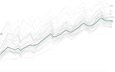
Improving vaccine distribution in all states
Lauren Leatherby and Amy Schoenfeld Walker reporting for The New York Times:
“Every…
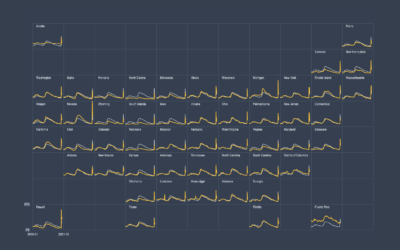
How to Make Small Multiples in Excel
Also known as trellis charts, lattice chart, or whatever you want to call them, the technique lets you compare several categories in one view.
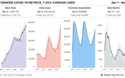
Spike past 100k Covid-19 cases in a day
Meanwhile… based on estimates from The COVID Tracking Project, the United States had…
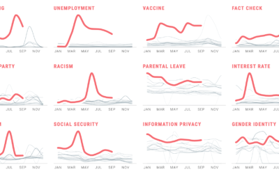
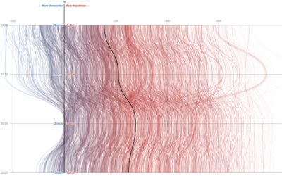
Political search interest in 2020
In Waves of Interest, a collaboration between the Google News Initiative and Truth…

Visual tour through the technology hype cycle
The Gartner hype cycle is a graphical representation of where certain technologies are…
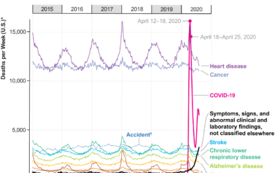
Covid-19, the third leading cause of death
For Scientific American, Youyou Zhou made a line chart that shows cause of…
How to Untangle a Spaghetti Line Chart (with R Examples)
Put multiple time series lines on the same plot, and you quickly end up with a mess. Here are practical ways to clean it up.
Redefining Old Age
What is old? When it comes to subjects like health care and retirement, we often think of old in fixed terms. But as people live longer, it's worth changing the definition.
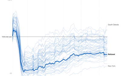
Visits to businesses compared year-over-year in each state
Businesses are still seeing visits mostly down compared to last year, which shouldn’t…
Analyzing the topics of cable TV news
From the Computer Graphics Lab at Stanford University, the results from an analysis…
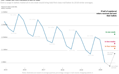
Vote-by-mail volume compared against years past
The volume of mail-in ballots will likely be higher than usual this year,…
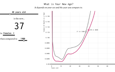
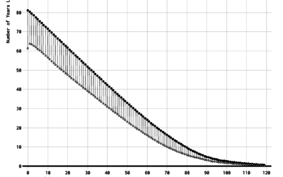
Finding the New Age, for Your Age
You've probably heard the lines about how "40 is the new 30" or "30 is the new 20." What is this based on? I tried to solve the problem using life expectancy data. Your age is the new age.
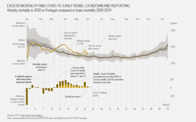
How to Make a Customized Excess Mortality Chart in Excel
Show current evolution against expected historical variability and add one or more series that could account for the difference.
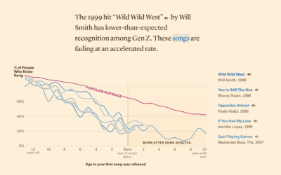
Defining ’90s music, based on song recognition
In search of songs that define music in the 1990s, Matt Daniels and…
Comparing U.S. coronavirus case rates to other hot spots
The numbers are high here in the United States, and at this point,…
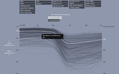
Unemployment for different groups
Unemployment has hit the United States hard over the past several months, for…

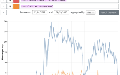
Bitcoin scam, Twitter hacked
Twitter was hacked yesterday. Over a few hours, prominent accounts were tweeting that…
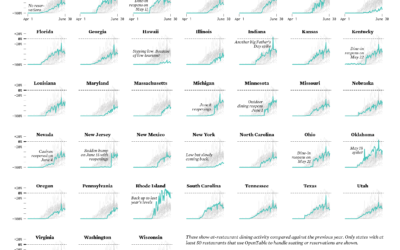
Restaurant Reopenings, a Comparison to Last Year
Restaurants are reopening for dining across the United States. Some states are doing it faster than others.
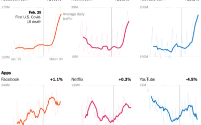
Change in internet usage since the virus
Your schedule changed. The time spent in front of or using a screen…