Line Chart
Typically used to show trends over time, the slope of the line between two points shows patterns of change.
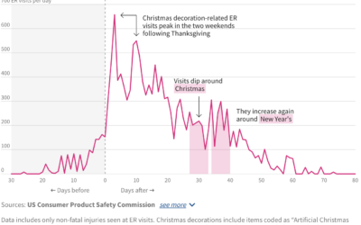
ER visits for Christmas decoration injuries
A lot of Christmas lights went up this past week. I hope you…
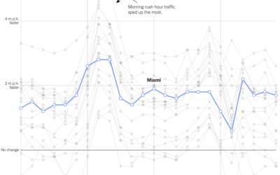
Change in commute times in major cities
Using GPS data processed by Replica, Lydia DePillis, Emma Goldberg, and Ella Koeze,…
Life Expectancy of Pets
When looking into getting a pet, it’s important to consider life expectancy. You probably don’t want to accidentally sign up for a twenty-year commitment with an impulse adoption at the pet store.

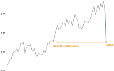
When the Cost of a Mortgage is a Multiple of the Original Loan
Use this chart to see how many times over you'll pay over the original loan amount, given the annual rate and the number of years of paying.

Competitive hot dog eating requirements
Nathan’s Famous hot dog eating contest, so gross to watch but impossible to…
Shortening baseball games
Baseball games grew longer over the decades, with the average length well over…

India estimated to pass China in population
Based on the United Nations’ world population report, it is estimated that India’s…
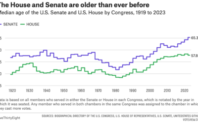
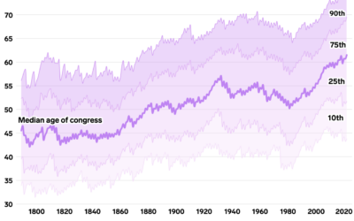
Congress still getting older
For FiveThirtyEight, Geoffrey Skelley digs into the ongoing trend:
What’s behind these increasingly…
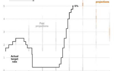
Changing Fed projections
This clever chart by Lazaro Gamio shows changing interest rates set by the…

More Dual Income, No Kids
People are waiting longer to have kids or not having kids at all, which leads to more dual income households with no kids.
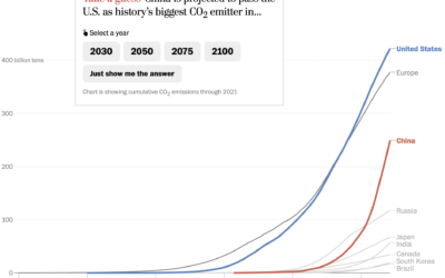
Line chart race to show emissions
For The Washington Post, Harry Stevens used the line chart equivalent of a…
Wealthy Percentiles Rising
The rich continue to get richer, and everyone else either only kind of earns more or stays where they're at.
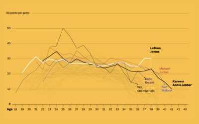
LeBron James’ longevity
Okay, one more LeBron James thing, mostly because I like seeing different looks…
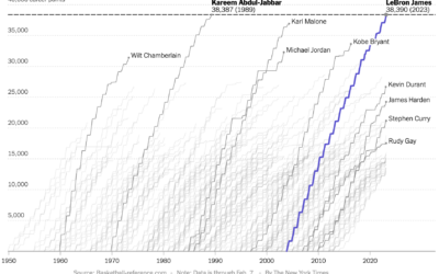
Cumulative points scored by LeBron James and other top scorers
Never fear, Sopan Deb, K.K. Rebecca Lai, and Eve Washington, for The New…
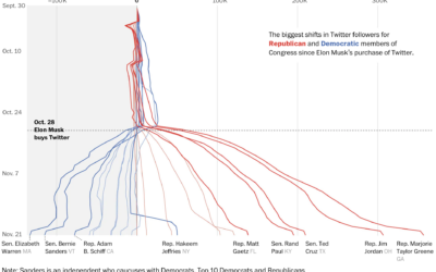
Republican and Democrat follower counts on Twitter
You might have heard that Elon Musk bought Twitter, and among the many…
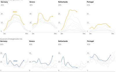
Shifts in European energy sources
Mira Rojanasakul, for The New York Times, dug into current and historical energy…
Oldest U.S. government
Annie Fu, Walt Hickey, and Shayanne Gal, for Insider, show the disproportionately aging…