Choropleth Map
Regions are colored by a variable. Be careful with your color choices, as they can quickly change what the map shows.
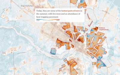
Racist housing policy from 1930s and present-day temperature highs
Brad Plumer and Nadja Popovich for The New York Times show how policies…
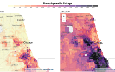
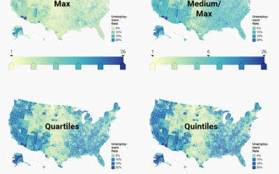
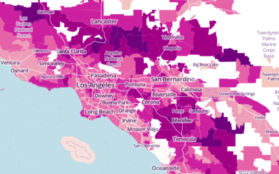
Distribution of unemployment at the tract level
We’ve been hearing a lot about national unemployment rate, but it’s not uniformly…
Where people are wearing masks
NYT’s The Upshot ran a survey through the data firm Dynata asking people…

Map of Foreign Students
There are over 1 million international higher-education students enrolled in the United States. This map shows where they reside.
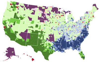
Racial Divide
It's hard to think of much else. These maps show the racial divide between black and white people in major cities.
Choosing color palettes for choropleth maps
Choropleth maps, the ones where regions are filled with colors based on data,…
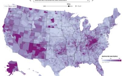
Mapping death in America, 1980 to 2014
Nationwide mortality data relies on death certificates, and when cause of death is…
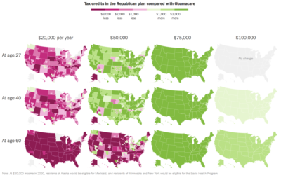
Republicans’ health care plan compared against Obamacare
Based on estimates from the Kaiser Family Foundation, Kevin Quealy and Margot Sanger-Katz…

How to Spot Visualization Lies
Many charts don't tell the truth. This is a simple guide to spotting them.

Reviving the Statistical Atlas of the United States with New Data
Due to budget cuts, there is no plan for an updated atlas. So I recreated the original 1870 Atlas using today's publicly available data.
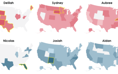
Mapping the Most Common Races
Select one or more races for a quick comparison. Counties are colored by the most prevalent.
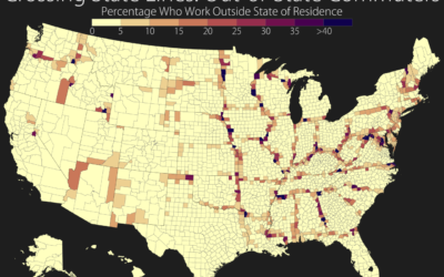
Out-of-state commuters mapped
In a straightforward map, Seth Kadish shows the percentage of county residents who…
Making an Interactive Map with Category Filters
Let readers focus on the regions they care about to make their own comparisons and conclusions.
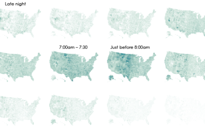
Interactive: When Do Americans Leave For Work?
We don't all start our work days at the same time, despite what morning rush hour might have you think.
Choropleth Maps and Shapefiles in R
Fill those empty polygons with color, based on shapefile or external data.
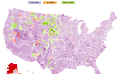
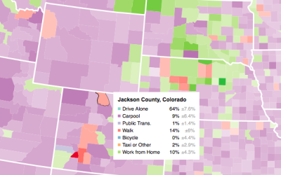
Interactive: How Americans Get to Work
The way that people get around can say a lot about how a place is made up. Here's an interactive map that shows how people get to work in America.
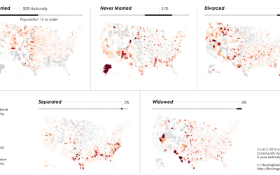
Relationship Status Geography
Some places attract young singles, whereas others attract married couples and families. I was curious how this varied across the country, so I mapped it.
Average commute times mapped →
The United States Census Bureau just released county-level commute estimates for 2011, based…