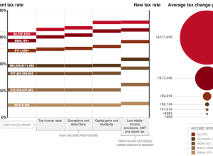
Wilson Andrews and Alicia Parlapiano report for The Washington Post on how the…
Infographics
Telling stories with data and graphics.
-
How tax breaks could affect your bottom line
-
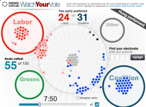
Election night in Australia relived
It was election night a few days ago in Australia, and News.com.au ran…
-
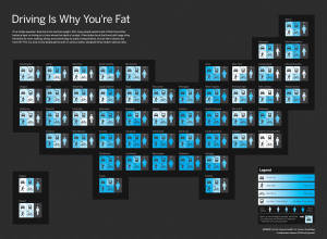
Discuss: Driving is why you’re fat?
In a collaboration between GOOD and Hyperakt, they come out with a bold…
-
Illustrated guide to a PhD
When I first got in to graduate school, I really had no idea…
-
You + Me = Awesome
I used this diagram to convince my wife to marry me (j/k).
Buy… -
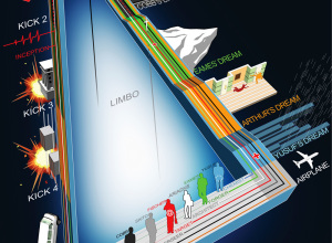
Another view of Inception, with the kicks this time
Here’s another timeline of Inception from deviantArt user, dehas. This one has the…
-
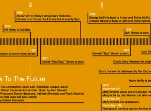
Back to the Future trilogy timelines
You know I can never resist a good Back to the Future reference.…
-
Inception dream levels explained in flowchart
You knew this was coming. I’d call spoiler alert for those who haven’t…
-
Inside the Glenn Beck/Goldline scheme
Jess Bachman and Barry Ritholtz take a look at the Glenn Beck/Goldline scheme…
-
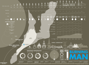
A graphical look at Burning Man
This graphic on Burning Man is totally lost on me, but maybe you…
-
How to win Rock-paper-scissors every time
I admit it. When I first heard there are actual tournaments for Rock-paper-scissors,…
-
History of The Beatles as told by their hair
The Beatles were famously known for their mop-top haircuts in the early 1960s,…
-
Investigation of top secret America
In response to the the 9/11 attacks, the United States government created a…
-
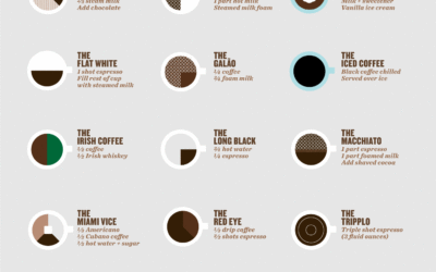
Citizen’s guide to fancy pants coffee drinks
In the same spirit of the original coffee drink infographic from a few…
-
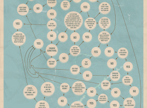
Path to happiness gets complicated and confusing
Just when you thought the path to lifelong happiness was uber simple and…
-
How data travels from phone to computer
Time Warner Cable explains how a picture travels from Jeff’s phone to Vijay’s…
-
Flowchart to lifelong happiness
The secret to lifelong happiness. If only it were so easy. [Typcut via…
-
Flowchart shows the startup business cycle
Technology and investment group HackFwd describes what it’s like to work with them…









 Visualize This: The FlowingData Guide to Design, Visualization, and Statistics (2nd Edition)


