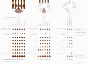
Accompanying an article on the changing family dynamic, The New York Times provides…
Infographics
Telling stories with data and graphics.
-
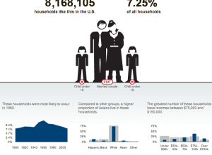
Households like yours
-
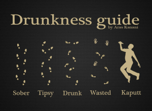
Simple guide to drunkenness
From Aran Kanani on DeviantArt. Try easing up on the tequila and maybe…
-
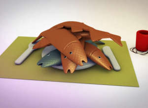
Why you shouldn’t eat farmed fish – a graphical explanation
Do you know where your fish comes from? Well, yeah, it comes from…
-
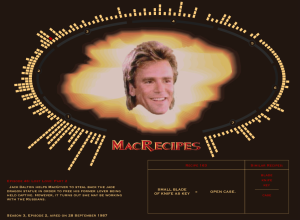
MacGyver recipe book – All 7 seasons of diversions and mischief
Oh. My. God. Fathom Information Design compiles every recipe from the show MacGyver:…
-
Flash vs. HTML5
Design firm Periscopic takes a look at the Flash versus HTML5 debate and…
-

Oil spill amounts in perspective
On the one-year anniversary of the Deepwater Horizon oil spill, designer Chris Harmon…
-
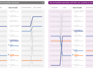
Perceived vs. actual country rankings
Lisa Strausfeld, in collaboration with GE, compares perceived country rankings and actual ones.…
-
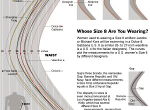
Women’s dress sizes demystified
Women’s clothing sizes have always confused me. My wife always has to try…
-
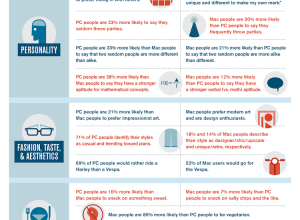
Mac vs. PC people
Recommendation site Hunch is another one of those applications that knows a ton…
-
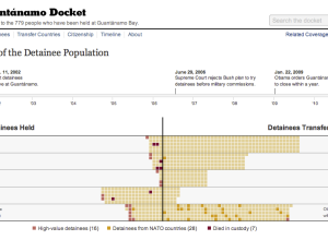
History of detainees at Guantánamo
On January 11, 2002 the first detainees arrived at Guantánamo. On January 22,…
-
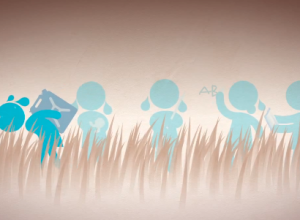
Water changes everything in motion graphics
In the most recent media push for Charity: Water, a video of motion…
-
See what you and others tweet about with the Topic Explorer
When you first come across a Twitter account it can be hard to…
-
Business intelligence vs. infotainment
Business intelligence expert Stephen Few goes on another rant about information graphics —…
-

Mental disorder graphics
Designer Patrick Smith has a minimalist look at mental disorders:
I was doing… -
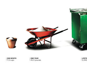
Sugar consumption buckets
Lovely imagery showing sugar consumption for day through lifetime. The average American consumes…
-
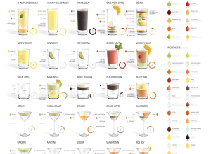
More proportions and cocktails
Designers’ current obsession with cocktails and proportions continues with Konstantin Datz’ recent poster.…
-

Taming the breath of a wok
I found this on Serious Eats, but it looks like it’s from a…
-
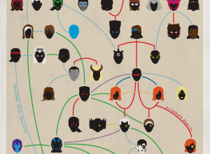
X-Men family tree
Amusing from graphic designer Joe Stone, although not as good as the crazy-detailed…
Recently for Members
Second Edition
 Visualize This: The FlowingData Guide to Design, Visualization, and Statistics (2nd Edition)
 Visualize This: The FlowingData Guide to Design, Visualization, and Statistics (2nd Edition)
New tools, refined process.
Browse by Chart Type See All →


