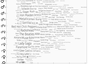
Last.fm intern Joachim Van Herwegen has a quick look at listening habits by…
Statistical Visualization
Finding patterns, distributions, and anomalies.
-
Music listening preferences by gender
-
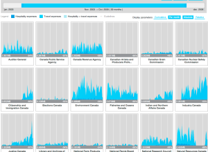
Expense visualizer
In an effort to make Canadian government expense data more accessible, FFunction designed…
-
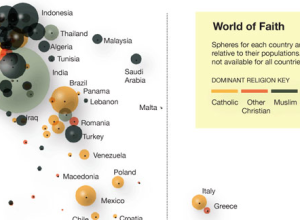
Faith and poverty in the world
Using data from a recent Gallup report showing a correlation between wealth and…
-
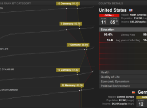
Countries of the world ranked by stuff
What country has the best education? Health? Quality of life? Thomas Klepl and…
-
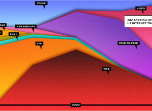
Stacked area shows the Web is dead?
Wired has declared that the Web is dead in their September cover story,…
-
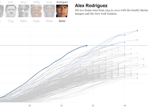
Alex Rodriguez joins the 600 club
Alex Rodriguez became only the seventh player in MLB history to hit 600…
-
$8.7b Iraq development funds unaccounted for
A simple question from GOOD magazine: where did the money to rebuild Iraq…
-
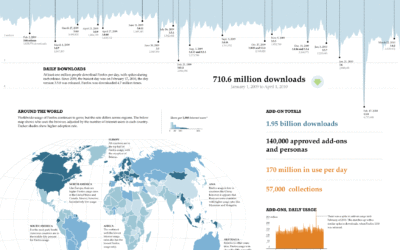
Exploring the Reach of Firefox
Once every blue moon I like to freelance as a short break from…
-
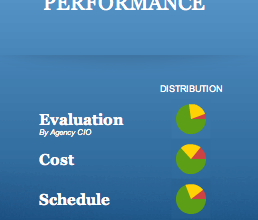
Redesign of the Federal IT Dashboard
About a year after the launch of the Federal IT Dashboard, business intelligence…
-
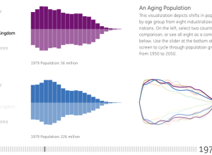
Exploration of our aging world
From Ben Fry’s newly established Fathom Information Design, is a visualization for GE…
-
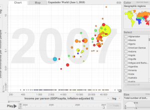
Gapminder makes its way to the desktop
You’ve seen the presentation. You’ve seen the motion graph tool. But up until…
-
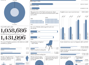
How Britain has changed since 1997
Prospect Magazine takes a look at how Britain has changed by the numbers…
-
JavaScript InfoVis Toolkit 2.0 released
Visualization in JavaScript is all the rage these days. Just a couple of…
-
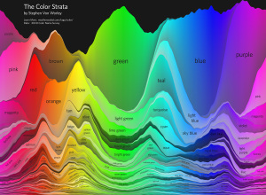
Strata of common and not so common colors
In another look at the data from xkcd’s color experiment, Stephen Von Worley…
-
Protovis 3.2 released – more examples and layouts
The most recent version of Protovis, the open-source visualization library that uses JavaScript…
-
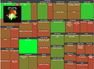
Current tracks and visualizes memes
It’s not easy keeping up with what’s going on around the Web. Trending…
-
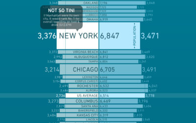
What America spends on food and drink
How much more (or less) money do you spend on groceries than you do on dining out? Bundle, a new online destination that aims to describe how we spend money, takes a look at the grocery-dining out breakdown in major cities.
-
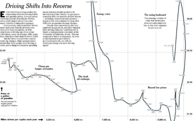
Driving habits and gas prices shift into reverse
Hannah Fairfield of the New York Times looks at driving habits and gas…


 Visualize This: The FlowingData Guide to Design, Visualization, and Statistics (2nd Edition)


