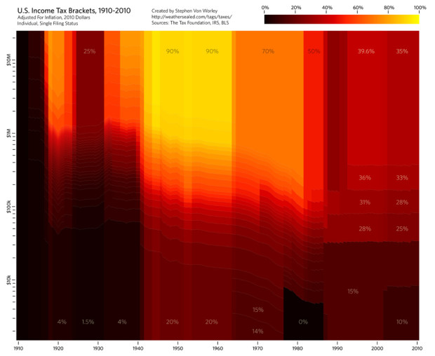
Stephen Von Worley’s Weather Sealed is one of my new favorites. In his most recent graphic, income tax brackets for individuals are displayed.
The colors indicate the marginal tax rate: black for low, red in the middle, and yellow for high. The horizontal axis is the tax year, and the vertical represents taxable income, log-scale, normalized to 2010 dollars with the Bureau Of Labor Statistics’ monthly CPI-U figures. The bracket data comes from The Tax Foundation and the IRS, and the effects of Social Security, capital gains, AMT, and other tax varieties are not included.
Through most of the century, brackets were much closer to a continuous scale. There was a big shift in thought though in the 1980s, when Ronald Reagan was elected president. The brackets became much more distinct. The idea has more or less stuck over the past two decades.
Of course what sticks out the most is the 90% income tax during the mid-1900s. Earn $10 million. Give the man $9 million of it. That seems sort of, uh, wrong. The range between lowest and highest is also really big at 70 percentage points. It’s only a small difference of 15 percentage points nowadays. Much better.
Update: As noted in the comments, my knowledge of tax brackets is amazing. I should be a CPA. Here’s the corrected math. The amount you earned over $10 million in 1950 is what would get taxed 90%. So if you earned $11 million, $900,000 of the last million would go to the man. Subsequently, the first $20,000 would be taxed 20%, then the next lump 30%, so on and so forth. Thanks, all.
 Visualize This: The FlowingData Guide to Design, Visualization, and Statistics (2nd Edition)
I like how you, sneakily, stuck in your standpoint on tax brackets in this article ;-)
In the Netherlands, the highest tax rate is 52% for incomes above €54368 (http://www.hr-kiosk.nl/xbook/id/2589).
I think you misunderstand tax brackets. If there’s a 90% tax on earnings above $10,000,000 then you only pay the higher tax on anything *above* $10,000,000. So if you earn $11,000,000 then you pay an extra $900,000, not $9,000,000 as you state.
Of course at that point, $900,000 is arguable small change if you’re earning $11,000,000 whereas for someone earning a lot less, 15% is a big deal.
Whoops there I go, sounding like a socialist… :P
Income tax brackets in the UK actually went up to 95% in the 1960s. It’s hard to believe today that The Beatles meant “Let me tell you how it will be/ There’s one for you, nineteen for me” literally (in “Taxman”), but that was just financial reality back then.
To be clear, all of these are marginal rates; the $10M earner would have paid slightly less than $9M, but the point stands. It’s still crazy high.
I see Jonathan beat me to the “marginal rates” correction. I’m giving Nathan the benefit of the doubt because it actually doesn’t make much of a difference in his example: the person making $10 million dollars in 1960 pays the respective marginal rates for the first million, but the other $9 million is taxed in the 90% bracket. So the tax burden is $8.1 million plus the total tax on the first million, which (eyeballing it) would probably be enough to round up to $9 million.
Personally, I don’t think it would hurt the US to have a top tax bracket somewhat higher than what it is. I would certainly draw the line somewhere before 90%, though.
Love the graph, could be harder to read for a non-technie — but I really hope not.
You might want to do something to adjust the scale of the amont: I’m a big fan of logarithmic scale, but I’m positive most people don’t understand it, and also certain the vast majority of your readers severly over-estimate how many people make lots of money. A version with the height of a bracket corresponding to how much money is earned in that bracket would help (and it might resolve partially the “you don’t understand marginal taxing” argument) — although you’d probably need an estimate for the lowest bracket, that the IRS might ignore a little.
It would be interesting to have the same graph for mean tax rates instead of marginal. Of course, it is going to be in continuous scale as there are no break in the evolution of mean taxes.
Maybe it would be a good way to bring home a point that is often misunderstood on the difference between marginal and mean in that case.
Nice graph. But as others pointed out, it only shows part of the picture about taxes. First, if you’d include deductibles the real “brackets” are much closer together. Often richer people have more deductibles, like mortgage rent etc. Second, often the brackets don’t apply to the really rich, since they get most of their “income” from other sources then a monthly paycheck. Warren Buffet once calculated that he pays a lower percentage tax rate then his secretary because of this.
And for a reality check, how about overlaying some debt and deficit figures, especially during the reign of Saint Ronald.
Nice to have my view that ignorance of how the tax system works corresponds with opposition to said system.
What Matt said about deficits. How is the current system “much better” if it doesn’t produce sufficient revenue to cover expenditures?
Anyone cheering lower tax rates should listen to David Walker’s talk at the Commonwealth Club from earlier this year. We are planting the seeds of a bitter harvest with these policies.
What’s most striking to me is the tax rate in 1910.
“Earn $10 million. Give the man $9 million of it. ”
Ummmm…no.
http://en.wikipedia.org/wiki/Tax_rate#Marginal
Another point that hasn’t been mentioned is that FAR fewer people earned $10 million in 1960 than do today. Today, it is not unusual for athletes, entertainers, C-level execs to earn $10 million per year. In 1960, it was only a very few people earning this type of money. What might be interesting is to give a reference point on the graph — plot median US household income by year to see what the effect was on the average American household.
It doesn’t look like this accounts for the standard deduction? Otherwise you’d see a band at the bottom for very low incomes with an effective 0% tax rate.
If the data were presented in constant dollars, the chart would look a lot different. A dollar today has about the same purchasing power as $21.25 did in 1910.
http://en.wikipedia.org/wiki/United_States_dollar#Purchasing_power
Aside from all of the other comments about what 90% top marginal rate means — plus the ability of those who fall into the top marginal rate to avoid paying a lot of that, income tax is only one of five types of taxes we pay and it is the only one designed explicitly to be progressive… the tax structure as a whole ends up being more or less proportional and we have one of the least redistributional tax/outlay structures of developed countries — in other words those being taxed at the top end (effective vs. statutory rate are very different) also received substantial benefits. Maybe pairing this with an examination of the effect on income disparity and distribution would address the question of whether it is “uh, wrong.”
Great display. As a dual display it would be neat to see the vertical scale represent 100% of the population, and then break up the vertical scale with the correct portion of the population going from least income to most… You’d need to make it bigger though to be able to see the highest income earners ;)
constantnormal :
I believe it is in constant dollars. “The horizontal axis is the tax year, and the vertical represents taxable income, log-scale, normalized to 2010 dollars with the Bureau Of Labor Statistics’ monthly CPI-U figures”
I would also like to see — as Matt Platte suggested — some overlay for current presidents.
Also, I usually associate red with being extreme values. Would be nice to see a different color ramp. Maybe it’s just me.
And is Single Individual the appropriate filing status to display? I really don’t know
Pingback: Income tax brackets, 1910 - 2010 « MNpublius.com
Not to be contrarian, but I find this graph difficult to interpret without studying it for a half hour. It looks more like an inkjet cartridge malfunction than a visualization.
Pingback: Notional Slurry » links for 2010-04-29
Marginal rate changes are interesting, but graphing the effective tax rate vs. population would be much more interesting and informative.
“Hauser’s Law,” as I call this formula, reveals a kind of capacity ceiling for federal tax receipts at about 19% of GDP.
“The Revenue Limits of Tax and Spend: Whether rates are high or low, evidence shows our tax system won’t collect more than 20% of GDP” by David Ranson in The Wall Street Journal on May 17, 2010.
http://online.wsj.com/article/SB10001424052748704608104575217870728420184.html
So the question might be, do rates make any difference?