Projects
Graphics by Nathan Yau, borne out of everyday curiosities, learning experiments, and mild insomnia.
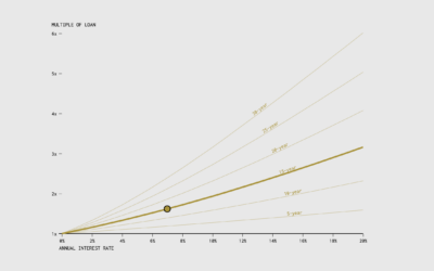
When the Cost of a Mortgage is a Multiple of the Original Loan
Use this chart to see how many times over you'll pay over the original loan amount, given the annual rate and the number of years of paying.
Renting vs. Owning a Home, by State
Among households in the United States, 68% are owned and 32% are rented, based on estimates from the American Community Survey in 2021. That breakdown isn't uniform across the country though.
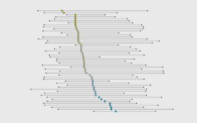
When is Dinner, by State
These are the states that eat dinner the earliest and latest, along with everyone else in between.
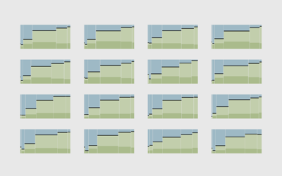
All the Household Types in the U.S.
No need to restrict ourselves to the most common types. There are thousands. Let's look at all of them.
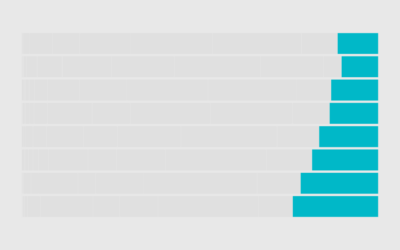
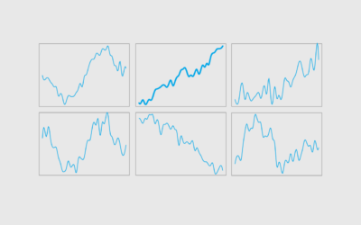
Chart Challenge for a Day
My schedule doesn’t really fit with the daily-thing-for-thirty-days genre of challenges. So my genius idea was to compress a 30-day challenge into one day.
Income Sources
Most people have a job and receive wages in return, but that starts to change when you get into the higher income groups.
Single Parents
In the 1950s, less than 10% of families with children were single-parent. In 2022, among families with children, 31% were single-parent — more than three times as common.
More Dual Income, No Kids
People are waiting longer to have kids or not having kids at all, which leads to more dual income households with no kids.
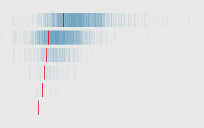
Bank Failures in the United States, Since 2001
These are all the failures since 2001, scaled by amount of assets in 2023 dollars.
Multiple Income Households
Here's household income by number of earners in the household, based on data from the 2022 Current Population Survey.
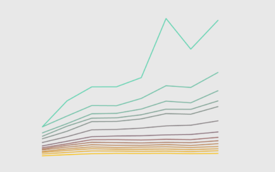
Wealthy Percentiles Rising
The rich continue to get richer, and everyone else either only kind of earns more or stays where they're at.
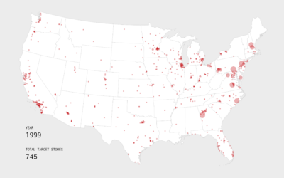
Growth of Target, an Animated Map
Watch the growth strategy behind Target stores, starting with the first location in 1962 in Minnesota.
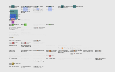
Where Else You Can Work
If you're searching for a new job, it's worth looking in different industries instead of doing more of the same elsewhere.
Mixed Feelings of Happiness and Meaning
Happiness and meaning do not always travel together. Sometimes we need to pursue meaning without the happiness, and vice versa.