Mushon Zer-Aviv offers up examples and guidance on lying with visualization.
We don’t…
Design
Important in presenting data clearly and beautifully.
-
Disinformation visualization
-
Link
Colour schemes
A bunch of color schemes and their corresponding hex codes.
-
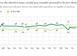
A bar chart would be better
There’s a strand of the data viz world that argues that everything could…
-
Link
We’ve Reached Peak Infographic, and We’re No Smarter for It
We’ve Reached Peak Infographic, and We’re No Smarter for It. Add another to the list of people who are tired of infographics that don’t say much. Again though, it’s best not to get too bent out of shape over low-quality work, and energy is much better spent working on things that shine.
-
Link
Infographics and marketing: the good, the bad and the ugly →
Mostly ugly, but that’s not necessarily a bad thing
-
Loving beautiful things
Lance Hosey, for The New York Times, on design, beauty, and functionality.
We… -
Masterful design of the everyday baggage tag
Pilot Mark Vanhoenacker describes the history and careful design of the everyday baggage…
-
Nigel Holmes on explanation graphics and how he got started
Some consider Nigel Holmes, whose work tends to be more illustrative, the opposite…
-
Infographics are like Mother’s Day cards
Stamen Design is the cover story of this month’s Icon Magazine. Well deserved.…
-
Analysis versus storytelling
Robert Kosara contrasts my version of the pay gap graphic with the NYT…
-
Too many axes
Kaiser Fung talks about the suck of overlaying plots to show a relationship.…
-
How businesses approach infographics
The Washington Post asked three “young entrepreneurs” how their company uses infographics. They…
-
Fast and slow thinking for maps
James Cheshire ponders the difference between fast and slow thinking maps, and the…
-
Link
Color Oracle →
Desktop tool that changes colors of entire screen to simulate color blindness
-
Link
When We Build →
When we build: “We shape our tools, and thereafter our tools shape us.” [via]
-
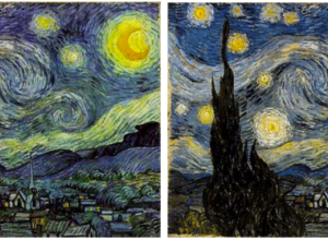
Van Gogh for the colorblind
After a chat with his color deficient friends about how Vincent van Gogh’s…
-
Substratum: A series of interviews with smart people
It’s always nice to hear from the people who are the best at…
-
Significant digits and relevance
Lulu Pinney goes over the subtle art of working with significant digits:
When… -
Wow vs. Ah-ha for data graphics
After attending the Eyeo Festival, Zach Gemignani of Juice Analytics noticed a difference…
-
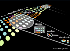
Approaching data, a UX perspective
UX designer and consultant, Hunter Whitney, describes a good mindset as you start…
Recently for Members
Second Edition
 Visualize This: The FlowingData Guide to Design, Visualization, and Statistics (2nd Edition)
 Visualize This: The FlowingData Guide to Design, Visualization, and Statistics (2nd Edition)
New tools, refined process.
Browse by Chart Type See All →


