If people put data on the Web – government data, scientific data, community…
Nathan Yau
-
Tim Berners-Lee with an update on open data
-
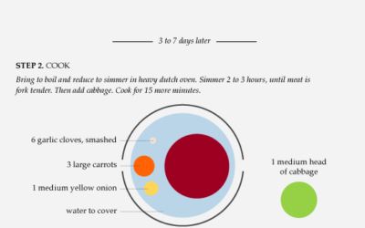
Data Underload #13 – Corned Beef Recipe
For as far back as I can remember, I’ve always had corned beef and cabbage on St. Patrick’s Day, or at least on the week of.
-
Weekend Fodder
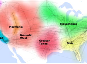
How to split up the US – Geographic clusters based on social network…
-
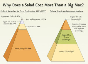
Challenge: Let’s do something with these 3-D pyramids
The government recommends a diet for healthy living, but there are billions of dollars of lopsided subsidies. Interesting point. Funky presentation.
-

Review: We Feel Fine (the book) by Kamvar and Harris
We Feel Fine, by Sep Kamvar and Jonathan Harris, is a selection of some of the best entries from the database of 12 million emotions, along with some insights into the growing dataset.
-
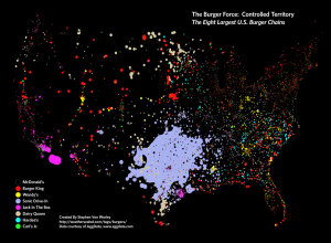
What burger chain reigns supreme?
In a follow up to his McDonald’s map, Stephen Von Worley of Weather…
-
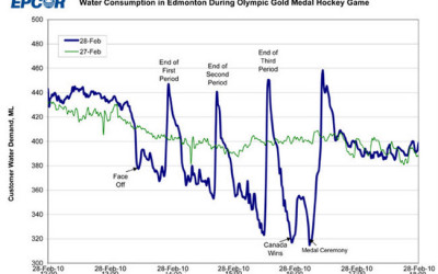
Canada: the country that pees together stays together
EPCOR, the water utility company that runs the fountains up in Edmonton, Canada…
-
Looking Inside a Bus Routing Algorithm
In an effort to put transit data from the Toronto Transit Committee to…
-
Edward Tufte will serve on Recovery Independent Advisory Panel
Big news for all you Edward Tufte fanboys and girls. He will be…
-
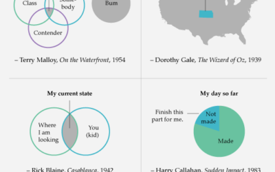
Data Underload #12 – Famous Movie Quotes
Here’s looking at you, data point.
-
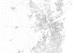
Weekend Fodder
Footprints – Every building footprint, and nothing else, in Montgomery County, Ohio. It’s…
-
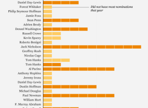
Is Jeff Bridges most likely to win best actor?
There’s this article on CNN, from The Frisky, that has this little theory…
-
Best of FlowingData – February 2010
It was a good month for FlowingData. We passed the 30k-reader mark, and…
-

How Genetics Works
Simple yet effective. Any questions? [via 9gag | Thanks, Barry]…
-

Think Like a Statistician – Without the Math
I call myself a statistician, because, well, I’m a statistics graduate student. However, the most important things I’ve learned are less formal, but have proven extremely useful when working/playing with data.
-

Visualize your Last.fm listening patterns with LastHistory
Frederik Seiffert provides this nifty tool, LastHistory, to visualize your Last.fm listening history.…
-
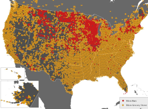
Where Bars Trump Grocery Stores
FloatingSheep, a fun geography blog, looks at the beer belly of America. One…
-
The State of the Internet
From JESS3 is this video on the state of the internet. It’s essentially…
-
Data Underload #11 – American Hockey
American interest in hockey went from practically zero to near Canadian status.
-
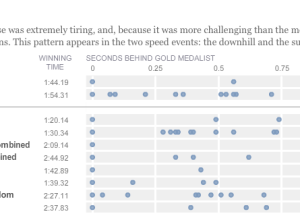
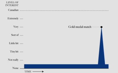
Olympic musical – how fractions of second make all the difference
Like everyone, I’ve been watching the Olympics, and it continues to amaze me…
Recently for Members
Second Edition
 Visualize This: The FlowingData Guide to Design, Visualization, and Statistics (2nd Edition)
 Visualize This: The FlowingData Guide to Design, Visualization, and Statistics (2nd Edition)
New tools, refined process.
Browse by Chart Type See All →


