As most of you know, there are 33 Chilean miners trapped 2,230 feet…
Nathan Yau
-
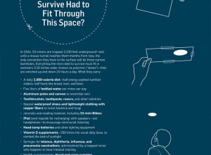
Bore hole for Chilean miners
-

Race and ethnicity mapped by block
Instead of breaking up demographics by defined boundaries, Bill Rankin uses dots to…
-
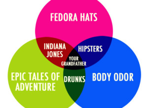
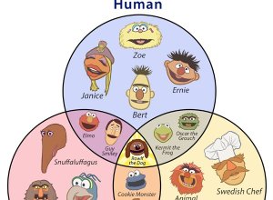
Venn: Your grandfather
Yeah, you know what day it is. What category do you fall under?…
-

FlowingData book in the works
You read that right. There’s going to be a FlowingData book, published by…
-

Electronic Medical Records by the numbers
In 2009, legislation mandated that doctors make use of electronic medical records by…
-

History of the Iraq War through Wikipedia edits
Through high school and sometimes beyond we’re taught history as absolute fact. It’s…
-
The state of mapping APIs
O’Reilly Radar surveys the state of mapping APIs from old sources (like Google)…
-
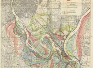
Evolving path of the Mississippi River
We often think of rivers as following a given path for the course…
-
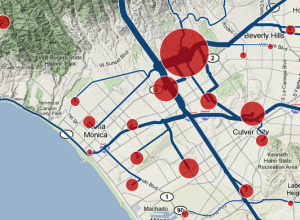
Where your neighbors commute to and from
Some people live in areas where a one-hour commute both ways is common,…
-
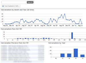
Graph and explore your Gmail inbox
Your email says a lot about who you are, who you interact with,…
-
The real stuff white people like
Online dating site OkCupid continues their run of amusing yet thorough analysis of…
-
Illustration of ideas and concepts
In a different take on the infographic, RSA Animate illustrates the ideas and…
-
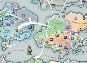
Battle for Web supremacy
Blend Interactive maps points of control for the Web 2.0 Summit in the…
-
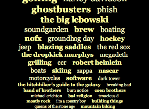
The Muppets name etymology
I know you were confused about Muppet names. I hope this venn diagram…
-

An approximate answer
Far better an approximate answer to the right question, which is often vague,…
-

The future of self-service banking
Too many slots. Too many buttons. Spanish bank BBVA and design consultancy IDEO…
-

Social life of Foursquare users mapped
Foursquare, the location-based social network, lets people share their location with others in…
-
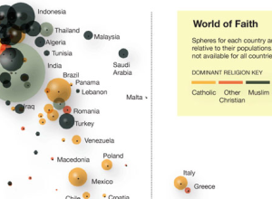
Faith and poverty in the world
Using data from a recent Gallup report showing a correlation between wealth and…
-
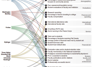
Various ways to rate a college
There are a bunch of college ratings out there to help students decide…
-
Poll: What do you use to analyze and/or visualize data?
I asked this same question a couple of years back. I wonder: has…
Recently for Members
Second Edition
 Visualize This: The FlowingData Guide to Design, Visualization, and Statistics (2nd Edition)
 Visualize This: The FlowingData Guide to Design, Visualization, and Statistics (2nd Edition)
New tools, refined process.
Browse by Chart Type See All →


