In this day and age, we should all be thinking about how we can better conserve the environment, because if we don’t, well you know, the planet will die. In a follow-up to my previous eco-friendly list, here are 10 more infographics and visualizations on going green.
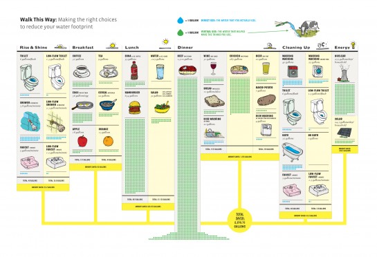
How much water do you use? from GOOD
In this collaboration with Fogelson-Lubliner, GOOD shows how much water you actually use during your daily activities.
Where US Oil Comes From by Jon Udell
US oil comes from places you wouldn’t normally expect.
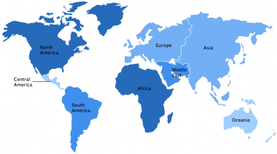
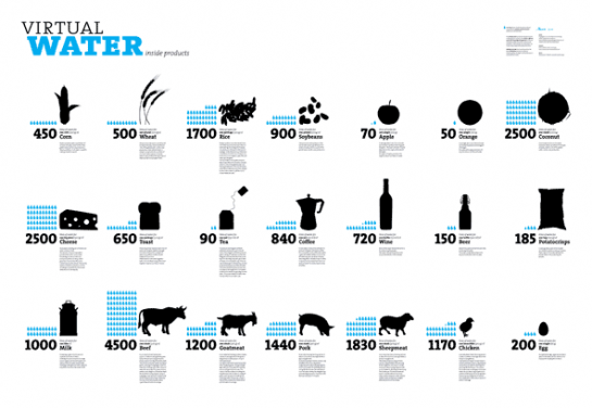
Virtual Water by Timm Kekeritz
While you might see the water in the end product, it’s still getting used.
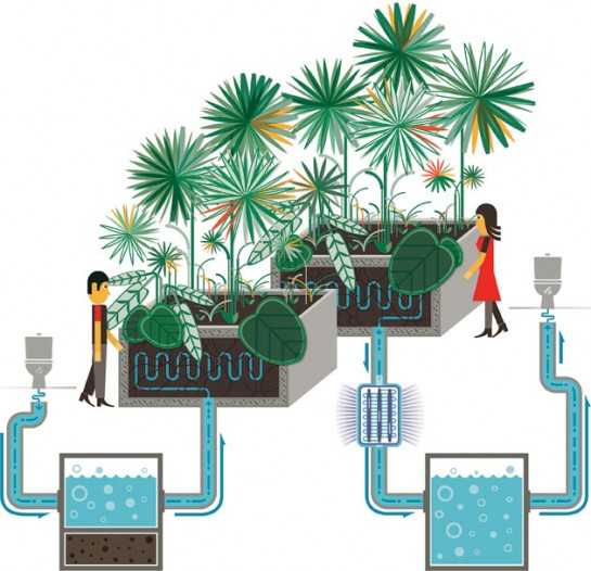
Deja Poo from Wired
This nifty filtration setup lets you drink recycled toilet water.
Track Energy Consumption with WattzOn
This is how much energy you’re using per day.
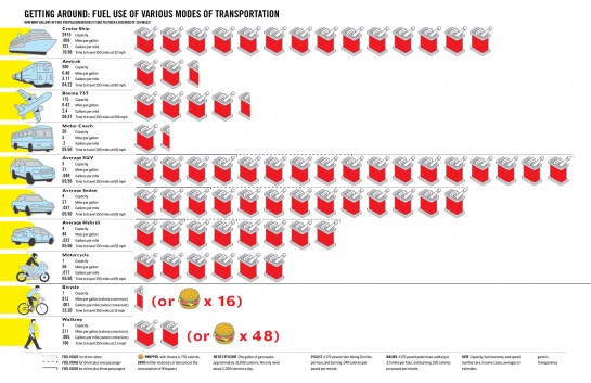
Getting Around by Robert Di Ieso, Jr for GOOD Magazine
Do you know how much gas you use with various modes of transportation?
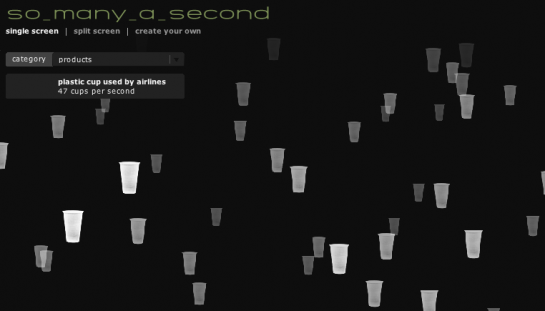
So Many a Second by Wouter Walmink
Putting the amount of garbage we produce in perspective.
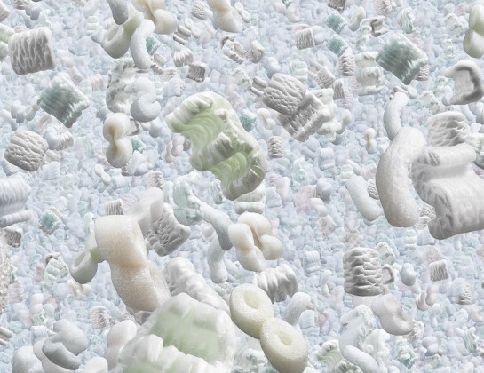
Running the Numbers by Chris Jordan
Putting the amount of garbage we produce… from a different perspective.
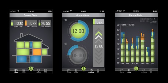
Current State Concept Drawings
How you could start tracking your own carbon intake.
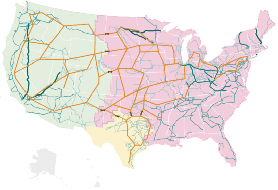
Complex Power Grid from NPR
Just how efficiently is energy distributed across the country?


 Visualize This: The FlowingData Guide to Design, Visualization, and Statistics (2nd Edition)

Pingback: raffa's status on Tuesday, 08-Sep-09 08:41:57 UTC - Identi.ca
Pingback: 10 More Infographic Reasons Why You Should Go Green | FlowingData « Netcrema – creme de la social news via digg + delicious + stumpleupon + reddit
Pingback: All Teched Up! « Caintech.co.uk
Pingback: Oblate Spheroid » Blog Archive » Visualizing Environmental Impact
I’m a bit dubious about the water stuff.
When we take a shower, we’re not consuming water. We’re consuming the energy required to pump the water to our house, heat it, pump it to the treatment plant, treat it, and pump it back out again.
Saving water in the US isn’t going to make more water available for Australia.
And of course water-intensive agriculture occurs in areas where irrigation infrastructure is well-developed – again, reducing water use there isn’t going to make more water pop up somewhere else.
not true. when you take water out of the river to irrigate the desert, there will be no more water at the end. look up the history of the aral sea and lake chad.
Pingback: Planner Reads » Blog Archive » Best of FlowingData: September 2009