Thanks for yet another very enjoyable chapter. If I had known statistics would…
Nathan Yau
-
Visualize This: From my editor
-

Coming soon: Bloom visualizes your music collection as planets
I almost never post about projects that aren’t released yet, but the previews…
-
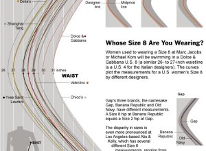
Women’s dress sizes demystified
Women’s clothing sizes have always confused me. My wife always has to try…
-
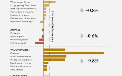
What costs more in 2011?
After seeing this article and graphic on the rising cost of food in…
-

Review: R Cookbook from O’Reilly
R can be confusing when you’re first starting out, especially when you don’t…
-
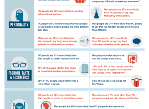
Mac vs. PC people
Recommendation site Hunch is another one of those applications that knows a ton…
-
New York Times R&D Lab explores how news is shared and read with Project Cascade
For online publications, it’s useful to know how people share links to articles…
-
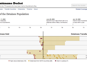
History of detainees at Guantánamo
On January 11, 2002 the first detainees arrived at Guantánamo. On January 22,…
-
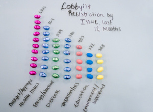
Open government and Easter candy
Sunlight Foundation displays some key government numbers with Easter candy, because as you…
-

Water changes everything in motion graphics
In the most recent media push for Charity: Water, a video of motion…
-
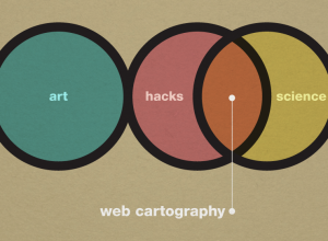
Art, science, and cartography
Similar discussions going on in the cartography branch among UW Madison geography folks.…
-
Life captured in data, charts, and graphs
Nice piece from NYT on seeing your life in data:
“There’s going to… -
How long it takes for house prices to drop
Shopping for a house? Sometimes it can be advantageous to wait a while,…
-
Charts about sex
OkCupid adds another report to their growing list of analyses on relationships. This…
-
Map your location – that your iPhone secretly records
Researchers Alasdair Allan and Pete Warden have found that the iPhone records cell…
-
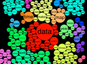
See what you and others tweet about with the Topic Explorer
When you first come across a Twitter account it can be hard to…
-
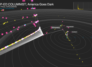
Visualization as a mass medium in the 21st century
In an op-ed for CNN and perhaps adding fuel to the fire, Martin…
-
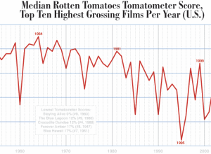
Dropping movie ratings from the past six decades
Dorothy Gambrell of very small array charts median Tomatometer ratings of the top…
-

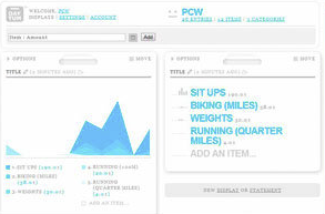
DisplayCabinet augments keys and wallet with data
DisplayCabinet is a clever use of a projected display and RFID tags to…
-
Business intelligence vs. infotainment
Business intelligence expert Stephen Few goes on another rant about information graphics —…
Recently for Members
Second Edition
 Visualize This: The FlowingData Guide to Design, Visualization, and Statistics (2nd Edition)
 Visualize This: The FlowingData Guide to Design, Visualization, and Statistics (2nd Edition)
New tools, refined process.
Browse by Chart Type See All →


