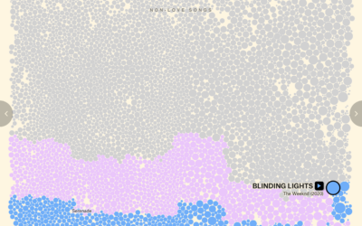
For The Pudding, David Mora and Michelle Jia examine the death of the…
Nathan Yau
-
Evolution of the love song
-
See you on Bluesky
Bluesky, maybe best pitched as a place for those who liked Twitter and…
-
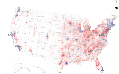
Dot density map for election results
With what is now a common mapping method, The Economist used a dot…
-
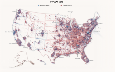
Mapping every voter as a grain of sand
To show the mix of votes across the country, the Washington Post used…
-
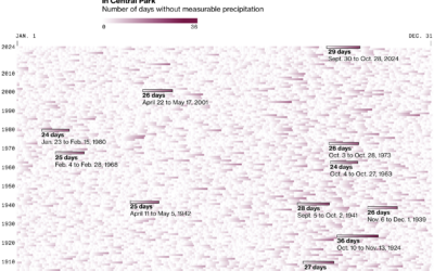
Days without rain
New York City recently issued a drought warning because of an abnormally dry…
-
23andMe sinking
For BBC, Zoe Kleinman reports:
Not so long ago, 23andMe was in the… -
What might have sank the Bayesian superyacht
A $40 million superyacht called the Bayesian sank off the coast of Sicily,…
-
Members Only
Random Everyday Walk
This week we talk randomness in the everyday.
-
Members Only
Make the Chart: Scatterplot Using Text Instead of Dots
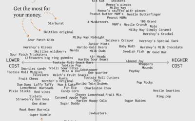
I made a chart about Halloween candy. Even dumb charts need attention and require that choices are made.
-
European night train map
The Night Train Map is for Europeans who want to travel at night:…
-
Restored rose and lily illustrations from the Pierre-Joseph Redouté collection
In the early 1800s, botanist and painter Pierre-Joseph Redouté painted hundreds of lily…
-
Jello map as states are called
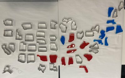
The Bloomberg Graphics desk is building out a jello map as states are…
-
Electoral vote cartogram
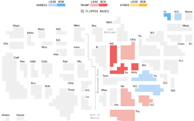
The major news outlets all have electoral vote cartograms, but I appreciate Bloomberg’s…
-
Why states swing while counts come in
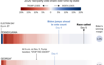
Some might wonder why early results lean towards a party and then shift…
-
Live map of county shifts
The Washington Post has a live county map that shows the shift towards…
-
Election touchscreen really deep dive by The Onion
The Onion gained access to the most granular election data yet. Technology sure…
-
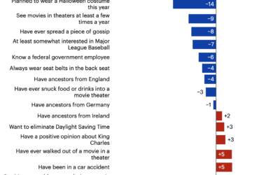
Presidential candidate preferences, by offbeat demographics
You’ve seen the voting tendencies among standard demographic groups, but there is so…
-
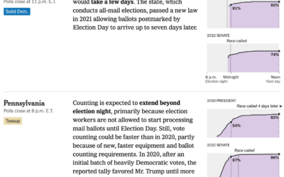
When to expect results from each state, based on previous elections
Some states count quickly, whereas others can take days. For NYT, Alicia Parlapiano…
-
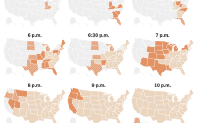
When the polls close
For The New York Times, June Kim, Leanne Abraham, and Maggie Astor provide…
-
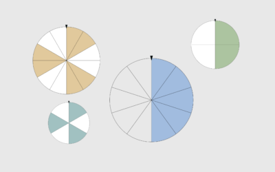
50/50 Spins
For no particular reason on this particular day, here are spinners to try your hand at random everyday things with even odds. Good luck.








 Visualize This: The FlowingData Guide to Design, Visualization, and Statistics (2nd Edition)


